Marketing Playbook 2026: How to Create a Youtube Shorts
Jump to a section
Most advice about how to create a YouTube Shorts is built for solo creators making one video on a phone. That workflow breaks the moment a marketing team needs volume, versioning, approvals, and repeatable output.
For performance work, the question isn't “where's the Create a Short button?” The primary question is how to turn existing footage, demos, creator clips, and ad assets into a system that ships Shorts fast, tests them cleanly, and keeps quality high enough to convert. YouTube has also changed what a Short can be. The product moved from the original 60-second era to a 180-second maximum in September 2024, which opened the door to deeper demos and more layered storytelling, while Shorts had passed over 9 trillion views with roughly 70 billion daily views as of April 30, 2026 according to YouTube Shorts history data.
That shift matters for marketers. You no longer have to squeeze every idea into a single punchline. You need a pipeline that can generate multiple hooks, shape the edit for mobile, package the upload correctly, and sequence the CTA so the short-form view becomes a business action.
Ideation and Hooks for High Retention
The Shorts feed is unforgiving. A weak opener doesn't just underperform creatively. It usually dies in distribution.
The two numbers that matter most are swipe-away rate and average percentage viewed (APV). For a Short to succeed, creators need a swipe-away rate below 30% and an APV of 80% or higher, and if more than 30% of viewers swipe away in the opening seconds, YouTube's system stops pushing the video wider. The same dataset also notes a 5.91% engagement rate for Shorts, higher than TikTok and Instagram Reels, in these YouTube Shorts statistics.
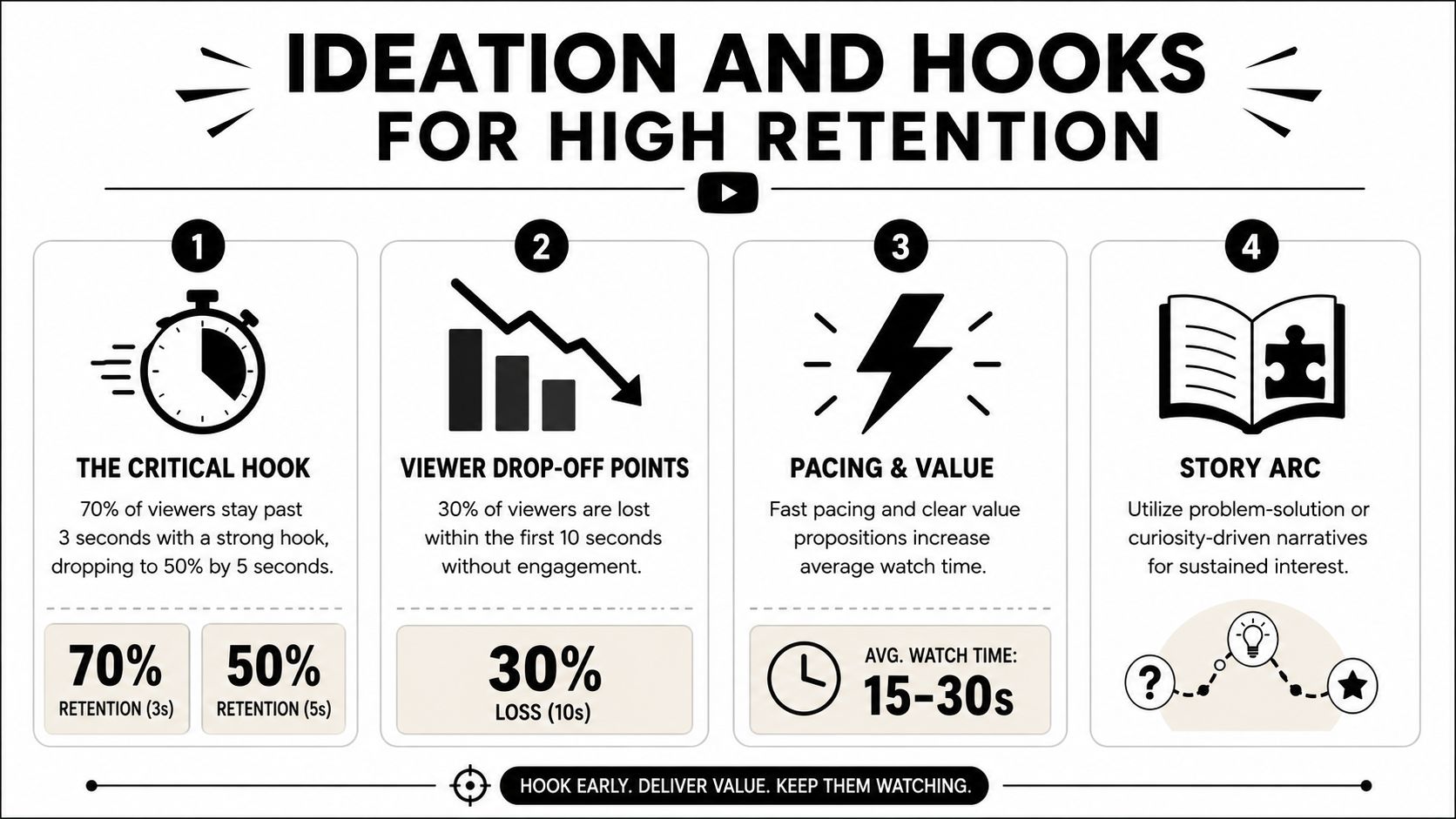
That changes how you brainstorm. Don't start with topic buckets like “feature video” or “brand awareness clip.” Start with what can stop a swipe in the first breath of the video.
Hook structure comes before scripting
A good marketing Short doesn't open with branding, context, or a neat introduction. It opens with tension. The viewer needs an immediate reason to stay.
Use these hook archetypes when building concepts:
- Problem and agitation. Start with the pain point in plain language. This works well for solution-aware audiences who already know the category. Example structure: “Your onboarding video is too long, so nobody finishes it.”
- Unexpected outcome. Lead with the result, not the setup. This works when the offer or product creates a visible before-and-after. Example structure: “We turned one product demo into a week of short-form ads.”
- Callout hook. Name the audience directly. This is effective when you need relevance fast. Example structure: “If you run paid social for an app, stop editing every short from scratch.”
- Pattern interrupt with proof setup. Open on a visual or statement that feels slightly off, then resolve it. Example structure: “This doesn't look like an ad, but it sells like one.”
Build hooks in batches, not one at a time
A team that needs output should write hooks as modular units. One product angle can generate several openers, and each opener can attach to the same body section.
A simple internal framework looks like this:
| Asset layer | What to create | Why it matters |
|---|---|---|
| Hook bank | Multiple opening lines and visual openers | Lets you test retention without rebuilding the whole edit |
| Body modules | Demo clips, proof points, objections, testimonials | Reuse across campaigns and audiences |
| CTA variants | Subscribe, click, learn more, watch longer video | Aligns the Short with funnel stage |
Practical rule: If the first line needs a second sentence to make sense, it's probably too slow for Shorts.
For teams that want a cleaner way to pressure-test opening performance before editing, a hook rate calculator for short-form concepts can help frame whether the idea has enough stopping power.
What usually fails
Three things sink retention early:
- Logo-first openings that ask for attention before earning it.
- Too much setup before the viewer understands the payoff.
- One-hook thinking where the team edits a single version and calls it done.
Many marketers don't need more content ideas. They need better opening mechanics. If you solve that, the rest of the Short gets a chance to work.
Repurposing Assets for a Scalable Workflow
The in-app recorder is fine for reactive content. It's a bottleneck for paid acquisition, client delivery, or any team that needs steady output.
YouTube's own creator guidance points in a different direction. It notes that creators can work across devices and that channels using both Shorts and longer videos see better overall watch time and subscription growth in YouTube's Shorts creator guidance. For marketers, the useful takeaway isn't “make both formats.” It's “stop treating every Short as a brand-new production.”
The repurposing-first model
Most brands already have more usable source material than they think. Product demos, webinars, interviews, creator whitelisting footage, testimonial calls, launch videos, and old paid social cuts can all become Shorts if you pull them apart correctly.
The shift is operational. Instead of asking editors to “make a Short,” ask them to build a library of reusable pieces:
- Openers taken from bold claims, reactions, objections, or strongest product visuals
- Body clips showing product use, feature explanation, social proof, or transformation
- End cards and CTA segments matched to campaign goals
That's how one longer asset turns into multiple Shorts rather than one isolated cut.
Why teams should avoid all-in-one timeline thinking
A single fixed timeline creates friction. Every new test means duplicate work, more review rounds, and inconsistent naming. Modular production fixes that.
A scalable workflow usually follows this path:
- Ingest raw footage from desktop, cloud folders, creator submissions, or prior campaigns.
- Tag scenes by function, not just file name. Mark clips as hooks, demos, proof, objections, and CTAs.
- Create interchangeable modules so one demo can pair with several openings.
- Render format-specific versions for YouTube Shorts and other vertical placements.
Teams scale Shorts faster when they manage components, not finished videos.
Tools matter. Adobe Premiere Pro and CapCut work well for hands-on editors. If you need searchable asset organization and modular assembly, platforms built for ad variation can reduce manual scrubbing. One example is Sovran's guide to repurposing video content, which reflects the same production logic performance teams use when they turn long-form footage into reusable hooks, bodies, and CTAs.
What a practical asset library looks like
A useful Shorts library isn't organized by campaign name alone. That makes retrieval slow. Organize by reusability.
Try a structure like this:
| Folder or tag group | Example contents |
|---|---|
| Hooks | Founder soundbites, bold claims, visual surprises |
| Product proof | Screen recordings, usage shots, transformations |
| Objections | Pricing concerns, setup concerns, comparison responses |
| Social proof | Testimonials, UGC callouts, review snippets |
| CTAs | Learn more, subscribe, click-through, longer video handoff |
That system gives strategists and editors more flexibility. Instead of waiting on net-new shoots, they can build fresh combinations from existing footage and push more creative into testing.
Framing Editing and Captioning for Mobile
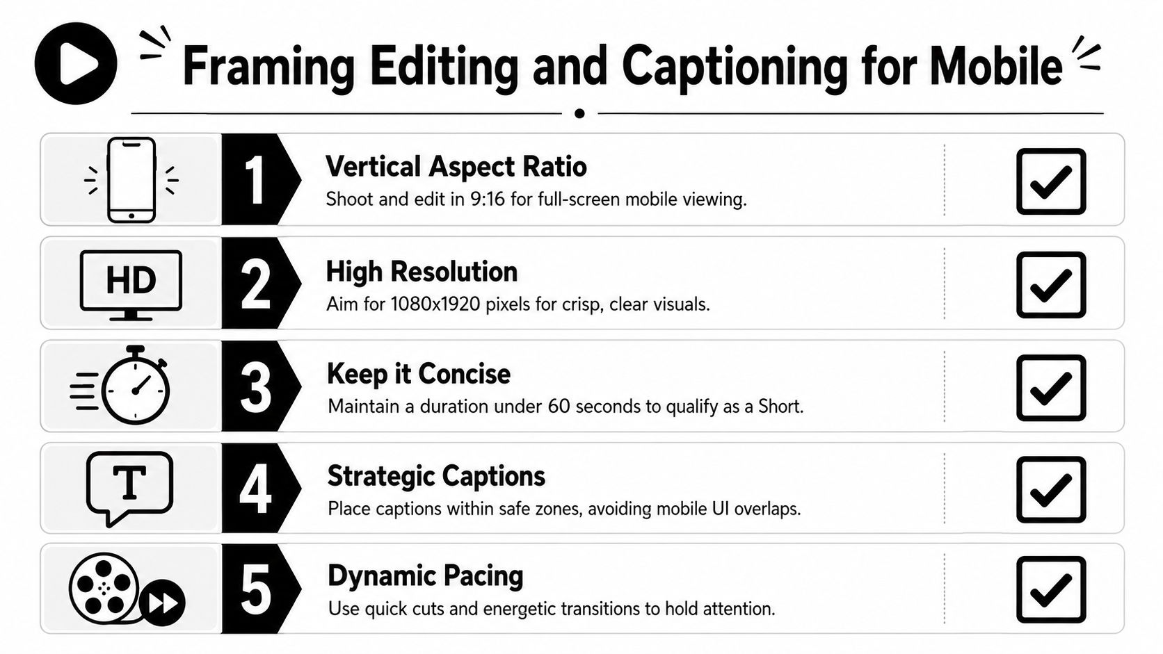
Recording in the YouTube app is rarely the bottleneck. Mobile framing is. Teams lose performance when they treat Shorts like compressed versions of desktop edits instead of designing each shot, caption, and crop for a phone screen first.
Shorts can now run up to 180 seconds, but extra runtime does not fix weak composition. It raises the cost of sloppy editing because more seconds need to hold attention.
Edit for the phone screen first
A good mobile edit starts with hierarchy. The viewer should know where to look in under a second. If the product, face, or proof point is small, low-contrast, or buried under text, the frame is doing extra work before the message even starts.
Use this checklist:
- Build for 9:16 at the source when possible. Reframing horizontal footage can work, but only if the subject is large enough and the action stays inside a vertical safe area.
- Keep one focal point per shot. A face, product detail, or UI moment should dominate the center third of the screen.
- Write text that adds meaning. On-screen copy should sharpen the claim, label the proof, or call out the takeaway.
- Burn in captions for silent viewing. They carry the message when audio is off and improve clarity when voiceovers move fast.
- Protect caption-safe space. Leave room at the bottom for platform UI and avoid covering hands, buttons, or product details.
- Cut when the viewer gets new information. Rhythm matters, but comprehension matters more.
For teams producing captioned variants at scale, this guide to adding captions in Sovran's video editor shows a practical way to place and style subtitles without blocking the frame.
Framing across devices requires planning, not cleanup
Performance teams often edit on desktop, review on laptop, and publish from mobile. That handoff creates mistakes. Text that looks readable on a 27-inch monitor can become unusable on a phone. A crop that feels centered in Premiere can sit too low once the Shorts interface wraps around it.
Set a review pass that covers three screens: desktop edit view, phone preview, and upload view. If your team publishes from a computer, the workflow details in ChurchSocial.ai YouTube uploads are useful for keeping that desktop-to-mobile handoff clean.
Pacing rules that hold up in ads
Fast editing only helps when each visual change earns attention. For paid social and YouTube Shorts ads, the best-performing cuts usually do one of four jobs: clarify the offer, reveal proof, reset attention, or move the viewer closer to the CTA.
A solid mobile edit usually includes:
- a visual shift as the hook lands
- a tighter crop when the core claim appears
- text overlays that state the benefit in plain language
- pattern resets such as UI zooms, reaction shots, before-and-after frames, or B-roll inserts
Captions should carry the argument, not decorate the video.
This walkthrough is a helpful reference point for creators who want to see mobile-native editing decisions in practice:
Music, voice, and production efficiency
Music can improve momentum, but it also creates rights and reuse problems when the same asset needs to run across paid placements, landing pages, and organic channels. Keep a clean master without baked-in music. That version is easier to repurpose, localize, and cut into new variants later.
Voiceover usually gives ad teams more control than trend-based audio. If the product needs explanation, clear narration beats borrowed momentum from a sound trend. Use music to support pacing and use voice to sell the point.
Optimizing Uploads and Metadata
A lot of Shorts lose value after the edit because the upload is treated like admin work. It isn't. Packaging affects whether the video gets understood, clicked, and acted on when it shows up outside the feed.
Newer creator guidance has pushed attention toward practical post-upload levers such as title length, custom thumbnail selection and editing, pinned comments, and the product shift where any vertical video under 3 minutes can be treated as a Short, as covered in this creator guidance video.
Titles should finish the hook
Don't write titles like inventory labels. Write them so they sharpen the promise the opening already made.
Good Shorts titles usually do one of these:
- complete a curiosity gap
- name the audience
- frame the payoff
- add a keyword without sounding like a search dump
If the Short opens with a product failure point, the title can name the solution category. If the Short opens with a surprising outcome, the title can anchor what the viewer is seeing.
Thumbnails matter more than many teams assume
Inside the feed, the opening frame does a lot of the work. Outside the feed, the thumbnail matters more. That includes search results, channel pages, playlists, and shared links.
Choose a frame that does one of three things well:
- shows a face with a readable reaction
- shows the product state clearly
- supports the title with a visual contradiction or payoff
If your team uploads from desktop rather than relying on phone-only publishing, this guide to ChurchSocial.ai YouTube uploads is useful because it walks through the practical upload flow from a PC.
Pinned comments are a second CTA layer
The pinned comment shouldn't repeat the title. Use it to move the viewer somewhere.
A few reliable uses:
- add the next-step link or offer context
- answer the obvious objection the Short raises
- direct viewers to a longer explainer video
- prompt a response that helps qualify intent
A good pinned comment extends the funnel. It doesn't summarize the video.
Many outdated guides fall short in this regard. They teach creation mechanics, but not packaging. For marketing teams, packaging is part of the creative.
Driving Conversions with CTAs and Sequencing
A Short that only earns a view is content. A Short that moves someone to the next step is marketing.
The basic structure still works. Hook, body, CTA. But in Shorts, each part has to be compressed and tied to a funnel role. The hook wins attention. The body earns trust or interest. The CTA tells the viewer what to do with that attention.
Match the CTA to the stage
The biggest CTA mistake is asking for too much too early. A cold viewer rarely wants the hardest action immediately unless the offer is unusually simple and urgent.
Let's consider it this way:
| Funnel stage | What the Short should do | CTA style |
|---|---|---|
| Awareness | Introduce pain, problem, or possibility | Watch more, follow, learn how |
| Consideration | Show mechanism, demo, or proof | See full demo, compare options, get details |
| Conversion | Remove friction and create action | Start now, book, buy, install |
That's why many paid teams need more than one Short. One video can surface the problem. Another can show the product in action. A later cut can answer objections and push the ask.
Build the body so the CTA feels earned
The body isn't filler between the hook and the sale. It's where you justify the CTA.
For product and performance work, the body often does one of four jobs:
- demonstrates the product quickly
- explains the mechanism behind the result
- contrasts old way versus new way
- handles the most common objection
If your CTA asks the viewer to click, subscribe, or install, the body needs to make that action feel like the obvious next move.
The CTA should feel like the conclusion of the argument, not an interruption.
Sequencing beats one-off publishing
Shorts work better as a series than as isolated uploads. A single clip can create awareness, but a sequence creates memory and intent.
A simple sequencing model looks like this:
- First Short. Stop the scroll with a sharp problem statement or surprising result.
- Second Short. Show the product or workflow more concretely.
- Third Short. Handle objections, add social proof, or present the direct ask.
Creative teams can borrow from paid social testing discipline. Treat each Short as one piece of a message ladder, not as a standalone masterpiece. If you need examples of CTA styles that fit different campaign goals, these video ad CTA patterns are a practical starting point.
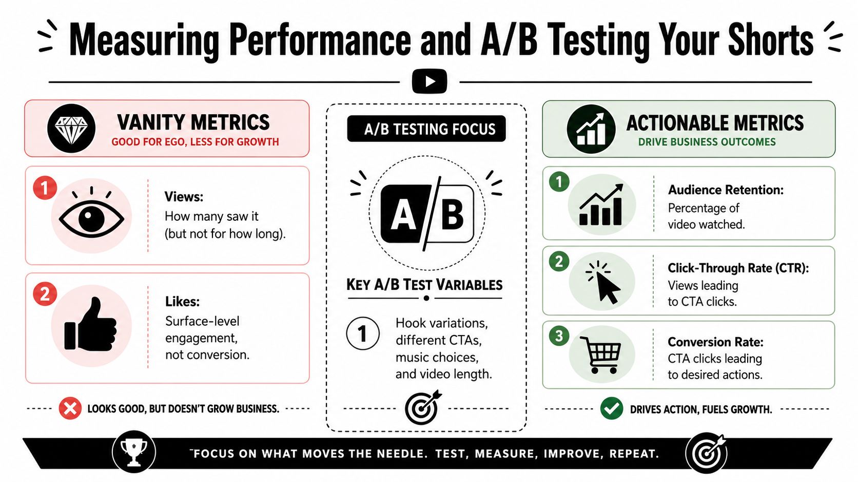
Measuring Performance and A/B Testing Your Shorts
The biggest testing mistake is changing too many variables at once. If a team swaps the hook, edit pace, captions, music, and CTA in the same batch, the result is useless for decision-making. You get a winner, but you do not know what won.
Views confirm distribution. They do not explain whether the first two seconds held attention, whether the product reveal kept momentum, or whether the CTA drove the next action. For performance teams, the goal is not more reporting. The goal is a tighter creative feedback loop that helps the next batch perform better.
Read Shorts like a creative analyst
Review Shorts at the cut level, not just at the video level.
Start by locating the exact moment performance changes. If retention falls off after the first spoken line, the opening promise was weak or too slow. If viewers drop when the product enters frame, the transition likely felt abrupt, confusing, or too ad-like. If the Short holds attention but gets no downstream action, the problem usually sits in the offer framing or CTA layer.
Then check context. A Short can win in the feed and underperform on your channel page because the viewer intent is different. Traffic source, watch pattern, and follow-on behavior matter more than raw reach if the goal is installs, clicks, or assisted conversion.
For teams running volume, I recommend tagging each version by hook, body structure, caption style, CTA, and source asset. That makes it possible to compare patterns across dozens of cuts, even when they were built from the same base footage on different devices and for different placements.
Keep A/B tests narrow
Narrow tests are what make a scalable Shorts workflow useful. If your process is built around reusable hooks, bodies, and end cards, you should test those modules one at a time.
A practical sequence looks like this:
- Test 1: same video, three different text hooks in the first two seconds
- Test 2: winning hook, two different body edits using the same product proof
- Test 3: winning hook and body, two CTA end cards with different asks
That structure gives you usable signal. It also fits batch production. Editors can swap one module without rebuilding the entire asset, which keeps testing fast and keeps results clean.
Here is a common example from performance creative. A brand has one strong demo clip pulled from a paid social ad, one UGC testimonial, and one product UI recording. Instead of producing six fully different Shorts, build one control version and vary only the opening text first. If "Why your current workflow wastes time" beats "The fix for slow reporting" and "We cut production time with one change," keep that opening and move to testing the proof section. Only after that should the team test whether "Start free" outperforms "See how it works" on the end card.
That is how you turn existing assets into a repeatable learning system instead of a pile of one-off edits.
If your team wants a more formal method for setting up controlled experiments, this guide to testing video ad creatives applies well to Shorts. The format is different, but the testing discipline is the same.
If your team needs to turn raw footage, old ads, UGC, and demos into a repeatable short-form pipeline, Sovran is built for that kind of modular production. It helps marketers organize assets into reusable hooks, bodies, and CTAs, assemble variations quickly, and render more creative without rebuilding every video from scratch.

Manson Chen
Founder, Sovran
Related Articles

Understanding Value Proposition for High-Velocity Video Ads
AI Talking Head Videos for Scaling Ad Creative