Best CTAs for Video Ads to Boost Conversions
Jump to a section
- 1. Direct Download CTAs with Urgency Messaging
- 2. Learn More and Discover CTAs for Educational Positioning
- 3. Social Proof and Authority CTAs
- 4. Benefit-Driven CTAs
- 5. Interactive and Gamified CTAs
- 6. Retargeting and Sequential CTAs
- 7. Action-Oriented Micro-CTAs
- 8. Personalized and Dynamic CTAs
- 8-Point Video CTA Comparison
- From Clicks to Conversions Your CTA Testing Blueprint

Video ads with a clear CTA consistently outperform creative that leaves the next step vague. The performance gap is large enough to change media efficiency, especially when the same concept is running across multiple placements and audience segments. A weak ask can drag down a strong hook, while the right ask can improve click quality, post-click intent, and conversion rate.
That pressure shows up fast in auction environments like Meta and TikTok. Creative testing is not about finding one winner and calling it done. It is about identifying which CTA works best by funnel stage, offer type, and audience temperature before frequency rises and response decays. In practice, the CTA is part of the conversion system, not a label added at the end of the edit.
A lot of CTA advice still stays at the phrase level. “Shop Now.” “Learn More.” “Get Started.” That is too simplistic for teams testing modular creative, separating cold prospecting from retargeting, and measuring CTR against CVR, CPA, and downstream quality signals.
This article uses a more useful framework. It organizes the best CTAs for video ads by campaign goal, then ties each category to the trade-offs that matter in live buying. Some CTAs pull cheap clicks and weak retention. Some reduce friction but lower urgency. Some work only after the video has established enough proof, product clarity, or offer relevance.
The other missing piece is execution. Good CTA testing depends on naming discipline, clean variable control, and enough volume to read results without mixing hook effects with CTA effects. Teams building repeatable systems often pair creative strategy with a clear direct response video ad formula so CTA tests sit inside a structure they can scale.
If video distribution is part of your acquisition mix beyond paid social, these YouTube SEO best practices are also worth folding into your workflow.
1. Direct Download CTAs with Urgency Messaging
For app growth, direct download CTAs are still the cleanest expression of intent. If the ad is built to drive installs, vague phrasing usually hurts more than it helps. “Get started” leaves room for hesitation. “Download now” tells the viewer exactly what to do.
Urgency can sharpen that intent, but it has to match the offer. A mobile game can get away with event language, limited-time rewards, and streak protection. A fintech app usually needs cleaner framing, because aggressive urgency can attract cheap clicks from users who won’t complete onboarding.
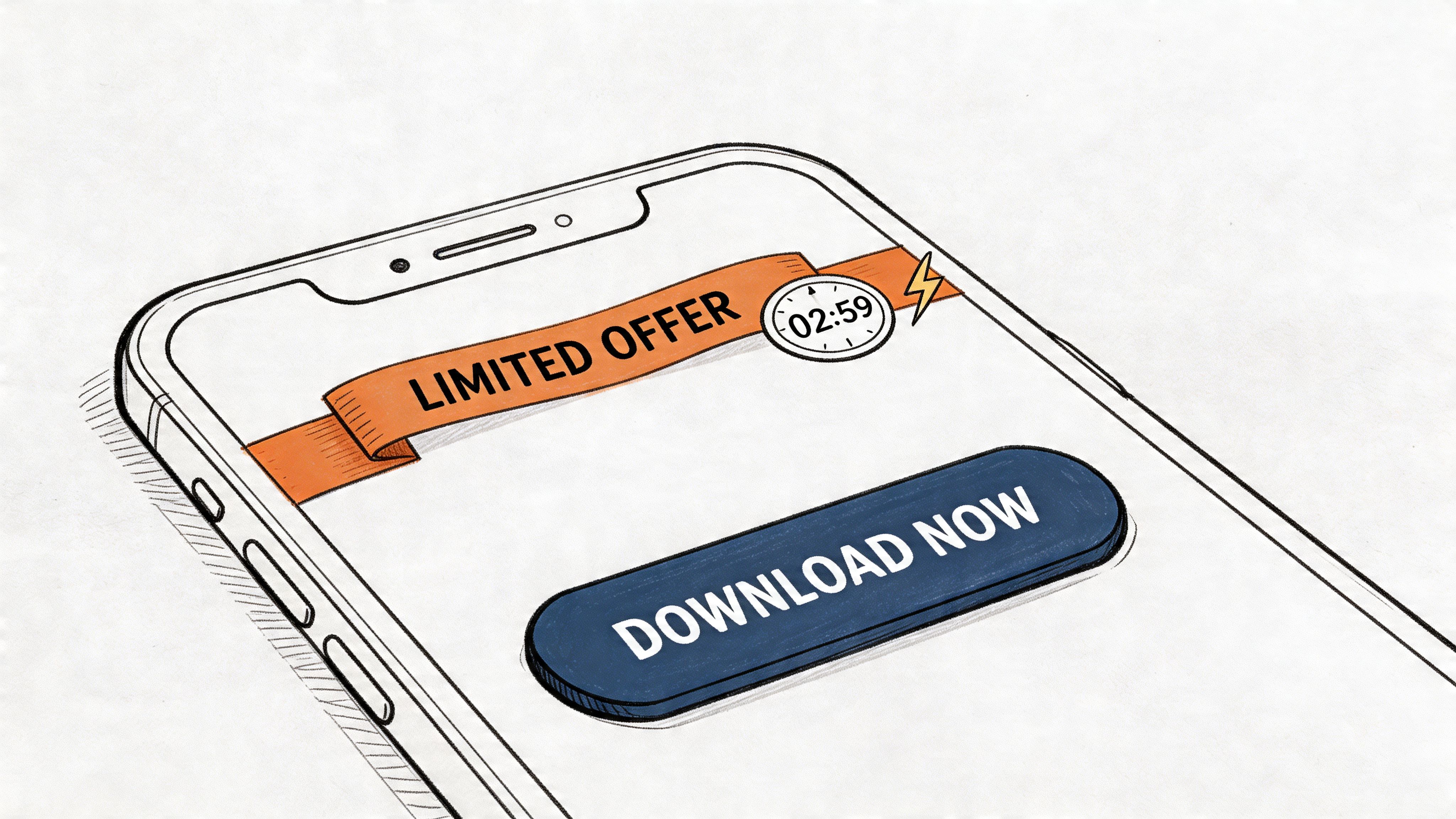
The format itself matters. Button-based CTAs increase click-through rates by about 30% over plain text CTAs, based on KlientBoost’s CTA analysis summarized here in button CTA performance guidance. If you’re testing urgency language inside video, don’t bury it in subtitles alone. Put it into a visual button treatment.
What to test in urgency messaging
Three versions usually separate cleanly in performance:
- Time-bound urgency: “Download now. Offer ends today.”
- Benefit urgency: “Install now to get your starter bonus.”
- Scarcity framing: “Join today before this challenge closes.”
Gaming brands often win with “Play Free Now.” Dating apps tend to perform better when urgency is tied to access or matching potential. Fitness apps usually need urgency attached to trial activation, not just a command.
Practical rule: Reserve the sharpest urgency for retargeting and lower-funnel audiences. Cold users often click fast and churn faster.
If your team is building modular direct response ads, the CTA should be isolated as a testable block. That makes it easier to swap urgency language without re-editing the whole ad. The structure in this direct response video ad formula is a good model for that workflow.
What usually fails
Urgency falls apart when the video body hasn’t earned it. If the ad never established value, “Download Now” feels like a demand. It also fails when the urgency is generic. “Limited time” with no context reads like recycled ad copy.
The strongest direct download CTAs pair a clear command with one reason to act now. Not three reasons. Not a paragraph. One reason.
2. Learn More and Discover CTAs for Educational Positioning
Wistia’s video marketing research has shown a consistent pattern. Mid-funnel videos drive stronger results when the ask matches buyer intent instead of forcing a conversion too early. That matters for performance teams running B2B SaaS, fintech, enterprise software, and any offer with a longer sales cycle.
Educational CTAs work best when the job of the ad is qualification, not immediate conversion. A cold prospect who still needs category context is more likely to respond to “See how it works” than “Start now,” especially if the product has setup friction, a pricing conversation, or a visible switching cost.
That does not make these soft CTAs less accountable.
The mistake is measuring them on purchase rate alone. For educational video, the right read is usually a sequence: thumb-stop rate, video hold rate, CTR, landing page engagement, and then downstream conversion quality. If “Learn More” drives fewer instant signups but improves demo-booked rate or lowers cost per qualified visit, it is doing its job.
Specificity usually improves performance here. “Learn more” is functional, but it hides the value exchange. “See the workflow,” “Watch the product tour,” and “Explore how teams use it” set a clearer expectation and filter clicks better.
Better alternatives to generic discovery CTAs
Use the CTA to continue the promise made in the hook:
- Mechanism-led: “See how it works”
- Workflow-led: “Watch the product tour”
- Problem-led: “Find a faster way to handle this”
- Proof-led: “See the platform in action”
Message continuity matters more in educational ads than many teams expect. If the hook calls out wasted time in reporting, the CTA should carry that exact thread into the next step. This performance video ad anatomy breaks down that handoff well.
For creative testing, treat educational CTAs as a distinct cluster in your naming structure. A simple framework works: CTA_EDU_HOWITWORKS, CTA_EDU_DEMO, CTA_EDU_EXPLORE. That lets media buyers compare educational intent against harder asks without muddying the read. Platforms like Sovran can run those variants at scale across multiple edits, which makes it easier to isolate whether the lift came from the CTA language, the offer, or the hook.
Brands with mature funnels already do this. SaaS teams often send cold traffic to a demo, explainer, or use-case page first, then shift to stronger asks in retargeting. If you need examples of how proof and education can work together before the CTA, these testimonial ad examples for performance campaigns show the sequencing clearly.
When the ad teaches, the CTA should extend the lesson.
Where soft CTAs go wrong
They fail when the ad is vague and the landing page asks for a different commitment than the click promised. “Watch the demo” should not drop users onto a generic homepage. “See how it works” should not open a hard-sell pricing page unless that audience is already warmed up.
They also fail when teams use them to avoid making a real offer. Educational positioning still needs a point of view, a clear problem, and a useful next step.
Use discovery CTAs for audiences that need explanation. Test them against harder asks with post-click quality metrics, not CTR alone. That is how you decide whether “Learn More” is buying curiosity or buying qualified intent.
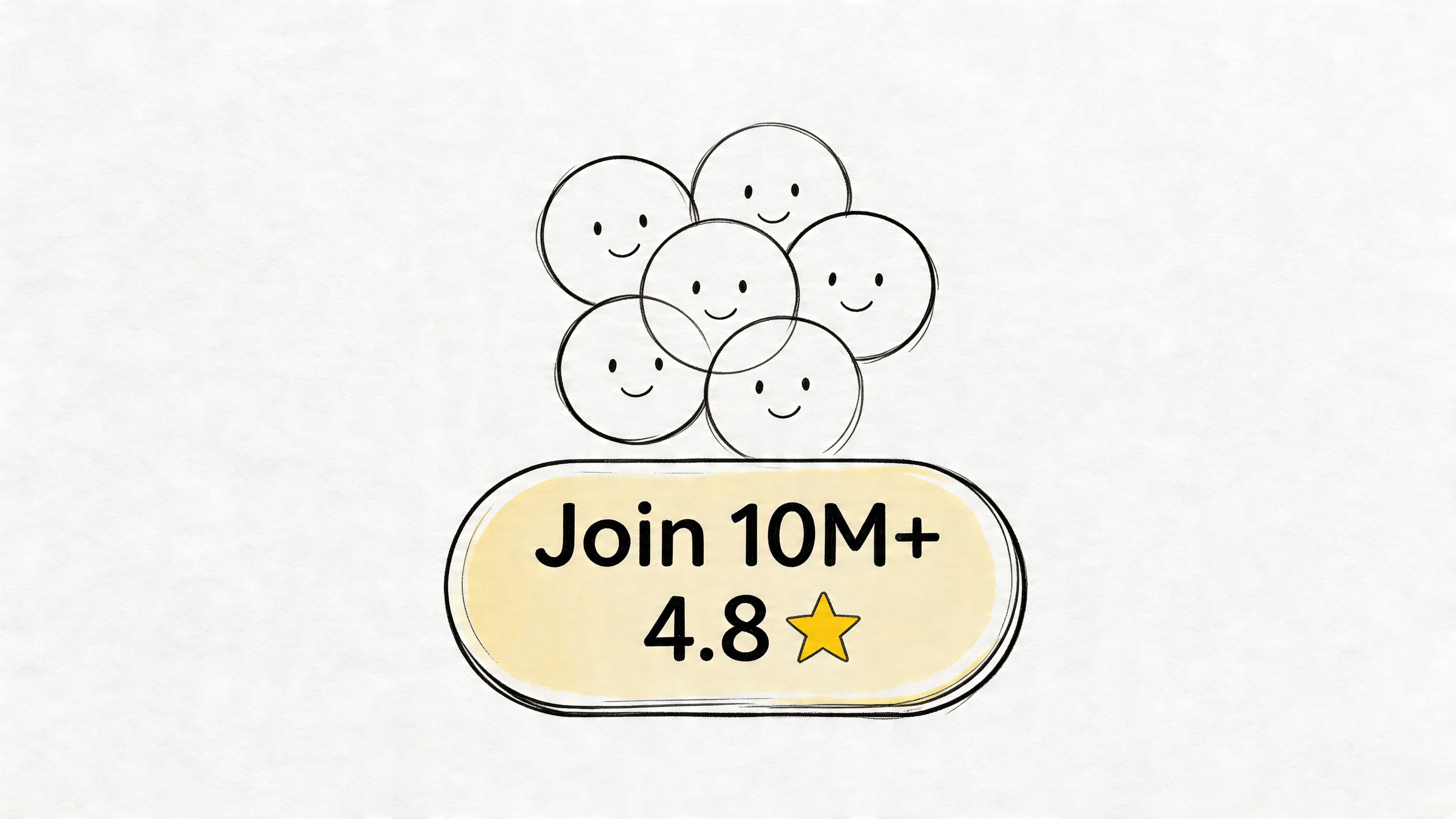
3. Social Proof and Authority CTAs
Ads that introduce proof before the ask usually convert better in high-friction categories. Finance, health, dating, and B2B software all share the same constraint. The user is not evaluating a button. They are evaluating risk.
That changes what the CTA needs to do. In these campaigns, “Start now” often asks for trust the creative has not earned yet. “See why customers switched” or “Watch real user results” fits the viewer’s state better because it lowers perceived downside before the click. The CTA is part of the proof sequence, not just the final instruction.
A report from Wyzowl found that customer testimonial videos are widely used because marketers see them as effective at building trust and driving action. That pattern shows up in paid social and video ads as well. Teams that place proof immediately before the CTA usually see cleaner post-click behavior than teams that save reviews for the landing page alone.
The strongest authority CTAs usually fall into four buckets:
- Review-led: “See why users rate us highly”
- Community-led: “Join the users already using this daily”
- Testimonial-led: “Watch how customers use it”
- Trust-led: “See what real customers said”
Use naming that makes the angle obvious in reporting. CTA_PROOF_REVIEW, CTA_PROOF_SWITCH, CTA_AUTHORITY_UGC, and CTA_COMMUNITY_10KPLUS are easier to analyze than vague labels like v3_final. That matters once you start testing the same proof mechanic across multiple hooks, offers, and edits. Teams running high creative volume through AI video ad workflows need naming discipline or they lose the read on what improved conversion rate.
What to pair with authority CTAs
Authority CTAs work when the ad has already shown proof the audience can verify quickly. UGC clips, customer footage, app store screenshots, creator commentary, before-and-after outcomes, and visible product usage all do the job. If the creative contains no evidence, the CTA reads like brand copy.
That is why customer-led endings often beat polished brand-only endings in trust-sensitive verticals. The final line inherits credibility from the scene right before it. If you’re building that style of creative, these testimonial ad examples are a better reference point than generic direct response ads.
The trade-off
Authority CTAs often lower friction for skeptical audiences, but they do not always win on CTR. They tend to earn better downstream quality when skepticism is the actual bottleneck. Measure them on hold rate, landing page engagement, qualified signup rate, trial start rate, or purchase rate by audience segment. CTR alone will bias the test toward louder language.
Social proof belongs before the click and inside the CTA path, not buried on the landing page.
Keep the claims real. Real reviews, real user counts, and real outcomes hold up in-platform and post-click. Inflated proof signals might get cheap clicks for a week, then hurt conversion quality, trigger compliance issues, and give the creative team the wrong learning.
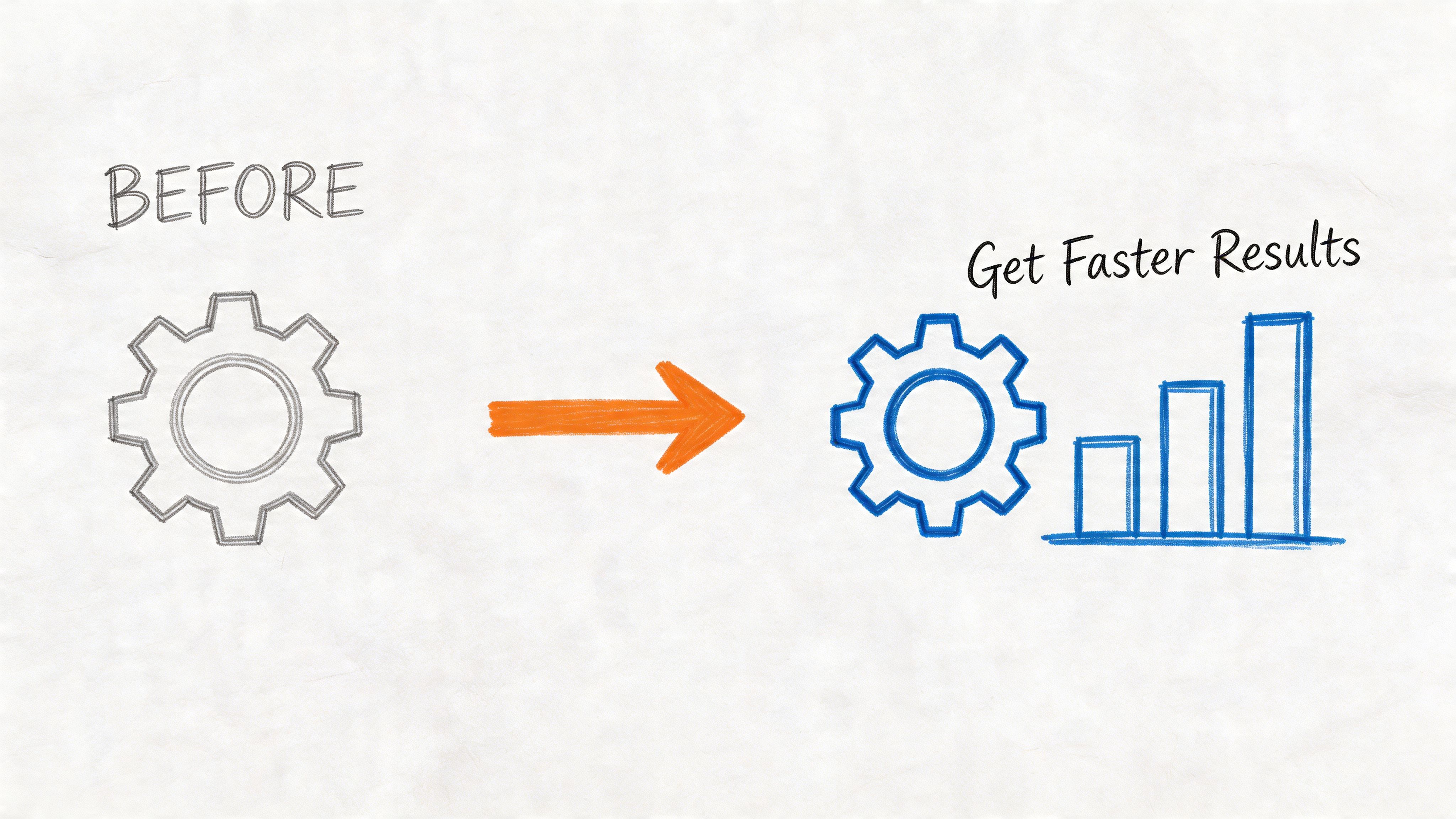
4. Benefit-Driven CTAs
Some of the best CTAs for video ads don’t lead with the action at all. They lead with the outcome. “Save time.” “Get stronger.” “Sleep better.” “Close deals faster.” That works because users buy the result, not the mechanism.
In practice, benefit CTAs are strongest when your product promise is emotionally or economically obvious. Fitness, productivity, learning, and personal finance all fit. A Peloton-style message sells momentum and identity. A Notion-style message sells control and time. A language app sells confidence more than lessons.
Transactional CTAs remain the most measurable CTA category because they map directly to sales, trials, downloads, and conversion rate changes, as explained in this overview of video CTA strategy. But that doesn’t mean every CTA should sound transactional. Often the best move is to present the benefit in the video CTA and let the button or destination carry the transactional action.
When outcomes beat commands
Benefit-led CTAs usually work when the viewer already understands what the product is. If the ad shows a clear product demo, “Get organized faster” can beat “Start free trial” because the mechanism has already been explained.
A few examples by category:
- Fitness: “Build your routine”
- Productivity: “Take back your day”
- Finance: “Start growing your savings”
- Learning: “Speak with confidence”
If your team is generating variants at scale, benefit language is one of the easiest variables to test without reshooting footage. You can swap overlays and end cards while keeping the body constant. That’s where workflows built around AI video ads become useful for creative iteration.
After the opening concept lands, a visual example helps make the point:
What to watch for
Benefit CTAs get fluffy fast. “Realize your potential” says almost nothing. Strong benefit copy is specific enough to feel tangible and broad enough to fit a short ad.
Also watch for mismatch between audience motivation and benefit framing. A power user might respond to speed. A new user might respond to ease. The same product needs different benefit CTAs for different motivations.
5. Interactive and Gamified CTAs
Sometimes the best CTA isn’t “buy” or “learn.” It’s “participate.” Interactive CTAs work because they convert passive viewing into a low-friction action. Quizzes, challenges, polls, and contests are especially useful when you need to build audience engagement before asking for a sale.
This style fits categories with natural curiosity or competition. Headspace can invite a stress assessment. A dating app can use a profile-rating mechanic. A gaming app can lead with a challenge or leaderboard hook. The CTA becomes part of the experience, not just a button at the end.
There’s also a practical platform benefit. Comment-based CTAs can create both engagement and acquisition signals at once. The Drive Editor summary notes brand examples where comment-driven CTAs boosted platform growth 2x over direct links in certain cases, discussed in this short-video CTA analysis. That won’t apply to every offer, but it’s a useful reminder that direct click CTAs aren’t the only path.
Where interactive CTAs fit best
Use them when one of these conditions is true:
- You need first-party data: quizzes can segment users before the sales push.
- You need cheap engagement signals: comments and participation can warm audiences for retargeting.
- The product is habit-based: challenges mirror the product experience.
A “Take the quiz” CTA is stronger when the video teases the outcome. “Find your learning style” works better than “Take our assessment.” “Join the challenge” works better when the ad shows what completing it feels like.
Field note: Interactive CTAs usually outperform passive CTAs when the audience isn’t ready to buy but is willing to raise a hand.
The downside
They can generate volume without purchase intent. That’s fine if the campaign objective is audience building or segmentation. It’s a problem if your media team judges success only by top-of-funnel action counts and ignores downstream quality.
The fix is simple. Treat interactive CTAs as a separate lane. Measure them on lead quality, retargeting efficiency, and later-stage conversion behavior, not just front-end engagement.
6. Retargeting and Sequential CTAs
One CTA across the whole funnel is lazy media strategy. Cold users, video viewers, site visitors, and cart abandoners do not need the same ask. The creative team can save a lot of wasted spend by matching the CTA to what the user has already done.
A practical sequence looks like this. Cold traffic gets “Watch how it works” or “See why people switch.” Warm viewers get “Learn more” or “Start free.” Hot audiences get “Download now,” “Complete purchase,” or “Upgrade.” The body copy can stay similar while the CTA sharpens as intent rises.
Recent guidance around modular ad workflows has pushed this idea further. Early tests tied to Meta Andromeda updates showed 25-40% ROAS uplift for modular ads in the research summarized by Drive Editor, referenced in that same earlier article. The useful takeaway isn’t the exact number. It’s the workflow logic. Sequential CTA testing works best when you can swap the CTA layer quickly without rebuilding the ad from scratch.
A simple sequencing model
Here’s a practical way to structure it:
- Stage 1, cold: “See how it works”
- Stage 2, engaged: “Learn more”
- Stage 3, high intent: “Start now” or “Download now”
Media buying discipline is paramount. If your exclusions are sloppy, users get the wrong CTA at the wrong time. Nothing tanks relevance faster than showing a first-touch prospect the same hard close you’d use for a cart abandoner.
What separates good sequencing from bad sequencing
Good sequencing acknowledges friction. Bad sequencing assumes every impression is a closing opportunity.
A gaming app might open with “Play free,” then retarget engaged users with “Upgrade to premium.” A SaaS brand might start with “See demo,” then move to “Start free trial,” then “Upgrade now” after product usage. That progression feels natural because each ask reflects known behavior.
The teams that do this well treat CTAs like audience-specific assets, not a fixed line at the end of a master edit.
7. Action-Oriented Micro-CTAs
Small copy changes can shift click quality more than teams expect. In CTA testing, the difference between “Start free” and “See your plan” is not cosmetic. It changes the level of commitment implied by the click, which changes who enters the funnel.
Micro-CTAs work best when the product has setup friction, education friction, or trust friction. SaaS, fintech, subscriptions, and higher-consideration consumer products all fit that pattern. The job of the CTA is to sell the first action, not the whole offer.
Optimizely has published findings from thousands of experiments showing that CTA language affects conversion outcomes in measurable ways, especially when the verb signals ownership or immediate progress. For micro-CTA tests, that usually means active verbs outperform softer, vague phrasing because they frame the click as a concrete next step instead of a broad commitment.
The strongest micro-CTAs usually reduce one specific fear:
- Risk removal: “Start free”
- Complexity removal: “Set it up in minutes”
- Commitment removal: “No card required”
Those patterns are useful, but they are not interchangeable. “Start free” can raise click-through rate while lowering downstream qualification if the landing experience attracts low-intent users. “See your plan” often brings in fewer clicks, but stronger lead quality, because it implies relevance and a customized outcome. That trade-off is the key decision.
A few examples show how this plays out in practice. A finance app can lead with “See your plan” before asking users to link an account. A project management tool can use “Build your first workflow” before pushing team invites. A language app can use “Take your first lesson” before introducing a paid tier.
This category needs more rigor than a phrase list. Treat micro-CTAs as a testing framework tied to funnel economics. Track click-through rate, landing page view rate, activation rate, and cost per qualified action. Name variants clearly so results stay readable across platforms. For example: MOFU_VID15_MicroCTA_StartFree_V1 versus MOFU_VID15_MicroCTA_SeeYourPlan_V2.
Execution speed matters too. Teams running modular creative can swap the CTA layer, hold the hook and offer constant, and isolate the lift from language alone. That is much easier with systems built for dynamic creative optimization workflows, especially when you need to test micro-CTAs across audience segments without rebuilding every asset by hand.
Softening the ask can improve entry rate. It can also create a longer path to revenue. Keep the micro-conversion only if the added step improves qualified progression, not just top-line clicks.
8. Personalized and Dynamic CTAs
Generic CTAs waste relevance. If you know the user is on mobile, say the app action. If you know they’ve visited before, continue the journey. If you know they’re in trial, push the next milestone, not the first one.
That’s why dynamic CTAs matter. They let the same core ad speak differently to different users without breaking creative consistency. New users can see “Start your journey.” Existing users can see “Continue your workout.” iPhone users can see an install CTA, while desktop users get a site visit CTA.
This category also matters more on platform-native video than is often recognized. The undercovered gap is not just personalization by audience. It’s personalization by platform behavior and device context. The research summary from Assemble Studio notes 2025 trends where TikTok favored interactive CTAs like “Duet this” or “Stitch with your fail,” driving 3x engagement versus static “Shop now” in those contexts, discussed in this article on digital ad CTA tips.
Personalization rules that hold up in practice
A few rules consistently make sense:
- Match device to action: app install on mobile, deeper explainer on desktop.
- Match lifecycle to ask: new user, active user, trial user, churned user all need different CTA language.
- Match platform to behavior: feed, Reels, and TikTok don’t reward the same interaction patterns.
If you’re organizing this at scale, the operational issue is asset management. CTA variants need to be tagged by audience state, platform, and intended outcome. That’s exactly the job a modular workflow and tools like dynamic creative optimization tools are meant to handle.
Personalized CTAs don’t need to be complicated. They just need to acknowledge what the advertiser already knows.
What not to do
Don’t overpersonalize with awkward specificity. If the CTA feels invasive, response drops. Keep the personalization functional. Device, stage, offer relevance, and prior behavior are enough for most campaigns.
Also, don’t personalize only the copy while leaving the rest of the ad generic. The CTA performs better when the hook, visual framing, and destination page all support the same audience logic.
8-Point Video CTA Comparison
| CTA Type | Implementation Complexity 🔄 | Resource Requirements ⚡ | Expected Outcomes 📊 ⭐ | Ideal Use Cases 💡 | Key Advantages ⭐ |
|---|---|---|---|---|---|
| Direct Download CTAs with Urgency Messaging | Low–Medium, simple copy + timers; easy to deploy | Low, creative copy, button design, occasional countdown assets | High short-term installs and measurable attribution; risk of lower-quality installs if overused | Mobile app install pushes, upper-funnel awareness, retargeting with time-limited promos | Drives immediate installs, easy A/B testing, strong conversion intent |
| Learn More / Discover CTAs for Educational Positioning | Low, straightforward links to content or demos | Medium, quality landing pages, educational assets, video content | Slower conversion path but higher-quality leads and stronger brand trust | B2B, complex products, long decision cycles, awareness-stage campaigns | Builds authority, lowers initial friction, nurtures informed prospects |
| Social Proof & Authority CTAs (Reviews, Ratings, Testimonials) | Low–Medium, requires ongoing metric updates and design space | Low, badges, counts, testimonial snippets; must keep metrics current | Increases trust and conversion quality; effective for risk-averse users | Fintech, health, dating, enterprise software, new brands needing credibility | Simultaneously drives action and trust; dynamically reinforces legitimacy |
| Benefit-Driven CTAs (Outcome-Focused Language) | Low, copy-first approach but requires validation | Low–Medium, creative that demonstrates outcomes, proof points | High emotional engagement and motivation; strong uplift when claims are credible | Aspirational categories: fitness, finance, productivity, skill-building | Aligns with user motivations; clearer value proposition and emotional pull |
| Interactive & Gamified CTAs (Quizzes, Challenges, Contests) | High, needs interaction logic, platforms, and compliance | High, quiz/contest platforms, reward systems, integration with CRM | Very high engagement and first‑party data capture; longer conversion journey | Audience building, shareable campaigns, community growth, surveys | Boosts engagement, captures user data, creates viral/shareable moments |
| Retargeting & Sequential CTAs (Multi-Stage Messaging) | High, requires audience segmentation, pixel & API setup | High, multiple creative variants and automated sequencing | Improved conversion rates and lower CAC through relevance; needs maintenance | Funnel optimization for apps, e-commerce, SaaS free-trial flows | Matches message to stage, reduces waste, increases ROAS |
| Action-Oriented Micro-CTAs (Multi-Step, Micro-Conversions) | Medium, design progressive flows and tracking | Medium, nurture sequences, analytics for downstream conversion | Higher CTRs and lower initial friction; longer funnel with potential drop-off | High-commitment products: SaaS trials, finance, premium subscriptions | Lowers entry barrier, builds momentum toward larger commitments |
| Personalized & Dynamic CTAs (Audience-Specific Messaging) | Very High, data pipelines, real-time templates, privacy compliance | Very High, segmentation, first‑party data, dynamic creative tooling | Highest relevance and conversion uplift when data is accurate; dependent on data quality | Large e‑commerce, segmented apps, lifecycle marketing, localization | Maximizes relevance and ROAS; reduces friction by meeting users in context |
From Clicks to Conversions Your CTA Testing Blueprint
Statista estimates that global digital video ad spend has moved into the hundreds of billions. At that scale, weak CTA testing is expensive. Small lifts in click-through rate, conversion rate, or post-click quality compound fast across paid social budgets.
The practical approach is to build a CTA testing system by campaign objective, then run it with naming discipline and clean measurement. Phrase lists help with ideation, but they do not tell a media team what to test first, what to hold constant, or how to read a winning result across Meta, TikTok, YouTube, and landing page variants.
Start with modular construction. Keep hook, body, offer, and CTA as separate variables. Test one meaningful dimension at a time. If the goal is to identify the right CTA family, hold the rest of the ad steady and rotate category: urgency, education, proof, benefit, interaction, retargeting, micro-commitment, or personalization. After a category wins, test copy strength, visual treatment, spoken versus on-screen delivery, and timing.
Placement deserves its own test cell. Mid-roll CTAs often outperform end-card-only asks because they catch attention before drop-off cuts into reachable inventory. The exact winner varies by platform, video length, and audience temperature, which is why storyboard decisions should be part of the testing plan, not an afterthought.
A workable blueprint looks like this:
- Use a naming convention your team can filter quickly:
Hook_Angle | Body_Theme | Offer | CTA_Category | CTA_Copy | Placement | Audience - Map CTA type to funnel stage: educational CTAs for cold traffic, proof and authority for consideration, direct-response asks for high-intent retargeting pools
- Measure primary and secondary outcomes: CTR, thumb-stop rate, hold rate, CVR, CPA, install quality, lead qualification, retention, and downstream revenue where available
- Keep each asset focused on one primary ask: multiple competing CTAs create attribution noise and usually depress the action that matters
- Account for sound-off viewing: pair spoken CTAs with text overlays, captions, and clear visual cues
- Review by segment, not just blended totals: a CTA that loses overall can still win with a high-value audience cohort
Testing order matters. Start broad, then tighten. First identify which CTA category fits the audience and offer. Then refine the copy. Then optimize placement and design. Teams that reverse that order often waste spend polishing a CTA style that was never right for the funnel stage.
Operational discipline matters just as much. Set a minimum spend or impression threshold before calling a winner. Define the success metric before launch. If the campaign is optimized for lead volume, CTR is a directional metric, not the final decision-maker. If the campaign is optimized for purchases or qualified demos, post-click conversion quality should outweigh cheap clicks.
Sovran supports this kind of workflow in a practical way. Teams can recombine hooks, bodies, and CTAs into multiple ad variants, keep assets organized in an asset bank, and push versions into Meta without rebuilding each ad manually. That matters when the test matrix gets large and naming consistency starts affecting reporting quality.
If you want to sharpen the post-click side too, these high-impact conversion rate optimization tips complement CTA testing well.
Strong CTA programs are built on cadence, segmentation, and disciplined analysis. The payoff is not one magic phrase. It is a repeatable system for matching CTA type to campaign goal, measuring the right outcomes, and scaling winners before fatigue erodes performance.
A CTA for Sovran.

Manson Chen
Founder, Sovran
Related Articles
Choose Your App Advertising Agency Wisely: 2026 Guide
AI Talking Head Videos for Scaling Ad Creative