How to End a Video Ad: A High-Converting Playbook
Jump to a section
Most advice on how to end a video ad is too simple to be useful. “Add a strong CTA” sounds right, but it doesn’t tell you what to put on screen, how long to hold it, what to say, or how to scale testing once you find something that works.
That gap matters because the ending is where performance teams either cash in the attention they paid for or waste it. A sharp hook can buy a few seconds. A clear close gets the click, the install, the purchase, or the lead. If the ending is vague, abrupt, or disconnected from the promise in the body, the ad feels unfinished even when the first half is strong.
The teams that consistently improve outcomes don’t treat endings like a final graphic slapped on in edit. They treat them like a system. The CTA line, the visual cue, the timing, the pacing, the music swell, the end card, the offer framing, and the testing plan all work together. That’s the difference between one decent ad and a repeatable creative workflow.
Why the Last 3 Seconds of Your Video Ad Matter Most
Performance marketers love talking about hooks. Fair enough. If nobody stays past the first moments, nothing else matters.
But the industry has overcorrected. Too many teams optimize for interruption and forget commitment. The hook earns attention. The ending converts it.
A lot of ad reviews still sound like this: “The first seconds aren’t thumb-stopping enough.” Sometimes that’s true. But just as often, the issue sits at the back of the ad. The viewer stays, understands the product, and then gets an ending that says almost nothing. A logo pops up. The voiceover trails off. The CTA appears too late. The story resolves emotionally, but not commercially.
That’s why I treat the ending as the point of the ad, not the cleanup step after the “creative part.” The close is where the viewer decides whether to act now, later, or never. In mobile feeds, that decision window is tiny, and the ad has to make the next step feel obvious.
Hooks get attention. Endings get action
The cleanest way to think about it is this:
- The hook creates curiosity
- The body builds belief
- The ending removes friction
If your ending doesn’t answer “what should I do next?” with total clarity, the ad leaks value. This is the same logic behind a strong video ad components breakdown. Each part has a job. The final seconds just happen to carry the heaviest commercial load.
Practical rule: If the ending can be swapped out without changing performance, it probably wasn’t doing enough in the first place.
The ending is where weak ads reveal themselves
Good ads often die from bad closes, not bad premises. You’ll see it in platform metrics, but you can also see it in the cut itself. The pace slows down. The visual energy disappears. The value proposition gets restated instead of sharpened. Or the CTA asks for too much before the ad has earned it.
That’s why strong creative teams don’t ask only, “Is this ad interesting?” They ask, “Does the final beat make action feel easy, immediate, and worth it?”
That’s the standard.
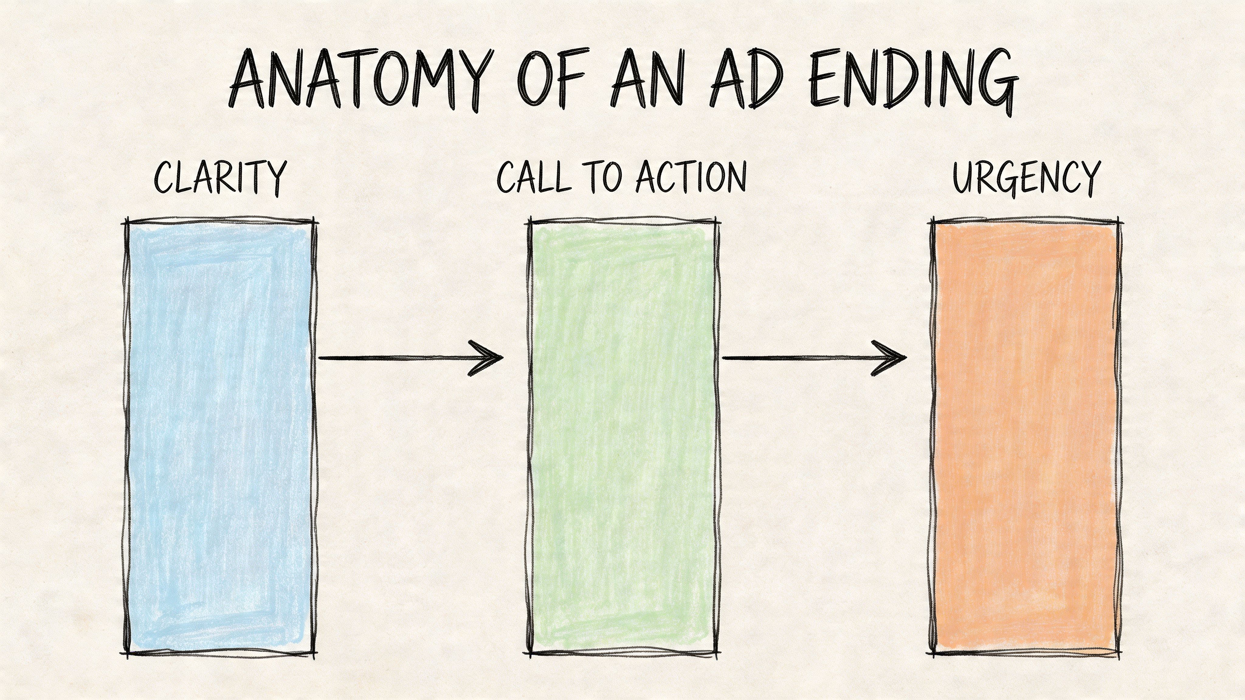
The Anatomy of a High-Converting Ad Ending
High-converting endings are built, not improvised.
The last beat has a clear job. It has to hold attention long enough for the viewer to process the offer, understand the next step, and feel enough confidence to click. In production, I break that job into three parts: timing, visual direction, and message order. If one of those is off, performance usually softens. If two are off, the ad often loses efficiency even when the hook and body are strong.
For teams building endings as repeatable modules instead of one-off edits, this hook, body, CTA framework for video ads gives the right production logic. The structure matters because the ending should be easy to rewrite, swap, and test across multiple versions without rebuilding the whole ad.
Timing determines whether the CTA has a chance
A weak close often starts with pacing, not copy.
Teams spend days refining hooks, then squeeze the CTA into the final second. On the timeline, it technically exists. In-feed, it barely registers. Mobile viewers need enough time to read the action, connect it to the offer, and decide whether the click is worth it.
My rule is simple. Give the ending its own beat. Usually that means a distinct closing window long enough for one primary message and one action prompt, with no competing visual change in the same moment. If the product shot changes, the text animates, the logo appears, and the voiceover lands all at once, one of those elements gets ignored.
Platform metrics help diagnose this. Video Completion Rate is useful because it shows whether people are making it to the close at all. If drop-off clusters late in the video, the issue is often one of two things: the body spent too long setting up the payoff, or the ending introduced friction right when the viewer needed clarity. Analysts at PPC Team explain that completion and end-of-video behavior are strong signals for whether the final message is working in paid social, especially when read alongside click-through and hold rates in their breakdown of video ad metrics.
Visual language should direct action, not decorate the frame
The best endings tell the eye where to go in under a second.
That usually requires a few disciplined choices working together:
- A primary text line that carries the action, not a slogan
- Button-like cues or UI framing that make the next step feel familiar
- A stable product or offer visual so the CTA stays connected to the promise
- Clear hierarchy so the first line reads before the supporting qualifier
- Audio resolution that signals decision, if sound is on
This part gets missed in review because static frames can look polished while the motion sequence still underperforms. I care less about whether the end card looks beautiful in Figma and more about whether the viewer can decode it instantly in a crowded feed. A clean close beats an ornate one.
One more operational point matters here. If your team plans to test endings at scale, the visual system needs to be modular. Keep the CTA zone, text safe area, offer treatment, and motion cue consistent enough that editors can swap message variants without rethinking the layout every time. That is how you go from “we tested a CTA” to “we have a repeatable CTA testing system.”
Message order matters more than clever copy
Clever lines win internal reviews. Clear lines win spend.
Response ads usually close best when the final message follows a strict order:
- Remind the viewer what they get
- Tell them what to do
- Reduce friction or add urgency
That sequence works because it matches how people process the close. Outcome first. Action second. Qualification third.
So instead of:
- “Join the movement”
- “Experience the difference”
- “Level up your routine”
Use lines that finish the sale:
- “See every profit driver. Book your demo.”
- “Get matched in 60 seconds. Start free.”
- “Track every workout in one app. Download now.”
For teams trying to create video content that converts, this is the difference between a branded ending and a performance ending. Both can look good. Only one makes the next step obvious.
What good endings actually look like in review
I use a simple grading lens with creative teams.
| Approach | What happens |
|---|---|
| Weak close | The demo ends, the logo appears, and “Learn more” flashes on screen with no reason to click now. |
| Usable close | The product stays visible, the benefit is restated in plain language, and the CTA gets enough screen time to read. |
| Strong close | The promise, action, and friction reducer appear in sequence, with one visual focal point and no extra clutter. |
The trade-off is straightforward. The more information you push into the final frame, the less likely any single message gets processed. Strong endings cut aggressively. One claim. One action. One reason to do it now.
A practical ending formula for production teams
Use this structure when the ad concept is working but the close is dragging down results:
- Line 1: Benefit or outcome
- Line 2: Direct action
- Line 3: Friction reducer, qualifier, or urgency
A few scripts that hold up in testing:
- “Track every workout. Start free today.”
- “Cut reporting time. Book your demo.”
- “Find your shade in seconds. Shop now.”
- “See your team’s pipeline clearly. Get a custom walkthrough.”
- “Sleep cooler tonight. Order now with free shipping.”
On set and in post, I recommend treating those lines as interchangeable modules. Write 5 to 10 endings against the same body cut. Keep the visual scaffold consistent. Swap only the offer framing, CTA verb, and friction reducer. That gives you a cleaner read on what changed performance, and it sets you up for scaled iteration later instead of one-off creative guesswork.
Swipeable CTA Frameworks and Scripts for Meta and TikTok
The easiest way to ruin an ending is to force the same CTA style into every campaign. Meta and TikTok don’t reward the exact same closing behavior, and neither do app install, DTC, and lead gen offers.
What works is matching the CTA to the viewer’s level of intent. If the ad did a good job qualifying interest, the ending can be direct. If the product needs a little more trust, the CTA should reduce risk before it asks for commitment.
The core wrap-up structure
I use a simple wrap-up sequence in scripting:
- Benefit reminder
- Action prompt
- Friction reducer
That last part matters. A lot. “Download now” is stronger when paired with “Free to start.” “Book a demo” gets easier when paired with “See how your team would use it.” The ad doesn’t need to say everything. It does need to make the next click feel safe and relevant.
For Meta specifically, ThruPlay is a useful read on whether the ending is doing its job. Meta counts ThruPlay when a viewer watches to the end or for at least 15 seconds. A low ratio of ThruPlays to impressions often signals post-hook drop-off, and sequential optimizations like clearer CTAs can slash drop-off down to 28%, which can increase product page visits and conversions, according to Affect Group’s explanation of Meta video metrics.
CTA Strategy by Campaign Goal
| Campaign Goal | CTA Script Example | Visual Overlay Tactic | Platform Focus |
|---|---|---|---|
| App install | “Download now and start in minutes” | App UI on screen, bold install cue, store-style button treatment | Meta |
| App install | “Try it free. See your first result today” | Fast captions, creator-style delivery, native text rhythm | TikTok |
| DTC purchase | “Get yours now before it’s gone” | Product close-up, offer text, directional arrow | Meta |
| DTC purchase | “Tap to shop the color everyone saves” | UGC face cam to product handoff, native caption stack | TikTok |
| Lead gen | “Book a demo and see it on your workflow” | Clean interface shot, one clear CTA button, low text density | Meta |
| Lead gen | “Want the setup? Tap and get the breakdown” | Talking head with screen recording insert, comment-style subtitle aesthetic | TikTok |
A broader set of examples lives in this collection of video ad CTA examples, but the principle is simple. Your CTA should sound like the natural next line in the conversation, not a pasted-on command.
What Meta endings usually need
Meta rewards clarity. The close should look intentional and easy to parse at a glance.
Use endings like these:
For subscriptions
“Start free today”
“Try it now”
“See your plan in minutes”For DTC
“Shop the set”
“Get yours now”
“Choose your shade today”For lead gen
“Book your demo”
“See it in action”
“Talk to our team”
What helps on Meta is visual discipline. Keep the final frame clean. Make the main CTA the biggest readable element. If you add a supporting line, it should clarify the payoff, not introduce a new argument.
What TikTok endings usually need
TikTok endings can be more conversational, but they still need closure. Too many brands mistake “native” for “casual and incomplete.”
Better TikTok closes sound like this:
- “If you’ve been putting this off, try it now.”
- “Tap and see which one fits you.”
- “I’d start with the free version.”
- “You can grab it right here.”
Those lines work because they preserve the creator-style tone without becoming vague. The best TikTok CTA doesn’t suddenly switch the ad into polished corporate language. It carries the same voice through the last beat.
Field note: If your ad sounds like a person for the first twelve seconds and then like a banner ad for the last two, expect drop-off.
Swipeable scripts by offer type
Mobile app install
Script option A
“Still doing this manually? Stop wasting time. Download [App Name] and get started free.”
Script option B
“Track it, fix it, ship it. Install [App Name] now.”
Overlay pairing
Top line: “Stop doing it manually”
Bottom line: “Download now”
DTC sale
Script option A
“This is the one people reorder for a reason. Shop now.”
Script option B
“If you want the easiest version of this, get yours today.”
Overlay pairing
Top line: “Best for everyday use”
Bottom line: “Shop now”
B2B lead gen
Script option A
“If your team is still patching this together, book a demo.”
Script option B
“See the full workflow on your own use case. Get a demo.”
Overlay pairing
Top line: “See your workflow live”
Bottom line: “Book demo”
The strongest CTA isn’t always the most aggressive one. It’s the one that matches what the ad earned.
Your Guide to A/B Testing Video Ad Endings
Creative review is a poor place to choose an ending. The strongest close usually loses in the room because it feels too direct, too salesy, or too simple. In market, that directness often wins.
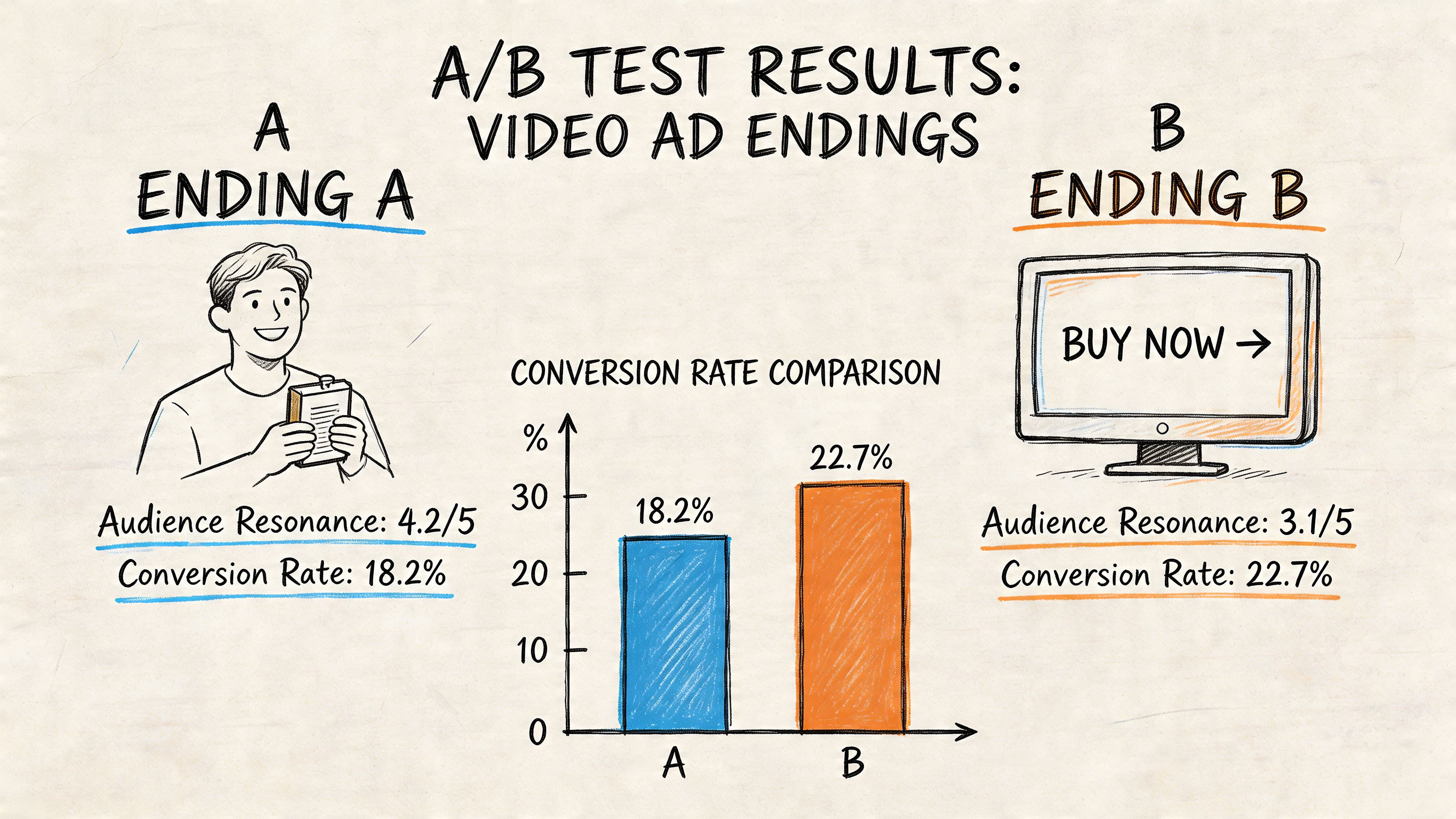
A useful ending test does one job. It isolates the close so the team can learn what moved performance, then turn that learning into the next round of production. According to Crimson Park Digital’s breakdown of campaign pitfalls, A/B tested endings can improve CTR by 25 to 40 percent and reduce CAC by 15 to 30 percent. The same source says static endings can raise costs by 30 to 50 percent after 1M impressions, which is why rotating 3 to 5 variants weekly matters. It also reports that 35 percent of campaigns underperform because CTAs and endings are not optimized, while iterative testing can recover a meaningful share of that loss.
What to isolate in the test
Keep the hook fixed. Keep the body fixed. Change the last beat only.
These are the four ending variables worth isolating first:
CTA line
Example: “Start free today” versus “Try it now”Visual close
Creator face, product shot, UI demo, branded end cardReveal timing
CTA appears at 0.8 seconds from end versus 1.8 seconds from endMessage structure
Benefit recap first versus direct ask first
If the voiceover, supers, offer, shot selection, and pace all change together, the test may produce a winner, but it will not produce a reusable insight. That is a bad trade if the goal is scale.
What to read beyond CTR
A lot of endings buy cheap clicks and weak sessions. Those are false positives.
Review endings in this order:
- Hold rate into the final 3 seconds
- CTR
- Landing page conversion rate
- CPA or CAC
- Fatigue after spend ramps
comprehensive video analytics gives teams a detailed view of drop-off, replay points, and last-frame engagement, which makes it easier to spot endings that attract curiosity without purchase intent.
Testing rule: If the ending lifts clicks but lowers qualified conversion, cut it.
A practical testing cadence
Here is the cadence I use when an account already has one stable concept and needs ending iteration, not a full creative reset.
- Round 1: Write 3 to 5 endings against one proven hook and one proven body.
- Spend threshold: Give each variant enough delivery to clear noisy early data. The exact threshold depends on CPM and conversion volume, but the team should set it before launch.
- First review: Check hold rate and CTR after initial spend. Kill obvious losers.
- Second review: Check downstream quality once enough post-click data comes in.
- Round 2: Keep the winning lane constant, then test micro-variables inside it, such as line length, card design, or CTA timing.
- Refresh cycle: Replace stale variants on a weekly cadence if spend is high enough to fatigue endings quickly.
That process matters more than any naming convention.
Example test matrix
| Variant | What changes | What you’re trying to learn |
|---|---|---|
| A | Direct CTA text only | Whether the audience is ready for a hard ask |
| B | Benefit recap plus CTA | Whether one extra line improves commitment |
| C | UGC-style spoken CTA | Whether conversational delivery lifts action |
| D | Product demo under end card | Whether keeping proof visible helps the close |
The key is to tag each version by component, not just by filename. Teams scaling output through modular systems like Sovran should log the ending as separate parts: spoken CTA, on-screen text, end card style, background shot, and timing window. That turns one winning edit into a testable asset set.
For teams building that kind of repeatable workflow, this guide on how to test video ad creatives at the system level is a useful reference because it treats testing as a production operation, not a one-off media exercise.
What winning tests usually teach you
The best ending tests do more than identify a winner. They show what kind of close the audience accepts at scale.
In practice, the pattern usually falls into one of four buckets:
- The audience converts on direct asks
- The audience needs one line of reassurance
- The audience responds to proof staying on screen during the CTA
- The audience clicks more when the CTA lands earlier
That is the part to document. Keep the lesson, not just the edit.
How to Scale Winning Endings with Modular Creative
A winning CTA ending is not the asset. The asset is the system that keeps producing new endings without rebuilding the edit from scratch every time.
Once an account needs volume, manual versioning turns into drag. Editors duplicate timelines, swap one line, export another file, and media buyers inherit a naming mess that makes it hard to learn anything. The fix is to treat the ending like a modular production unit with its own inputs, tags, and testing rules.
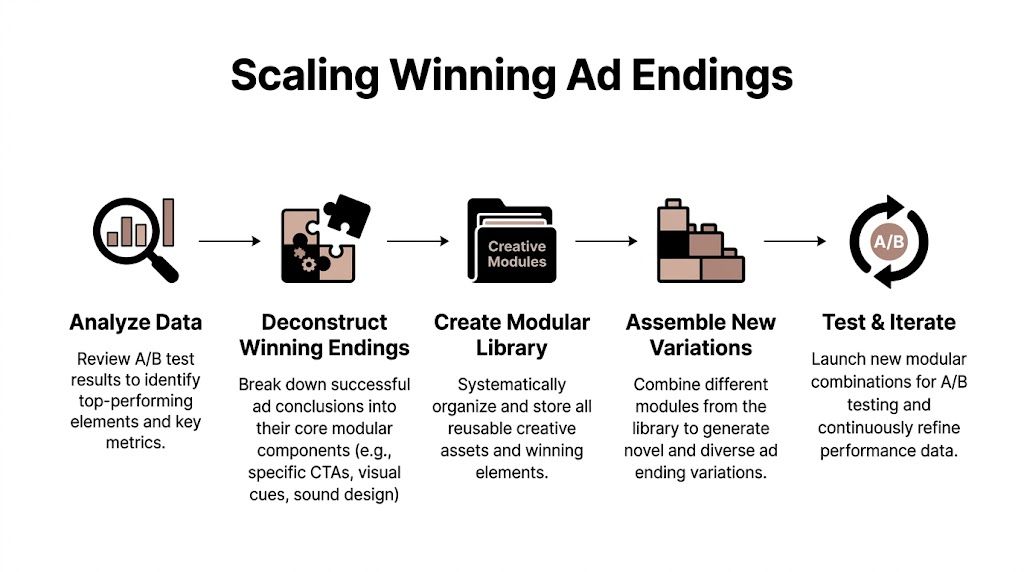
Deconstruct the ending before you scale it
In practice, a “winning ending” usually bundles several separate decisions into one cut. If you save it as a single exported ad, you keep the output but lose the learning.
Break the ending into reusable components:
- Spoken CTA line
- On-screen CTA text
- Background visual or proof shot
- Offer frame or urgency device
- End card layout
- Audio cue and final beat
- Timing window for the close
That breakdown matters because the winner is often only half transferable. A spoken line might travel across ten ads. A specific end card may only work with one offer. A proof shot might improve the close only when the product claim has already been established in the body.
A structured modular video ad framework gives teams a clean way to preserve those parts and redeploy them across new concepts.
Build an ending library like performance infrastructure
Creative teams that scale well do not store CTA assets in folders named “final_final_v7.” They use an asset bank that reflects how the ad will be tested and reused.
Tag endings by fields that change buying behavior:
| Tag Type | Example |
|---|---|
| CTA tone | Direct, low-friction, proof-led, urgency-led |
| Offer type | Discount, trial, demo, bundle, limited drop |
| Visual close | Talking head, product demo, UI walkthrough, offer card |
| Proof layer | Review quote, before/after, feature recap, result claim |
| Placement rules | Meta feed, Reels, TikTok, sound-off friendly |
| Timing | Early close, standard close, rapid close |
This gives the team retrieval speed. More important, it gives the team pattern recognition. After a few rounds, you can answer questions like: does this audience respond to low-friction language paired with UI proof, or do they need a stronger offer card to convert?
Use controlled recombination
Random variation creates noise. Controlled recombination creates a usable testing program.
The workflow I use is simple:
- Lock one hook that already earns attention.
- Pair it with one approved body or two closely related bodies.
- Swap only the ending modules for the first round.
- Log results at the component level, not only at the ad level.
- Promote repeat winners into the active library.
- Re-test those winners against a new hook or offer frame.
The point is isolation. If the hook, body, offer, and CTA all change at once, the account gets a result but not a lesson. If only the ending changes, you can identify which closing mechanic deserves another ten variants.
Where automation helps
Automation should remove production labor, not strategic judgment.
The useful parts are ingestion, tagging, assembly, and export. A platform that can detect scenes, pull transcript segments, identify likely CTA moments, and sort them into reusable modules saves hours before testing even starts. The next gain comes from assembling approved combinations in bulk so the team can launch batches without rebuilding timelines by hand.
Sovran fits that operating model. It structures clips into an asset bank, supports modular assembly across hooks, bodies, and CTA endings, and makes it easier to push clean variations into paid social workflows. That matters when the bottleneck is no longer ideas. It is the time required to turn those ideas into valid tests.
Don’t promote the finished ad. Promote the repeatable closing logic.
Run a weekly scaling loop
A good modular system needs rhythm. Without one, the library fills up with old winners and no one knows what still travels.
A workable weekly cadence looks like this:
- Review endings that drove qualified action, not just cheap clicks
- Extract the reusable CTA parts from those ads
- Tag each part with consistent naming and usage rules
- Rebuild fresh variants around one clear hypothesis
- Launch in batches large enough to produce a real read
- Archive or promote components based on repeat performance
I prefer one hypothesis per batch. Example: “Benefit recap plus direct ask will travel better across cold Meta traffic than urgency-led end cards.” That gives the creative team a clear build brief and gives the buyer a clean read on what to keep.
What should not enter the library
Some endings produce a temporary spike and teach the wrong lesson. Loud graphics can inflate clicks and hurt downstream conversion quality. Novel delivery styles can win once and fade as frequency climbs. Some CTA lines only work because the body did all the persuasion work for them.
Before an ending becomes a reusable module, put it through a simple filter:
- Does it hold up across multiple bodies?
- Does lead quality or purchase quality stay intact?
- Does the CTA still make sense when the surrounding story changes?
- Is the response driven by the closing mechanism, or by a one-off creative gimmick?
That filter keeps the library clean. Otherwise, teams scale volume faster than they scale learning.
Conclusion: Turn Ad Endings into Your Unfair Advantage
Many still think about how to end a video ad as a copywriting problem. It’s bigger than that. It’s a creative strategy problem, a testing problem, and eventually a production systems problem.
That’s why generic advice on endings stays shallow. A lot of content still focuses on static YouTube-style end screens and ignores what counts for Meta and TikTok: modular CTA testing across high volumes of creative. That gap is real. Verified research notes that existing guidance misses the dynamic assembly of hundreds of CTA variations for these platforms, even though modular hook, body, and CTA frameworks can lift CTR by 20-40%, as noted in this discussion of the content gap around end-screen guidance.
The practical takeaway is simple. Stop treating the ending as the final decoration on an ad that was already decided. Treat it like the commercial mechanism that closes the loop. The timing, the visual hierarchy, the script, the urgency, the offer framing, and the testing plan all belong to the ending. That’s where the ad either cashes out or fades out.
The teams that keep winning don’t rely on one magical CTA. They build a repeatable process:
- they identify what kind of close works,
- they isolate why it works,
- they test new versions quickly,
- and they scale the pieces that keep producing action.
That’s a much stronger position than chasing endless new hooks without fixing the part that asks for the click.
If you want a durable edge, build your workflow around the close. Audit your last frames. Rewrite vague CTAs. Test multiple endings against the same hook and body. Save winning closing elements as reusable modules. Make the final seconds as deliberate as the first ones.
Most advertisers are still trying to make better ads.
The better move is to build a system that keeps making better endings.
If you want to operationalize that workflow, Sovran is built for modular video ad testing. It helps teams organize clips into reusable hooks, bodies, and CTAs, assemble variations quickly, and push more ending tests into market without turning every iteration into a manual editing project.

Manson Chen
Founder, Sovran
Related Articles

Create Video Ads with AI That Perform in 2026
AI Talking Head Videos for Scaling Ad Creative