7 Video Ad Call to Action Examples That Convert
Jump to a section
A weak CTA can waste a strong video. The hook earns attention, the body builds intent, and the CTA decides whether that momentum turns into a click, install, signup, or sale.
Treat the CTA as part of the conversion architecture, not a line you tack on in the final frame. The right choice depends on four variables: campaign objective, platform behavior, placement timing, and audience intent. A “Shop Now” CTA can work in a bottom-funnel retargeting ad and underperform in a cold TikTok prospecting video, even with the same creative.
That is why strong video ad CTA examples work as systems, not just phrases. The copy has to fit the offer. The offer has to fit the stage of awareness. The placement has to fit how people consume the ad. On Meta and TikTok, the result often comes from the combination, not the isolated CTA line.
Here, testing discipline matters.
One hook can pair with multiple body cuts, offer treatments, and CTA endings. If your team only swaps thumbnails or opening lines, you miss a large part of the signal. A modular workflow lets you test CTA variants across the same base creative without rebuilding every ad from scratch. For teams running app and performance campaigns at scale, a modular mobile app creative testing workflow makes that process much easier to manage.
The seven CTA types below show up repeatedly because each solves a different job. Some reduce friction. Some qualify intent. Some create urgency. For each one, the useful question is not “Is this CTA good?” It is “When does this CTA outperform the alternatives, where should it appear, and how do we test enough versions to find the winner quickly?”
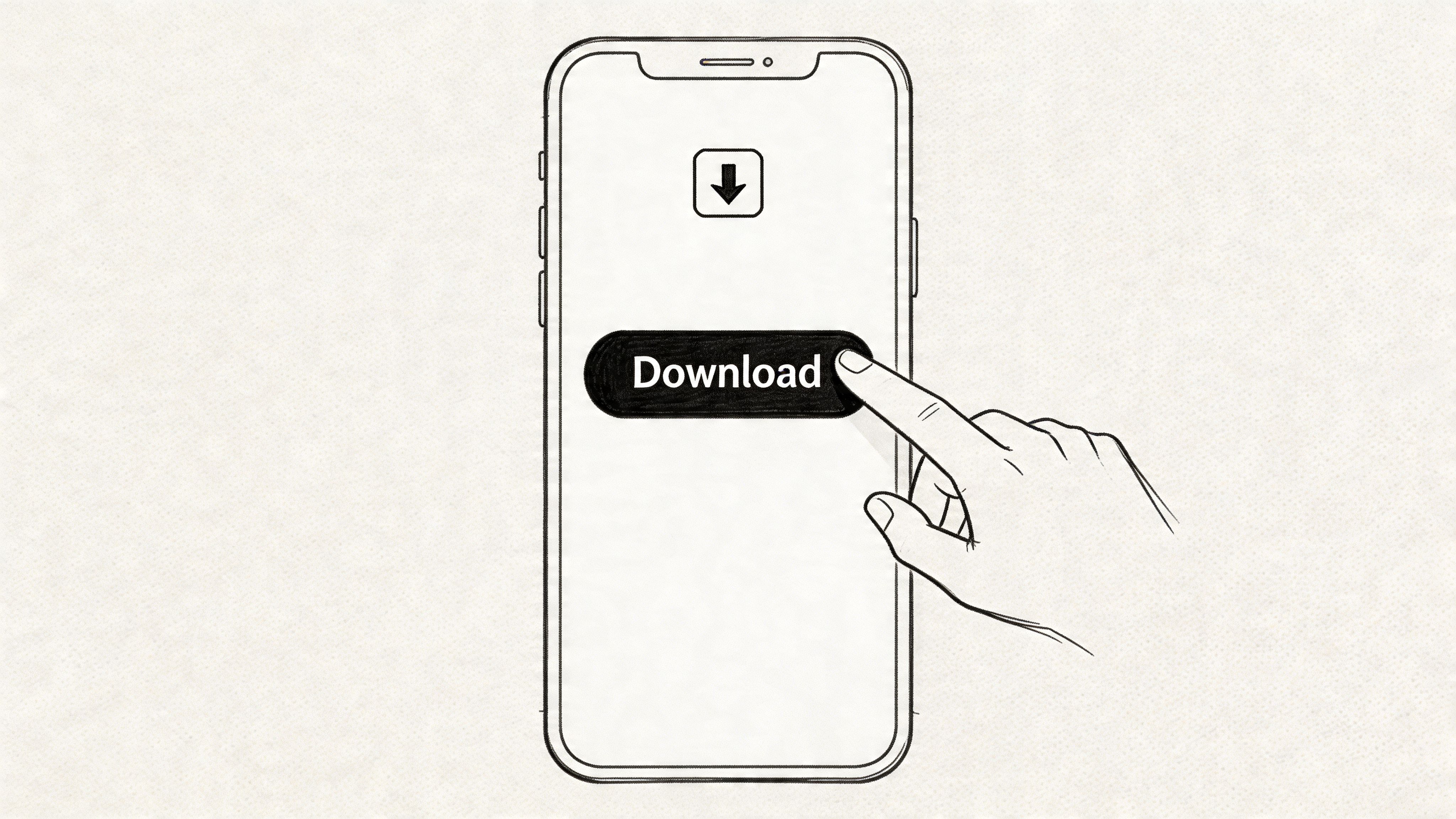
1. Direct Download/Install CTA
If you run app growth, this is the CTA you probably use most. It’s blunt on purpose. “Download Now,” “Install,” “Play Now,” and “Get the App” work because they remove interpretation. The viewer doesn’t need to infer the next step.
That simplicity matters in mobile acquisition. A generic CTA can still get clicks, but specificity often wins when the creative already did the persuasion work. In one Meta app campaign, replacing a generic CTA with “Download Now – Limited Spots!” lifted CTR from 2.1% to 3.1% across 500,000 impressions, while CAC dropped by 28% and ROAS improved from 1.2x to 1.8x in the same test setup, according to this video ad metrics case example.
A direct install CTA fits mobile games, dating apps, shopping apps, and utility tools. Think Zynga-style “Play Now” endings, Fashion Nova app pushes, or a short TikTok-style app demo that ends with “Get the App.”
What makes it work
The strongest version usually does three things at once. It states the action, reinforces the benefit, and reduces visual friction. If the ad shows gameplay, the CTA should stay native to that context. If it shows a shopping app, the store interface and CTA should feel like part of one flow.
A lot of teams sabotage this by overcomplicating the close. They add too much copy in the last seconds, or they use a weak button treatment that disappears into the background. Contrast matters. Clear on-screen text matters. The final beat has to be readable on a phone without effort.
Practical rule: If the viewer can’t understand the next action in a split second, the CTA is too soft for install campaigns.
How to test it at scale
Modular production helps. Instead of editing one “Download Now” ending by hand, build a CTA bank with install-focused variants. Then pair those endings with different hooks and body scenes for separate audiences.
Useful variations to test include:
- Action word changes: “Download Now,” “Install Now,” “Play Now,” and “Get App” don’t signal exactly the same intent.
- Urgency framing: Adding time pressure or limited availability can sharpen response if it matches the offer.
- Visual treatment: Button color, text size, and text position change whether the CTA gets seen.
- Placement timing: End-card only versus an earlier overlay plus final end-card often produces different click behavior.
For app teams building large test matrices, Sovran for mobile app campaigns is relevant because the workflow depends on recombining hooks, bodies, and CTA modules quickly, not manually exporting every variation one by one.
Direct install CTAs work best when the ad already proves the app’s value. They fail when the CTA tries to carry the whole sale alone.
2. Learn More/Swipe Up CTA
Traffic campaigns usually earn lower-intent clicks than signup or purchase campaigns. That is exactly why “Learn More” keeps showing up in winning ad sets. It matches the job: get qualified curiosity to the right page without forcing a commitment the creative has not earned yet.
This CTA works best when the product needs a little explanation before the conversion ask. SaaS buyers want to see the workflow. Higher-consideration ecommerce shoppers want details on fit, materials, pricing, or comparisons. Feature-heavy apps often need a quick education step before an install has real intent behind it.
Brands use this in different ways. A workspace tool might send viewers to a use-case page. A team communication product can push traffic to a feature explainer. A DTC brand can route clicks to a product education page instead of a generic collection page.
Where softer CTAs outperform harder ones
“Learn More” usually beats a harder CTA when the ad is doing mid-funnel work. If the audience is cold, “Shop Now” or “Start Now” can pull clicks from people who are curious but not ready. Those visits bounce fast, which hurts both efficiency and signal quality.
The trade-off is simple. Softer CTAs often improve click quality, but they can lower immediate conversion rate if the landing page does not keep momentum. That is why the destination matters as much as the button text.
A few versions tend to hold up across platforms:
- SaaS and B2B: “See How It Works,” “View Demo,” or “Explore Use Cases”
- Higher-consideration DTC: “Learn More,” “See Details,” or “Compare Options”
- Feature-rich apps: “See Features,” “Explore Rewards,” or “How It Works”
Placement and testing logic
Placement changes performance more than many teams expect. On TikTok and Reels, I usually test a soft CTA once after the core proof point and again in the closing frames. On Meta feeds, an early overlay can work if the first few seconds already explain the problem and promise the payoff.
Sequencing matters here. A soft CTA underperforms when it appears before the viewer understands the value exchange. This hook, body, and CTA video ad structure is the right model for setting that sequence up cleanly.
For testing, isolate one variable at a time:
- Copy: “Learn More” versus “See How It Works” versus “Explore Features”
- Moment of appearance: body-only, end-card only, or both
- Visual treatment: button style, text size, contrast, and screen position
- Click destination: homepage versus use-case page versus PDP versus comparison page
Modular production helps in a very practical way. Instead of exporting full edits for every CTA idea, build CTA variants as swappable modules, then pair them with different hooks, proof sections, and landing-page paths. In Sovran, that means testing the CTA as one part of a system, not as an isolated line of copy. That approach scales faster and makes results easier to read because you can see whether the lift came from the wording, the timing, or the surrounding creative.
“Learn More” is not a weaker CTA. It is a better fit for ads that need to qualify interest before asking for commitment.
What fails is using it as a default when no information gap exists. If the ad already made the offer obvious and the viewer is ready to act, a softer CTA just adds one more step.
3. Sign Up/Register CTA
A signup CTA sits in the awkward middle of the funnel. It asks for commitment, but not full payment. That makes it powerful and fragile at the same time.
Community apps, collaboration tools, freemium products, fitness platforms, and newsletter products all live here. Discord-style “Join Now,” Peloton-style “Start Free Trial,” and Substack-like “Create Account” prompts are common because the account itself is the gateway to value.
The mistake I see most is asking for registration before the video has earned it. Signup CTAs work when the ad already made the benefit obvious. They struggle when the viewer still has basic questions about what the product is for.
The best signup CTAs reduce commitment anxiety
Language matters more than people think. “Register” can feel heavier than “Join Free.” “Create Account” can feel mechanical. “Start Free Trial” usually works only if the ad already established what the trial offers.
There’s also a format lesson here from short-form social. A B2B SaaS brand running TikTok and Meta tested an interactive CTA, “Comment ‘Sovran’ for Free Trial Link,” and saw engagement rise from 1.5% to 4.6%, while conversion from video views to demo signups increased from 2.4% to 3.9% across 1M impressions, as described in this video ad examples analysis. That approach won because it bridged engagement and conversion instead of forcing a cold direct signup ask.
For signup campaigns, these contrasts usually matter:
- Low friction wording: “Join Free” often feels easier than “Register Today.”
- Value-first framing: Lead with what they get after signup, not the form itself.
- Contextual CTA format: A direct button isn’t always the best move. Sometimes a comment-driven CTA opens the door better.
Scaling creative around signup intent
Signup ads usually need more sequencing discipline than purchase ads. You want a clear hook, a body that demonstrates utility, then a CTA that feels earned.
That’s one reason the Hook Body CTA ad structure matters so much here. If you treat signup as a modular ending instead of a fixed sentence, you can test “Join Free,” “Create Account,” “Claim Access,” and “Start Free Trial” against the same body asset without rebuilding the whole ad.
What tends to fail:
- Asking for signup in the opening moments.
- Showing a form before showing value.
- Using sterile copy with no stated payoff.
- Treating warm and cold audiences the same.
A signup CTA should feel like opening a door, not filling out paperwork. When it feels administrative, people hesitate. When it feels like access, they move.
4. Shop Now/Purchase CTA
Video shortens the path from interest to checkout, but only when the CTA appears after the buyer has enough proof to act.
That is why purchase CTAs are less forgiving than signup or learn-more asks. “Shop Now” asks for commitment, not curiosity. If the viewer still has basic questions about the product, price logic, use case, or credibility, the CTA exposes the gap instead of fixing it.
For DTC brands, retail advertisers, TikTok Shop sellers, and paid social teams pushing catalog products, that directness is useful. A purchase CTA works best when the ad does three jobs before the close. It identifies the product fast, shows the outcome clearly, and gives the buyer a reason to click now instead of later.
Here’s a fitting example of this style in the wild:
What high-intent ecommerce CTAs need
The strongest purchase ads usually earn the CTA with demonstration. Show the product in use. Show what changes for the customer after they buy. Then close with a CTA that matches buying temperature.
As noted earlier, video often performs well in conversion-focused journeys because it can compress explanation, proof, and product detail into a few seconds. In ecommerce, that matters most for products that need a quick visual proof point. Skin texture. Fit. Before-and-after use. Setup speed. Size context. A static end card cannot carry that load on its own.
For “Shop Now” campaigns, I’d test these variables first:
- CTA intensity: “Buy Now” suits impulse products and low-consideration offers. “Shop Now” usually works better for broader catalogs or shoppers comparing options.
- Offer visibility: If free shipping, bundles, or a first-order incentive affects conversion, surface it before the final frame.
- Timing: On short-form placements, the CTA often needs to appear before the last second so mobile viewers have time to process and tap.
- Product proof: Show the product solving one specific problem before asking for the sale.
- Platform context: TikTok and Reels often reward creator-style demonstration. Facebook and YouTube frequently need stronger commercial framing by the end card.
One practical rule helps here. If a buyer could not explain what the product does after five seconds, the CTA is early.
How to avoid the common failure mode
A common mistake in ecommerce creative is spending the full ad on mood, then dropping a purchase CTA with no commercial handoff. That can work for established brands with heavy demand capture. It usually underperforms in prospecting, where the ad has to create intent and convert it.
Don’t ask for the sale before the ad shows the product doing its job.
This CTA category is also where structured testing matters most. The variable is rarely just the button copy. It is the full combination of hook, product angle, offer framing, and CTA wording. “Shop Now” may beat “Buy Now” on cold traffic but lose on retargeting. “Add to Cart” may improve click-through while lowering completed purchases if it attracts lower-intent shoppers. Those are useful trade-offs to measure, not creative details to guess at.
That is why modular production helps purchase campaigns scale. Teams can keep the winning product demo and swap only the closing CTA, on-screen pricing, offer line, or end card layout. The bottleneck for ecommerce teams is often versioning, which is where Sovran’s ecommerce workflow fits the need. It lets you test “Shop Now,” “Buy Now,” “Add to Cart,” and offer-led variants against the same core asset without rebuilding the ad from scratch.
“Shop Now” works when the creative has already built buying intent. On weak product proof, it just asks too much too soon.
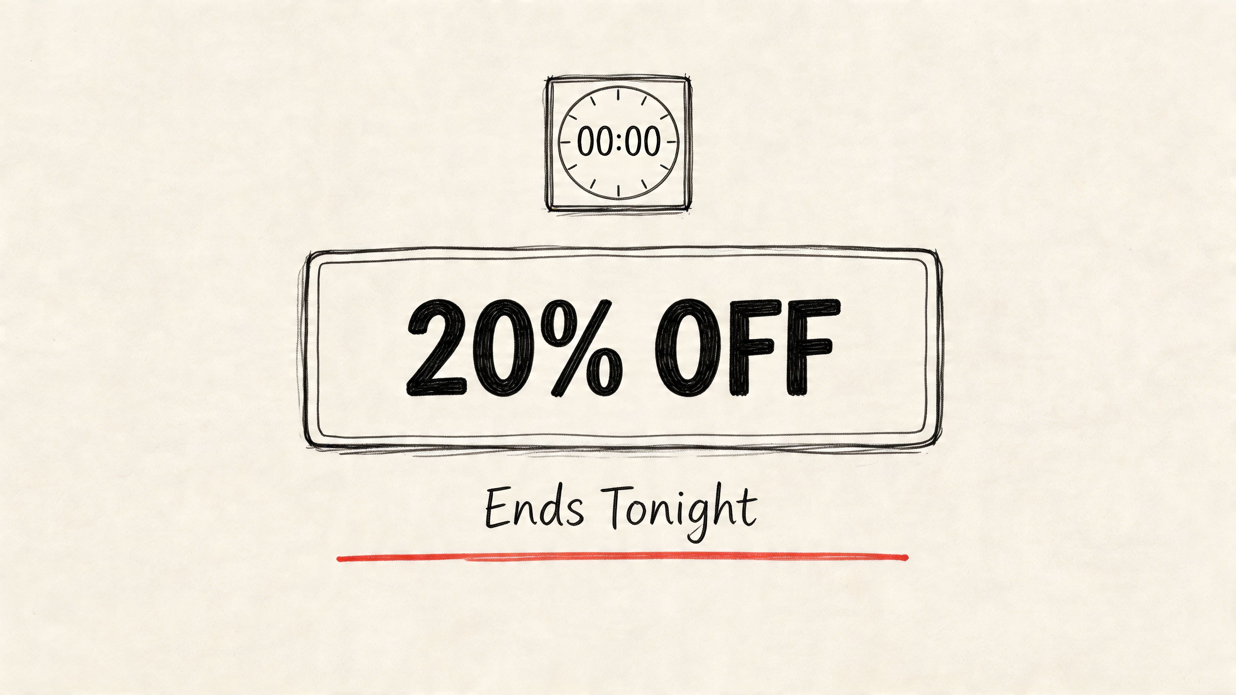
5. Limited-Time Offer/Code CTA
Time pressure changes buyer behavior. It can also damage trust fast when the offer feels recycled, vague, or hard to redeem.
A limited-time CTA works best when three things are true at once: the offer is real, the deadline is specific, and the ad has already built enough desire for the product. Common versions include “Ends Tonight,” “Use Code SAVE20,” “Claim Offer,” and “Get 30% Off Before Midnight.” You’ll see this pattern in apparel drops, beauty launches, seasonal promos, subscription trials, and in-app purchase campaigns.
The strategic job of this CTA is different from a standard purchase CTA. It does not create demand from scratch. It converts existing interest by adding a concrete reason to act now.
What urgency should look like on screen
Execution matters more here than marketers often admit. If the viewer cannot read the code, catch the expiry, or understand the savings in one pass, the urgency loses force.
Keep the final frame simple. One offer. One deadline. One action. The visual priority should usually be offer first, code second, CTA third. If the voiceover says “Use code SAVE20 tonight,” the text overlay should mirror that line instead of introducing a second message.
Placement timing matters too. On short-form video, urgency often works better as a closing push after the product proof lands. On retargeting, earlier code reveals can work because the viewer already knows the product and only needs the final nudge. For subscription and trial campaigns, the same structure applies to offer-led end cards and promo windows in Sovran’s subscription app creative workflow, where teams can swap deadline language, code styling, and end-screen layout without rebuilding the whole ad.
I’d test this CTA in modules, not as isolated copy lines:
- Offer structure: Percentage off, dollar-off, free shipping, bonus item, or trial extension.
- Deadline framing: “Ends Tonight,” “24 Hours Left,” or a fixed calendar date.
- Reveal timing: Code shown in the first third, middle, or final frame.
- On-screen treatment: Full-screen offer card, lower-third code, or product-plus-offer split layout.
- Audience fit: Cold prospecting, cart abandoners, past purchasers, or lapsed subscribers.
That testing structure matters because urgency changes more than click-through rate. It can change who clicks.
Where this CTA breaks down
The weak version of this ad is easy to spot. The whole creative relies on pressure, while the product case stays thin. That usually hurts prospecting efficiency because viewers still need proof before they care about the countdown.
There is also a quality trade-off. A stronger discount can lift conversion rate and still lower margin, reduce average order value, or bring in buyers who do not stick. For trial and app campaigns, the equivalent problem is low-intent activations that cancel before value is realized. Measure the post-click outcome that matches the business model, not just the redemption spike.
This is one of the clearest use cases for modular testing. Keep the winning hook and product demo fixed. Then rotate the offer amount, expiry line, promo code format, and end card hierarchy across dozens of variants. That gives you a cleaner read on whether urgency is improving a good ad or covering up weak product communication.
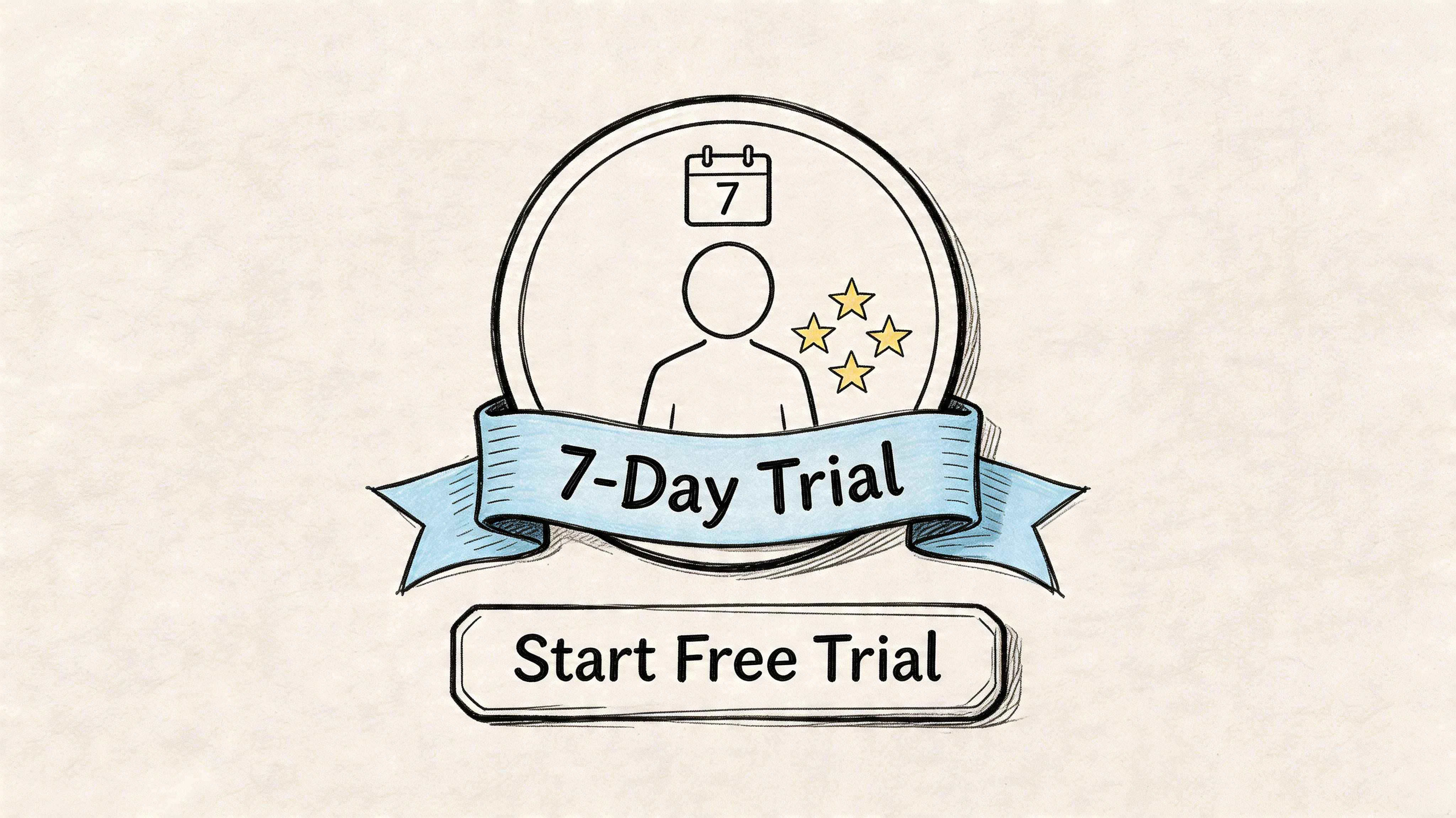
6. Subscribe/Membership CTA
Subscription CTAs ask the viewer to commit to an ongoing relationship, not a one-time transaction. That changes the job of the ad.
“Start Free Trial,” “Try Free,” “Join Today,” and “Get Access Now” are common in fitness apps, streaming services, software subscriptions, paid communities, and media memberships. Netflix, Disney+, Adobe, Microsoft 365, Peloton Digital, and subscription-based gaming products all use some variant of this model because recurring revenue depends on getting the viewer over the first commitment threshold.
The strongest subscription CTAs don’t sell the billing cycle first. They sell the ongoing benefit first. Then they clarify the trial or membership offer.
The message has to carry retention intent
A free trial CTA can drive a lot of low-friction starts if the ad overpromises. That doesn’t help if subscribers churn quickly. So the best membership ads make the usage pattern clear. They show the workouts, the content library, the software workflow, or the premium feature access before the CTA asks for trial activation.
This is also where personalization becomes more interesting than generic FOMO language. Background research around short-form ad workflows points to a gap in dynamic, readiness-based CTAs, especially for TikTok and Meta campaigns where AI-generated overlays, captions, and voiceovers can adapt the offer to audience stage. The practical takeaway is simple. Warm audiences often respond better to a benefit-specific ask than a generic “Start Now.”
A few examples:
- Warm retargeting: “Claim your free trial now” can fit someone who already watched product education.
- Cold prospecting: “See how it works” may outperform a direct trial ask if the product still needs context.
- Feature-led subscriptions: “Access all workouts” or “Get full access” can be stronger than “Subscribe.”
How to build a better test matrix
Subscription teams usually have more CTA angles than they think. Trial length, billing transparency, feature emphasis, and access framing all change user perception. But if every variation requires a new manual edit, the testing pace slows down fast.
That’s why a modular subscription workflow matters. If your team can maintain one asset bank of hooks, demos, benefits, and CTA endings, you can test trial language without recreating the ad each time. For brands in this category, Sovran for subscription apps maps well to the actual workflow issue, which is repeated CTA variation across the same underlying product story.
Subscription CTAs work best when they sell continued value, not just a free first step.
7. Watch Full Video/View More CTA
View-through rates drop fast in short-form placements. That is exactly why "Watch Full Video" and "View More" matter. They give interested viewers a lower-friction next step when a 6 to 15 second ad can spark intent but cannot finish the sale.
Use this CTA when the short ad is a trailer for a longer asset with real selling power. That can be a product demo, a founder story, a customer case study, a YouTube review, or a branded film that builds consideration better than a landing page ever could. The objective is not raw clicks. It is qualified attention from people willing to spend more time with the message.
This CTA works best under four conditions:
- The product needs more explanation. Complex software, high-ticket services, technical products, and education offers often need more than one short ad to make the value clear.
- The long-form asset closes the gap. If the destination video answers objections, shows proof, or demonstrates the product in use, "View More" can outperform a harder sell.
- The platform supports a natural handoff. TikTok to profile video, Meta to an in-app video destination, YouTube Shorts to long-form, and creator ads to a full review are common fits.
- The CTA appears after curiosity is earned. Mid-video or end-card placements usually beat an immediate ask because the viewer already has a reason to continue.
The trade-off is straightforward. You usually give up some immediate conversion rate in exchange for better message absorption and cleaner intent signals. For awareness and mid-funnel campaigns, that is often the right deal. A click to a longer video from a cold viewer can be more useful than a weak landing page visit that bounces in seconds.
Placement and timing matter more here than with direct-response CTAs. "Watch Full Video" should appear at the point of tension. Right before the reveal, after the problem is framed, or once the demo shows enough to create a knowledge gap. If the CTA interrupts too early, click-through suffers. If it appears after the ad has already said everything, there is no reason to continue.
Testing should focus on the teaser, not just the button copy. Start with one destination asset and build a matrix around three variables: hook type, payoff promise, and CTA wording. For example, test a problem-led opener against a proof-led opener, then pair both with "Watch Full Video," "See the Full Demo," and "View More." That setup shows whether people are clicking for story, for utility, or for proof.
A modular workflow makes this much easier to scale. In Sovran, teams can keep the long-form destination constant while swapping intros, captions, voiceovers, and CTA end cards across dozens of variants. That matters because the winning combination is rarely just the CTA phrase. It is the relationship between the first two seconds, the promise made in the short ad, the platform context, and the payoff in the longer asset.
The failure mode is overpromising. Curiosity helps. Mismatch hurts. If the short ad hints at a strong reveal and the full video is slow, generic, or off-topic, the campaign buys cheap clicks and weak intent. Good "View More" creative sets a specific expectation, then the long-form asset meets it quickly.
7 Video Ad CTAs Compared
| CTA | 🔄 Implementation Complexity | ⚡ Resource Requirements | 📊 Expected Outcomes | Ideal Use Cases | ⭐ Key Advantages / 💡 Tips |
|---|---|---|---|---|---|
| Direct Download / Install | Low, straightforward app-store deeplink | Minimal creative + Ads Manager integration; real-time tracking | Install-driven conversions; 2–8% (varies by audience) | Mobile UA, games, DTC apps, performance campaigns | Clear conversion path; place CTA in final 3s, high-contrast button, monitor D1/D7 retention |
| Learn More / Swipe Up | Medium, needs landing pages & routing | Landing page UX, fast load times, tracking pixels | Lower immediate CVR 0.5–3% but higher-quality leads & retargeting audiences | B2B, higher-ticket, education, consideration-stage funnels | Enables storytelling and intent qualification; ensure <2s mobile load, mobile-first pages |
| Sign Up / Register | Medium–High, account flow & verification | Registration forms, social login options, attribution events | Sign-ups as mid-funnel metric; 1–5% (incentive dependent) | Freemium SaaS, communities, fitness apps, newsletters | Builds owned user base; test social login (often +20–30%), lead with benefits |
| Shop Now / Purchase | High, checkout & inventory integration required | Cart/checkout, payment gateway, product feed & sync | Revenue-focused outcomes; 0.5–4% CVR, strong ROAS when product-market fit | DTC retail, e‑commerce, shoppable social ads | Direct monetization and ROAS clarity; show price/shipping, use scarcity, optimize one-click flows |
| Limited-Time Offer / Code | Medium, promo systems & timing logic | Promo code generation, timer overlays, CRM tracking | High conversion velocity; 3–12% but can lower margins & LTV | Seasonal sales, inventory clearance, incentivized user acquisition | Drives urgency and fast CVR; use visible countdown, test discount formats, limit overuse to avoid conditioning |
| Subscribe / Membership | Medium–High, billing & compliance needed | Billing system, trial logic, auto-renew disclosures, cohort tracking | Subscription conversions 1–6%; higher LTV (5–10x one-time purchase) | SaaS, streaming, fitness, content platforms | Predictable recurring revenue; lead with free trial, show pricing transparency, optimize trial-to-paid funnel |
| Watch Full Video / View More | Low–Medium, content routing and hosting | Long-form video production, hosting (YouTube/Vimeo), chaptering | Higher engagement/watch metrics; 5–20% watch-through; low immediate sales but strong LTV impact | Storytelling brands, creators, B2B case studies, luxury | Builds deeper affinity and retargeting pools; use short teasers, place CTA at natural story break, offer completion incentives |
Scale Your CTA Testing and Find Winners Faster
Often, teams don’t have a CTA problem. They have a testing problem.
They know the obvious options. Download now. Learn more. Shop now. Start free trial. The issue is that they treat those lines like final copy decisions instead of variables inside a system. In performance environments, that’s too limiting. A CTA’s performance depends on the hook before it, the body that sets it up, the audience seeing it, the timing of the overlay, the visual treatment, and the landing experience after the click.
That’s why a single “best CTA” usually doesn’t exist. The better question is which CTA works best with this hook, for this audience, on this platform, at this stage of intent. Once you frame it that way, the production process has to change too.
The practical move is to break the ad into modules. Keep separate libraries for hooks, proof sections, demos, offers, and CTA endings. Then test them as combinations rather than one-off exports. That makes it possible to isolate what is driving the result. Maybe “Learn More” beats “Start Free Trial” on cold traffic. Maybe “Download Now” only wins when paired with urgency language. Maybe the CTA copy isn’t the issue at all, and the body isn’t giving the close enough support.
There’s also a trade-off between depth and speed. Handcrafting every variation can feel safer, but it usually slows teams down so much that they stop testing meaningful CTA breadth. On the other hand, spraying out random variants without a framework just creates noise. The answer is structured volume. You want enough combinations to surface signal, but enough consistency to know why a winner won.
That’s especially important in Meta and TikTok workflows where fatigue sets in fast. If you’re only refreshing hooks and never revisiting CTA logic, you can miss profitable gains. The closing ask often determines whether attention turns into action. That’s true for direct response offers and for softer goals like lead qualification or longer-form engagement.
A platform like Sovran can fit into that process because the workflow problem is operational as much as strategic. Teams need a way to organize creative into hook, body, and CTA components, generate many combinations quickly, and push those variants into media buying workflows without rebuilding ads manually. That doesn’t replace strategy. It makes strategy testable.
The seven video ad call to action examples in this guide should give you a starting framework, not a fixed script. Use direct CTAs when the path is simple. Use softer educational CTAs when the product needs context. Use urgency when the offer is real. Use engagement bridges when signup friction is high. Use long-form continuation CTAs when attention needs a second step before conversion.
The key is to stop choosing one CTA by instinct and start proving it through repeated, structured testing. That’s how you find the combinations that lower CAC, protect ROAS, and keep creative production from becoming the constraint.
A CTA for Sovran.

Manson Chen
Founder, Sovran
Related Articles

Create Video Ads with AI That Perform in 2026

AI UGC Video: A Guide to Scale Ads on Meta & TikTok