Direct Response Video Ad Endings That Convert (2026 Guide)
Jump to a section
Performance teams often spend 80 percent of the review on the first three seconds and almost none on the last three. That habit creates a blind spot in direct response creative.
A video ending is not a throwaway CTA card. It is the part that translates attention into a clear next step, and on Meta and TikTok it also shapes how cleanly the algorithm can read intent across your creative tests.
That changes how endings should be built. Generic advice like “add urgency” or “make the CTA clear” does not help much once you are producing variations at scale. The better approach is a modular ending system: a small set of closing components you can swap across concepts, offers, and audience angles without rebuilding every ad from scratch.
I use modules because they solve two real problems at once. Creative teams get a repeatable production process. Media buyers get cleaner tests, because the variable is the close itself, not a totally different ad with a different hook, pace, and proof structure.
On Meta, that makes it easier to compare whether a price-led close beats a benefit-led close for the same body cut. On TikTok, it helps preserve native momentum while testing different calls to action, proof frames, and friction reducers at the end instead of dropping in a polished brand card that changes the feel of the ad. If you need examples of stronger CTAs for video ads, start there. The larger win comes from treating the ending as a system you can test, learn from, and scale.
Why Your Video Ad Ending Is Costing You Sales
A large share of video viewers say video ads influence what they buy. That makes the close a revenue step, not a formatting detail.
Performance teams usually spend review time on hooks because the miss is obvious. A weak opening tanks thumb-stop rate fast. A weak ending is less visible in a creative review, but it shows up later in the numbers: lower CTR from otherwise solid videos, weaker CVR on ads with healthy hold rate, and more spend pushed into ads that attract engagement without producing enough purchase intent.
That pattern shows up on both Meta and TikTok.
On Meta, I regularly see ads with a strong first five seconds and acceptable watch-through rates lose efficiency because the final frame gives the user no concrete reason to click now. The body sells the outcome. The ending falls back to a generic button cue like “Learn More,” with no offer framing, no risk reduction, and no reminder of what happens after the tap. The algorithm can still find cheap attention, but it has less conversion signal to optimize around.
On TikTok, the failure looks different. The ad feels native until the last two seconds, then the editor drops in a polished brand card that belongs in a TV spot. Watchers do not need more branding at that moment. They need a final nudge that matches the tone of the video and removes the last bit of friction.
That is where sales get lost.
The ending has one job: make the next action feel obvious and worth doing now. If the close is vague, delayed, cluttered, or tonally disconnected from the rest of the ad, viewers hesitate. Hesitation is expensive in direct response because the platform is buying you a short window of intent, not a patient audience.
I treat endings as a distinct performance variable for that reason. A better close can improve a mid-tier concept enough to keep it in rotation. A weak close can bury a good concept before the account gets enough clean conversion data to scale it. That matters even more if your team uses modular production or AI-assisted workflows to create AI video ads that convert, because the ending is one of the easiest places to test meaningful variation without changing the whole ad.
If you want a quick reference for stronger CTA phrasing, this breakdown of CTA examples for video ads is useful. The bigger point is broader: the close should be built like a testable system. Not a default end card your editor pastes onto every asset.
That shift changes results. Instead of asking, “Did this ad work?” ask, “Did the offer presentation fail, did the proof fail, or did the ending fail to convert intent?” Teams that separate those variables get clearer signals from Meta and TikTok, and they scale creative faster.
The Anatomy of a High-Converting Ad Ending
High-performing direct response video ad endings usually do four jobs at once. They tell the viewer what to do, reinforce the offer visually, reduce doubt, and create a reason to act now.
Here’s the structure worth building around:
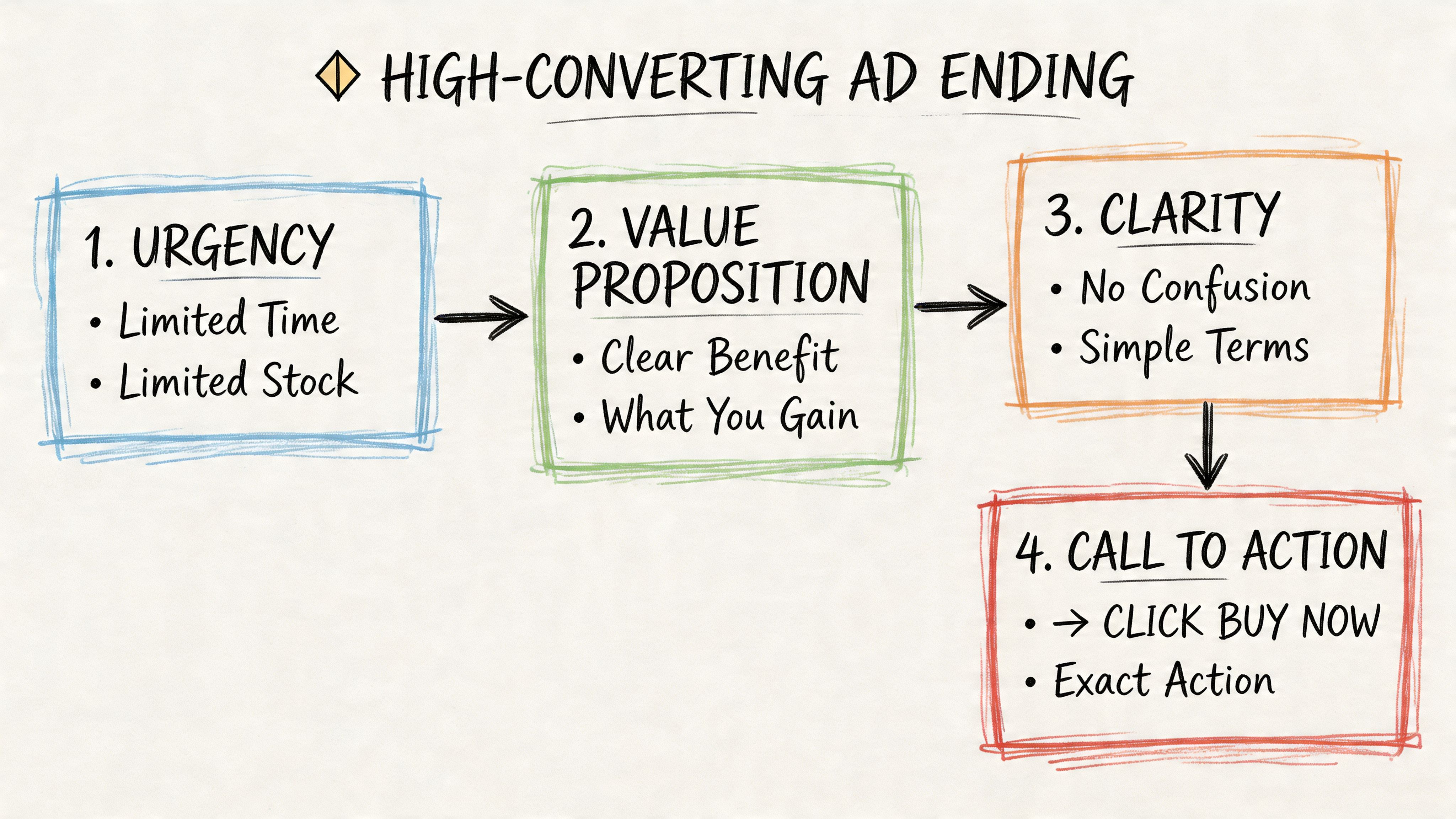
The CTA needs to be painfully clear
The CTA is the instruction layer. It should remove ambiguity, not summarize the ad.
According to WIT Group’s direct response best practices, CTAs with high specificity and urgency terms like “now” or “today” can produce response rates 10 to 30 times higher than standard digital ads. That doesn’t mean every ad needs to shout. It means the viewer should know exactly what action to take.
Weak CTA
- Learn More
- Check Us Out
- Get Started
Stronger CTA
- Tap to claim your first order discount today
- Install now to start your first session
- Apply now to book your demo
The stronger versions tell the user what happens after the click.
The end card reinforces, not replaces
The end card or final text overlay is the visual memory cue. Its job isn’t to look brand-safe. Its job is to make the last thing the viewer sees easy to process.
A solid end card usually includes:
- Brand recognition: The brand name or product identity should be visible.
- Offer clarity: State the offer in plain language.
- Action cue: Repeat the CTA in readable text.
- Visual contrast: Make it legible in a fast-moving feed.
On Meta, this often works best as multi-line copy over product footage or testimonial footage, not a dead static slab. On TikTok, oversized native-looking text can outperform polished branded layouts because it feels continuous with the rest of the video.
For a good breakdown of how the close fits into the full creative structure, this guide to performance video ad anatomy is worth reviewing.
Social proof belongs in the close
Social proof near the ending works because that’s when the buyer is deciding whether to trust the claim enough to act. This doesn’t have to mean a giant testimonial block.
Use compact proof elements such as:
- Creator validation: “This is what I kept using.”
- Customer reaction: A short quote on screen.
- Product evidence: Showing the result one more time.
- Use case fit: “For busy parents,” “for anxious sleepers,” “for teams hiring fast.”
If the body builds desire, the ending should remove the last excuse.
Urgency gives the close teeth
Urgency is where many brands get awkward. They either skip it entirely or fake scarcity in a way that feels forced. The better approach is to tie urgency to an actual decision window or immediate outcome.
Good urgency language sounds like this:
- Start today
- Claim your offer now
- Order tonight
- Install now and begin immediately
Bad urgency language sounds inflated, generic, or disconnected from the product.
If you’re building endings quickly with generated or remixed assets, this resource on how to create AI video ads that convert is useful because it focuses on assembling creative around conversion logic, not just editing speed.
CTA Ending Templates for Meta and TikTok
A lot of CTA templates fail because they ignore platform behavior. Meta users often tolerate a slightly denser close if the offer is clear. TikTok users punish anything that suddenly feels like a banner ad.
The principles of direct response still hold. A clear, urgent close works because it asks for action in a measurable way. That’s the same reason channels like direct mail continue to perform. Short Genius notes that direct mail averages 161% ROI and delivers response rates 5 to 9 times higher than email or social. Different format, same lesson. A direct ask beats a soft one when the campaign is built to convert.
What Meta endings usually need
Meta endings usually benefit from:
- Benefit-first language: Lead with the value before the ask.
- Two-step readability: First line for benefit, second line for action.
- Visible offer framing: Price incentive, trial, or outcome.
- Repetition: Voiceover CTA and on-screen CTA should align.
A common Meta mistake is ending with a button-style phrase but no supporting text. The viewer sees “Shop Now” but doesn’t see why.
What TikTok endings usually need
TikTok endings usually perform better when they preserve the ad’s tone through the final frame.
That often means:
- On-screen text that feels creator-native
- Fewer polished brand elements
- More direct speech
- A CTA that sounds spoken, not written by legal
The fastest way to ruin a TikTok close is to switch from conversational footage into a glossy end slate that looks like it was imported from another platform.
Here’s a practical swipe file to start testing. If you want more examples, Sovran also has a useful library of video ad call-to-action examples.
Direct Response Video Ad Ending Templates
| Campaign Goal | Meta Ending Template (Text Overlay + CTA) | TikTok Ending Template (On-Screen Text + CTA) |
|---|---|---|
| E-commerce Sale | Text overlay: Get the result without the usual hassle. Your first order offer is live today. CTA: Tap to shop now. | On-screen text: If you’ve been waiting, get it today. CTA: Tap shop now. |
| App Install | Text overlay: Start your first session in minutes. No learning curve. CTA: Install now. | On-screen text: Download it now and try it tonight. CTA: Install now. |
| Lead Gen | Text overlay: See exactly how it fits your workflow. Book a tailored walkthrough today. CTA: Apply now. | On-screen text: Want the breakdown for your team? CTA: Tap to book now. |
| Subscription Offer | Text overlay: Make this part of your routine starting today. CTA: Start now. | On-screen text: Start today. Cancel the guesswork. CTA: Try it now. |
| Promo Push | Text overlay: Your offer is available right now. Don’t wait to claim it. CTA: Claim offer today. | On-screen text: The deal’s live right now. CTA: Tap to claim it. |
| Demo Request | Text overlay: See the product in action before you commit. CTA: Book your demo today. | On-screen text: Want to see how it works? CTA: Tap to book now. |
How to adapt these without breaking performance
Don’t just swap nouns. Change the angle based on buyer hesitation.
For Meta:
- If the buyer doubts value, lead with the payoff.
- If the buyer doubts fit, mention the audience or use case.
- If the buyer needs a push, make the urgency line more explicit.
For TikTok:
- If the ad is UGC-style, keep the close spoken and casual.
- If the product needs explanation, let text support the final spoken line.
- If the offer is straightforward, go bold and brief.
A good ending doesn’t sound “creative.” It sounds easy to act on.
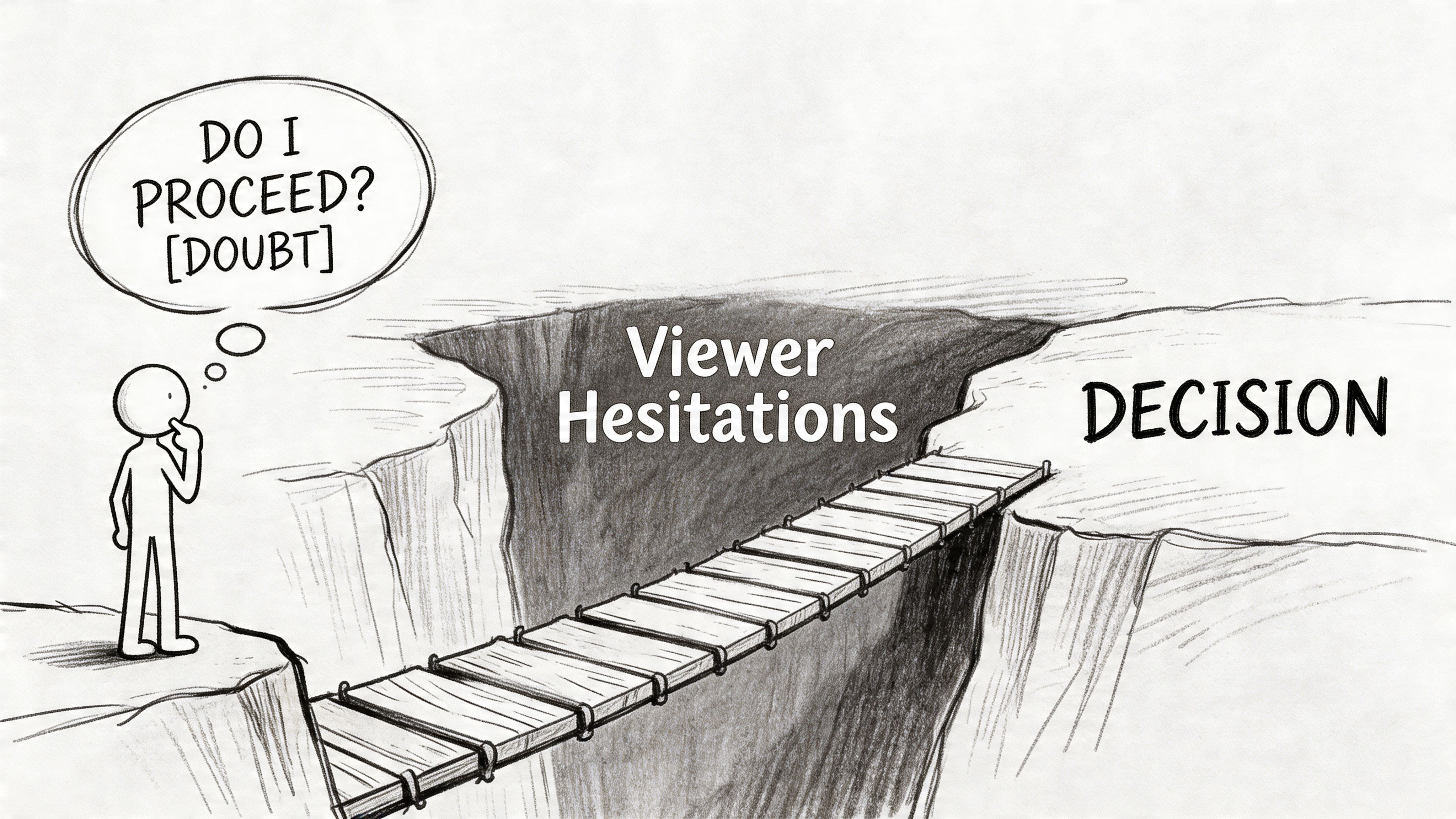
Advanced Endings That Overcome Final Hesitations
Most viewers who reach the end of a direct response ad aren’t confused. They’re unconvinced. There’s a difference.
A standard CTA asks for action. An advanced ending answers the objection that’s still alive in the buyer’s head. That’s where a lot of polished brand ads fall apart. They assume the body already did enough selling, then they end on a logo and a button.
Future benefit endings
One of the strongest ways to close is to make the next step feel connected to a concrete future state. Ads4Scale’s breakdown highlights endings tied to specific future benefits and Regret or Enemy angles, noting these approaches have been used across brands responsible for more than $100M in sales.
That matters because “Buy now” is abstract. “Start now so you can wake up feeling rested” is not.
A few examples:
- Sleep product: Tap now and start falling asleep faster tonight.
- Fitness app: Install now and follow your first routine today.
- Finance tool: Start today and see where your spending goes.
- B2B workflow tool: Book now and remove the handoff bottleneck from your team’s week.
The benefit should be close enough to feel believable and specific enough to feel real.
Regret and enemy endings
These work when the buyer is stuck in a frustrating loop and needs a sharper emotional nudge.
Examples:
- Still wasting time on manual reporting? Book your demo today.
- Stop guessing which creative is working. Launch the next test now.
- If you’re tired of restarting your routine every week, begin today.
This style works best when the body of the ad has already established the pain authentically. If the ad hasn’t earned that tone, the ending can feel manipulative.
The final hesitation is usually one of three things: “I don’t trust this,” “I don’t need this yet,” or “This won’t work for me.” Your ending should answer one of them.
Why ugly often beats polished
There’s a persistent belief that the ending should be the cleanest, most branded part of the ad. In practice, that often hurts direct response performance, especially in DTC and app growth.
Authentic-looking endings do a few things better:
- They preserve continuity: The ad doesn’t suddenly change visual language.
- They feel less rehearsed: That lowers skepticism.
- They keep the message human: A creator saying “I’d just get it today” can land harder than a branded card.
An “ugly” ending doesn’t mean careless. It means frictionless, believable, and native to feed behavior. On TikTok, that may be a handheld close with raw captions. On Meta, it may be a looser testimonial clip with a direct text overlay instead of a polished end slate.
The key trade-off is control versus trust. The more polished the ending, the more control the brand has over presentation. The more native the ending feels, the easier it is for the viewer to believe it belongs in their feed.
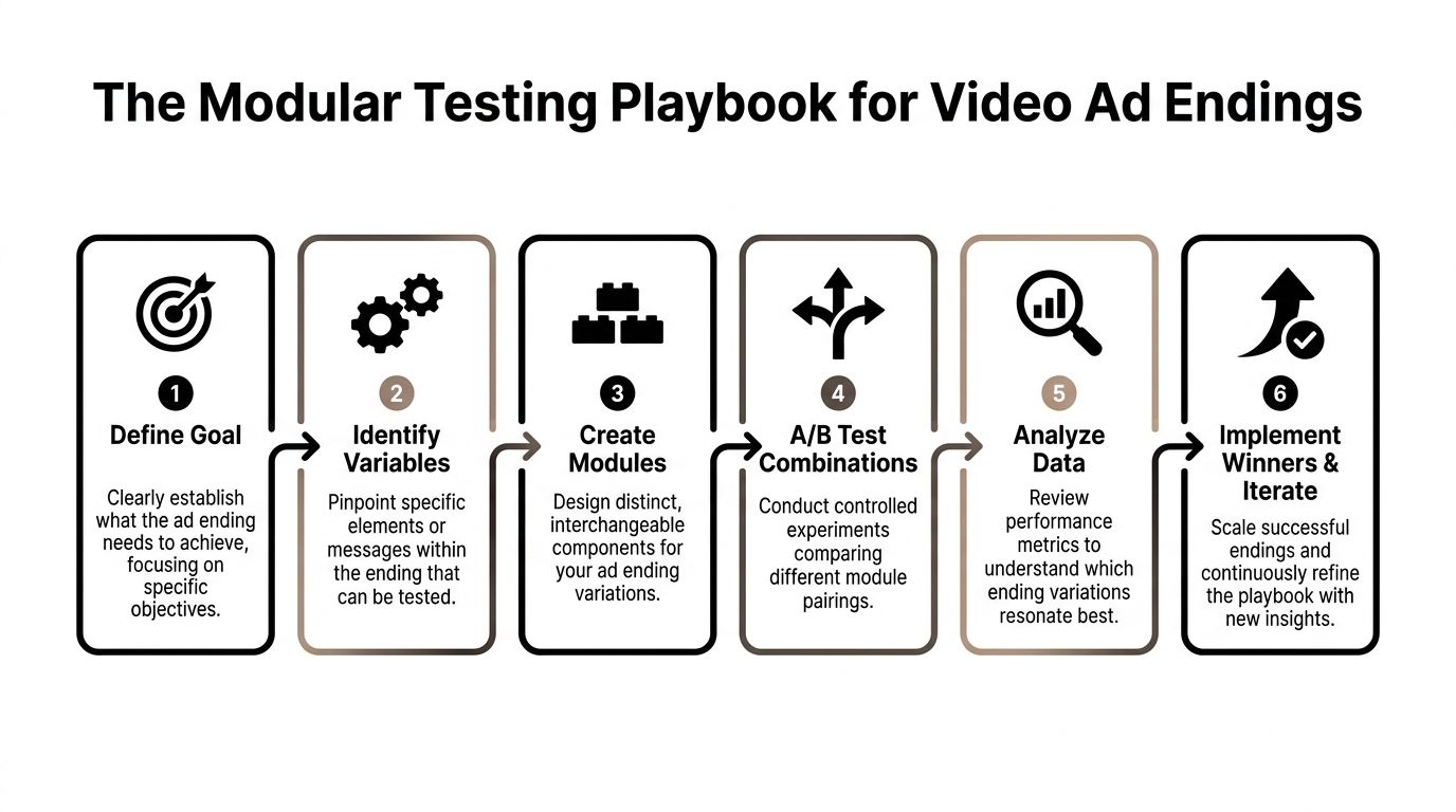
The Modular Testing Playbook for Video Ad Endings
Many still test endings the slow way. They brief a new ad, recut the full asset, launch it, then guess whether the CTA or the concept caused the result. That workflow can’t keep up with Meta or TikTok.
A better system treats the ending as a module. You keep hooks and bodies flexible, then rotate structured close variations on top. That lets you test more combinations without rebuilding every ad from zero.
Why modular endings matter more in automated environments
This matters even more in Meta’s automated campaign environment. FetchFunnel notes that Advantage+ Shopping Campaigns can automate up to 150 creative combinations, and poorly structured modular endings can cause a 20 to 30% drop in attribution.
That’s the part many guides miss.
If your ending is the only place the offer, urgency, or brand is clearly stated, then weak modular structure makes it harder for the system to learn from combinations. A hook may win attention. A body may explain the product. But if the close doesn’t consistently carry the action signal, the machine gets muddy inputs.
Build ending modules around variables, not one-off copy
The cleanest way to work is to define the variables you want to test.
Use a matrix like this:
| Variable | Version A | Version B | Version C |
|---|---|---|---|
| CTA verb | Shop now | Claim offer today | Start now |
| Urgency style | Today | Now | Limited-time framing |
| Proof type | Testimonial quote | Product result shot | Creator endorsement |
| End card format | Text over footage | Static branded card | Native creator close |
| Offer framing | First order incentive | Trial framing | Outcome framing |
This does two things. It creates clear creative hypotheses, and it stops the team from making random edits that can’t be interpreted later.
A practical workflow for Meta and TikTok
Here’s the process that tends to work best:
Lock the body first
Don’t test endings on top of a chaotic middle section. Use a body that already delivers the core claim clearly.Create three to five ending families
Build by angle, not by wording alone. For example: benefit-led, urgency-led, objection-led, proof-led, creator-led.Change one major variable at a time
If you rewrite the CTA, swap the visual style, and change the offer line all at once, you won’t know what moved performance.Keep key signals visible in the final frames
Brand, offer, and action should be easy to identify. That’s especially important when ads enter automated combination systems.Tag endings consistently
If you’re using a modular workflow tool, label endings by angle and variable. That makes reading results possible at scale.Promote winners into new combinations
A winning ending should be paired with fresh hooks and fresh bodies quickly. Don’t leave it trapped in one ad.
The goal isn’t to find one perfect ending. It’s to identify repeatable ending components that keep winning across concepts.
What not to do
A few patterns usually waste testing cycles:
- Only testing button language: “Shop now” versus “Learn more” is too narrow if the whole close is weak.
- Hiding the offer until the end: The final frames should reinforce, not introduce everything.
- Over-designing end cards: Clean design is fine. Sterile design usually isn’t.
- Mixing audience messages in one ending: A single close shouldn’t speak to budget buyers, premium buyers, and first-timers all at once.
If you want to run this with actual modular assembly, tools like Sovran’s modular video ad framework are built around tagging and recombining hooks, bodies, and CTA segments rather than forcing a full edit every time.
Measuring Ending Performance and Scaling Winners
A lot of ending tests get judged on the wrong signals. Teams look at thumb-stop rate, hold rate, or comments, then assume the close worked. Those metrics can tell you whether the ad was watchable. They don’t tell you whether the ending converted intent.
To evaluate direct response video ad endings, focus on the metrics that sit closest to the action:
- Outbound CTR
- Conversion rate
- Cost per purchase or lead
- ROAS
What each metric tells you
If outbound CTR rises but conversion rate drops, your ending may be good at prompting curiosity but bad at qualifying the click. If CTR stays flat but conversion rate improves, the ending may be filtering for higher intent users. That’s often a good trade.
Cost per purchase helps you see whether the close is helping efficiency, while ROAS tells you whether that efficiency supports scale.
A useful interpretation framework looks like this:
| Pattern | Likely ending issue or strength |
|---|---|
| High engagement, weak CTR | Close isn’t explicit enough |
| High CTR, weak CVR | Ending over-promises or attracts low-intent clicks |
| Stable CTR, stronger CVR | CTA is better matched to buyer readiness |
| Better efficiency in one audience only | Ending angle fits a segment, not the full account |
Segment results before you scale
One of the most useful lessons from YouTube direct response applies here. Quality Score’s YouTube guidance recommends running ads during profitable hours and splitting audiences into separate campaigns with customized CTAs. That same discipline helps on Meta and TikTok.
Look at ending performance by:
- Audience type: Prospecting, retargeting, broad, interest, lookalike
- Offer context: Full-price, promo, demo, install
- Time window: When do buyers convert best?
- Creative style: UGC, founder-led, testimonial, product demo
Don’t assume one winning ending should scale everywhere. Some endings are broad-account workhorses. Others are segment closers.
Kill endings that attract cheap clicks and weak buyers. Scale endings that keep intent aligned from click to conversion.
For a more structured process around creative experimentation, this guide on how to test video ad creatives is a solid reference.
If your team is trying to scale direct response video ad endings without rebuilding every ad manually, Sovran gives you a way to recombine hooks, bodies, and CTA segments into modular test variations and push them into Meta workflows with clearer structure for creative testing.

Manson Chen
Founder, Sovran
Related Articles

Create Video Ads with AI That Perform in 2026
AI UGC Video: A Guide to Scale Ads on Meta & TikTok