8 High-Converting Video Ad Hook Examples for 2026
Jump to a section
- 1. The Pattern Interrupt Hook
- 2. The Curiosity Gap Hook
- 3. The Social Proof FOMO Hook
- 4. The Relatable Problem Hook
- 5. The Visual Transformation Before After Hook
- 6. The Storytelling Character Hook
- 7. The Data Insight Hook
- 8. The Lifestyle Aspiration Hook
- 8-Point Video Ad Hook Comparison
- From Examples to a Scalable Testing System
73% of ecommerce video ads fail within the first three seconds because they look too polished and too much like ads, not native content (YouTube research summary). That single stat explains why so many otherwise decent campaigns never get enough delivery to prove whether the offer, landing page, or audience is any good.
For performance marketers, the hook isn't a creative garnish. It's the first filter on spend efficiency. If the opening frame doesn't stop the scroll, Meta and TikTok don't get the engagement signals they want, and your team ends up debugging the wrong part of the funnel.
The practical standard is now simple. You have about 3 seconds on TikTok and Reels to engage the viewer, and the strongest hooks usually combine text overlay, sound, a visual element, and an overall vibe in the opening beat (YouTube research summary). That has changed how good teams build ads. They don't hunt for one perfect intro anymore. They build modular hook systems, test fast, and refresh the opening more often than the body.
That's also why broad lists of video ad hook examples are often less useful than they look. A hook only matters if you can produce variants, isolate variables, and learn from the result. If your workflow can't turn one angle into multiple usable first seconds, you won't keep pace with fatigue.
Below are eight hook types that still matter in 2026. More important, each one includes a practical way to test it, iterate it, and scale it with a modular workflow. The examples are written for people buying media, not just collecting swipe-file inspiration. If you're running Meta, TikTok, or app growth campaigns, treat these as testing templates, not scripts to copy word for word.
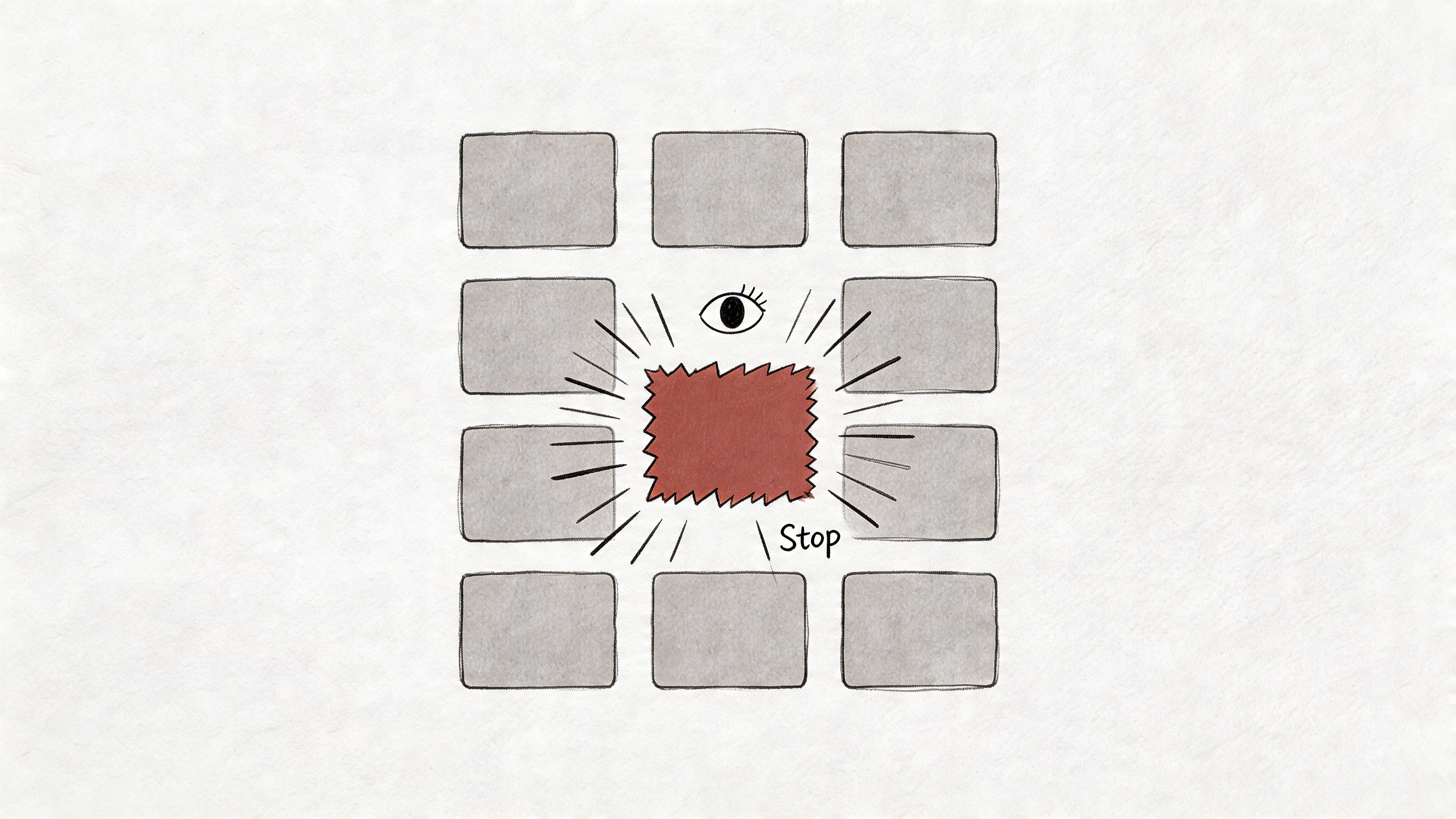
1. The Pattern Interrupt Hook
A pattern interrupt works because feeds train people into automatic scrolling. The strongest ads break that rhythm immediately with an unexpected visual, edit, movement, or framing choice.
You see this in very different ways across brands. Dollar Shave Club used abrupt humor and hard pivots. Squarespace often uses sudden shifts in visual rhythm. Supercell game ads rely on chaos, explosion, or instant contradiction between calm setup and intense payoff.
The mistake is assuming "random" equals "interrupt." It doesn't. A weird first frame that doesn't connect to the product just buys curiosity clicks and weak intent. A useful interrupt creates friction first, then hands the viewer a reason to keep going.
What actually interrupts the feed
On short-form placements, the opening frame carries more weight than text overlays or spoken copy. Visual hooks outperform text or verbal ones in impact on performance, and for TikTok and Reels the first frame has to stop the user immediately (Billo on hook variation testing).
That means your pattern interrupt should usually come from one of these moves:
- Abrupt visual contrast: Start with the "wrong" setting, then reveal the product context a beat later.
- Unexpected motion: A fast zoom, object drop, screen grab, or snap cut that feels native to short-form content.
- Contradiction: Open on a statement or scene that appears to go against the category norm.
- Designed roughness: Slightly raw framing often beats studio polish when the audience expects organic content.
Practical rule: Interrupt first, explain second. If you explain before you stop the scroll, the explanation never gets seen.
How to test it without wasting production time
Don't shoot five entirely different ads. Cut five openings from the same core asset.
If you're using a modular workflow, isolate only the first second or two. Change the first frame, transition speed, or opening motion while keeping the body and CTA fixed. That's the cleanest way to learn whether the interrupt itself is doing the work.
A timeline-based workflow helps here. With first 3 seconds video ad testing, teams can swap opening scenes fast, compare cut points, and preserve the same body sequence underneath. That's much better than rebuilding the ad every time creative strategy wants a new hook idea.
One more trade-off matters. Pattern interrupts are excellent at earning attention, but they can over-index on novelty. Pair them with a clear benefit in the next beat. If the body doesn't cash the check the hook writes, you'll get watch time without enough buying intent.
For teams trying to sharpen this style, studying effective video marketing strategies on social media can help clarify where native-feeling disruption beats polished brand presentation.
2. The Curiosity Gap Hook
Curiosity hooks work because viewers will give you a few extra seconds if they believe a useful answer is coming soon. In paid social, that only helps if the reveal earns the click and sets up the product truthfully.
A strong curiosity gap opens on a missing piece tied to a real outcome. A meditation app can say, "The habit keeping you awake isn't caffeine." A meal brand can open with, "Why healthy dinners keep tasting disappointing." A finance app can lead with, "The first number new investors check is usually the wrong one."
The mechanism is simple. Create tension around a specific problem, then close the loop fast enough that the viewer feels informed, not tricked.
Where teams usually miss
The reveal often comes too late. Creative teams chase hold rate, stretch the tease, and end up buying curiosity clicks from people who were never good prospects. You may see stronger thumb-stop performance and weaker downstream efficiency at the same time.
That trade-off matters. A curiosity hook should raise qualified attention, not just attention.
Compare these two opens:
- Stronger: "Why does your to-do list grow even on productive days?"
- Weaker: "This changed everything."
The first line names a tension the viewer already feels. The second asks for trust before giving any reason to keep watching.
How to test curiosity without rebuilding the whole ad
This hook type is well suited to modular production. Keep the body, proof, and CTA fixed. Swap only the first line, the first subtitle card, or the opening visual, then measure whether the hook is improving the first few seconds without hurting click quality.
Use three variants that express different kinds of curiosity:
- Direct question: "Why are your install ads getting ignored?"
- Contrarian angle: "More footage won't solve ad fatigue."
- Specific tease: "Most app ads lose the viewer on frame one."
That setup gives a cleaner read on what changed. If the body and offer stay constant, performance shifts are more likely tied to the hook itself rather than editing noise elsewhere in the ad.
Teams building a repeatable process should organize these as hook families, not one-off scripts. Sovran's framework for testing video ad hooks is useful here because it supports a modular workflow. One core asset can produce multiple curiosity intros, each mapped to a distinct angle, audience, or awareness level.
One practical rule helps prevent wasted spend. Resolve the curiosity by the second beat. If the opening asks a question, the next scene should answer it or at least point clearly toward the answer with proof, product UI, or a concrete demonstration.
Curiosity hooks usually perform best in categories where the buyer already has some category knowledge and needs a sharper reason to care. That includes apps, gaming, SaaS, and B2B offers. Broad ecommerce tactics can feel generic in those segments. Specific tension usually wins.
Curiosity works when the answer improves the viewer's situation. Surprise alone rarely carries the sale.
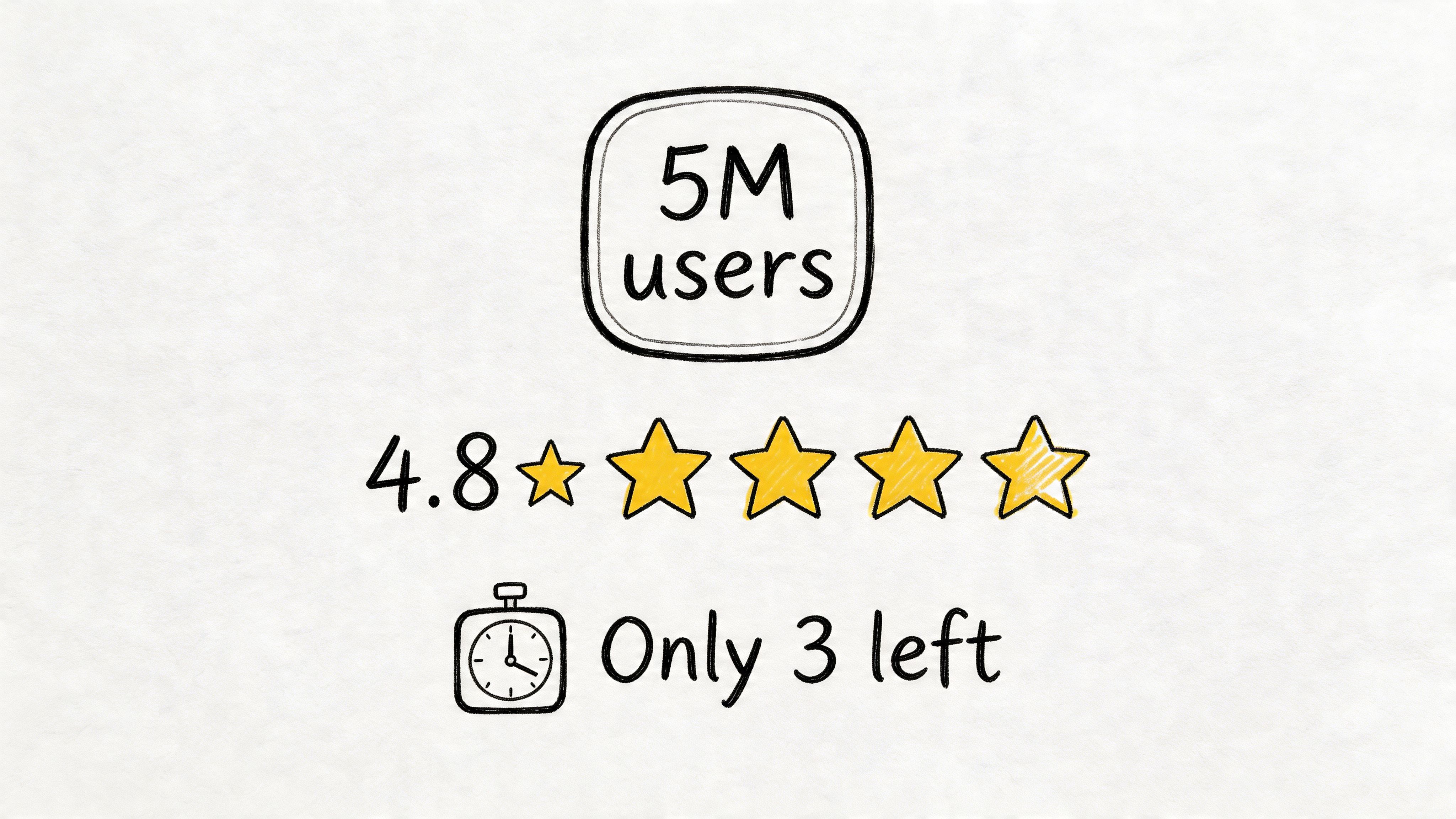
3. The Social Proof FOMO Hook
Shoppers use other people's behavior as a shortcut. In video, that shortcut works fast. A visible review, usage count, waitlist, or "just sold out" signal can answer the risk question before the product pitch starts.
This hook is strongest when the product needs borrowed credibility. Finance, health, subscriptions, marketplaces, and crowded app categories often benefit from it because the viewer is deciding whether the offer is safe, popular, and worth acting on now.
Robinhood has used scale and participation cues for years. Marketplace brands often open on ratings. Delivery and local service apps get good mileage from trust badges, review snippets, and real in-app activity because those signals feel concrete.
What to show first
The opening proof should match audience temperature.
- Popularity-first: Lead with adoption, active users, waitlist size, or repeat purchase behavior.
- Validation-first: Open on ratings, UGC comments, expert quotes, or creator reactions.
- Scarcity-first: Show limited inventory, expiring pricing, booking pressure, or a time-bound bonus.
Cold audiences usually need legitimacy first. Retargeting audiences often respond better to proof tied to the specific objection blocking conversion, such as fit, results, shipping speed, or product reliability.
Meta's guidance on creative for performance advertisers consistently pushes visual storytelling over static claims because people process proof faster when they can see it in context, whether that is a review overlay, a creator's screen recording, or a native-looking comment thread. Social proof works the same way. Show the evidence in the format people already trust on that platform.
How to test and scale this hook
The mistake is treating social proof as one script. It scales better as a modular system.
Start with one proof claim and produce multiple wrappers around it:
- Comment overlay cut
- Creator reads the review
- Product demo with rating badge
- Fast montage of proof signals
- On-screen objection, then customer quote
Keep the body of the ad stable for the first test round. Change the first three seconds, the proof format, and the order of signals. That gives a cleaner read on whether "4.8 stars," "10,000 customers," or "selling out this week" is doing the work.
For teams running high output, Sovran's framework for testing video ad hooks is useful because it maps hook families to a modular production workflow. One approved proof asset can turn into several intros without reshooting the full ad. That lowers production drag and makes fatigue management much easier.
One warning matters here. Weak proof hurts more than it helps. "Customers love us" says almost nothing. Specific proof, shown in a native format and tied to a buying reason, gives this hook its edge.
4. The Relatable Problem Hook
This hook works when the audience recognizes themselves before they recognize the product.
A good problem hook doesn't start broad. It starts painfully specific. Not "struggling to stay organized." More like, "Your notes are split between Slack, Notion, Apple Notes, and your own inbox." Not "payments are hard." More like, "You still need engineering help to launch a basic checkout flow."
That specificity is what earns attention. The viewer thinks, "Yes, that's exactly the mess I'm in."
Precision beats drama
The practical mistake here is overacting the pain. Most high-performing problem hooks don't need theatrical suffering. They need accuracy.
For B2B and app growth especially, category-blind hook libraries often miss the friction points. Research calling out gaps in current hook coverage notes that mobile apps, gaming, and B2B need more industry-specific angles because audience pain points differ sharply from generic DTC examples (Brandedby on industry-specific hook gaps).
That matches what many media buyers see in platform data. Generic pain statements may get some attention, but hooks built around real operational frustration tend to qualify intent better.
A simple workflow that improves hit rate
Use real customer language. Pull from:
- Support tickets
- Sales call recordings
- App store reviews
- Internal search queries
- Comments on competitor ads
Then write the first line the way your buyer would say it, not the way your brand deck would say it.
For example:
- "Your UA team keeps making new ads, but performance still drops."
- "Your CRM says the lead is qualified, then sales says it isn't."
- "You shipped the app update, but retention didn't move."
Those are stronger than generic problem statements because they imply experience.
The opening beat should stay short. Problem for a moment, solution immediately after. If you linger too long in the pain setup, the ad starts to feel like a rant. The body should quickly prove relief.
This is also one of the easiest formats to scale from existing footage. Pull multiple "problem moments" from demos, Zoom recordings, UGC, or screen captures, then pair them with the same body and CTA. You don't need a new production day to create useful problem-led variants. You need better tagging and cleaner segmentation of your existing library.
5. The Visual Transformation Before After Hook
Transformation is one of the fastest ways to earn comprehension in-feed. If the viewer can register the delta in a second, the hook does a lot of the selling before the voiceover or copy has to explain anything.

That makes this format useful well beyond beauty or weight-loss ads. Home brands can show clutter to order. SaaS teams can show a broken workflow to a clean handoff. Mobile games can show low-power to high-power progression. Creative tools can show raw asset to finished output.
The advantage is clarity. The risk is shallowness.
A before-after hook works when the visual change maps to the outcome the buyer wants. A cleaner dashboard is weak if the buyer cares about faster reporting. A polished video edit is weak if the offer is really about reducing production time. The opening has to show the changed state that carries economic or emotional value, not just cosmetic improvement.
Why this hook converts
This format reduces cognitive load. The viewer does not have to decode a claim first. They see the result, then decide whether it matters.
That is why transformation hooks often travel well across paid social, landing pages, and retail video. The same core asset can support multiple angles if the contrast is strong enough. For performance teams, that matters because one source clip can become several testable openings with different labels, supers, and CTAs.
Good categories for this hook include:
- cluttered to organized
- slow to fast
- manual to automated
- low-converting page to clearer offer flow
- basic character or account state to advanced state
This is also one of the easiest hook types to build into a modular testing system. A reusable transformation block can sit on top of multiple bodies, creator reads, and offer variants. That aligns well with video marketing best practices for modular creative systems, especially if your team is tagging assets by outcome instead of by shoot date.
How to structure the cut
The common editing mistake is overexplaining the "before." Teams burn the first seconds proving that the bad state is bad, even though the audience usually gets it immediately.
A better sequence is:
- Show the before instantly
- Trigger the change fast
- Hold on the after long enough to register
- Add a short payoff line
The transition does real work here. Hard cuts, snap zooms, sound hits, and UI motion can all sharpen the perception of change. Keep on-screen copy sparse. In many tests, one clear label beats a sentence because the eye can process it without splitting attention.
Here's a visual reference format many teams use to pressure-test pacing:
A transformation hook fails when the "after" looks cosmetic and the buyer needed a meaningful outcome.
That trade-off shows up constantly in software and app creative. If the ultimate sale depends on revenue lift, time saved, or fewer errors, the opening should hint at that business result. Use the visual transformation to stop the scroll, then let the next beat connect the new state to the metric or workflow change the buyer cares about.
6. The Storytelling Character Hook
Character-led openings work because viewers decide fast whether a person is worth following. If the first frame gives them a recognizable role, a clear problem, and a reason to care, the ad earns a few more seconds to sell the outcome.
Duolingo does this well with recurring personalities and a distinct tone. Airbnb often frames the moment through a guest or host. Wellness brands like Calm use lived experience to make the setup feel personal instead of promotional.
What performs here is micro-narrative. One person. One tension. One change.
This hook is especially useful when the purchase is tied to identity, confidence, routine, or emotion. A feature-first opener can feel abstract in those categories. A character gives the buyer a proxy. They can immediately ask, "Is that me?" or "Do I want that result?"
Retention is only half the job, though. Character hooks also need production discipline. Teams often overshoot this format, then end up with expensive assets that are hard to test because every variation requires a new scene, actor read, or edit.
A better approach is modular. Keep the character, setting, and core conflict fixed. Then swap the first line, opening crop, subtitle phrasing, and product reveal timing. That gives you multiple hook variants from one shoot instead of treating each ad as a standalone story. If your team is already structuring assets around the hook, body, and CTA video ad framework, this format becomes much easier to version systematically.
Use a simple build:
- Who is the person
- What are they trying to do
- What is stopping them right now
- How does the product enter the scene
That sequence should happen quickly.
A few workable setups:
- A creator opens analytics, sees flat performance, and tests one new workflow.
- A language learner freezes in a live conversation, then uses the tool in the next beat.
- A player keeps failing the same level, notices one missed mechanic, and immediately changes the result.
The character needs one signal the audience can read instantly. Job title. Uniform. Workspace. Device. Habit. Something visible enough to establish the archetype before the viewer scrolls.
Testing should focus on the variable that changes interpretation, not the whole story. Run the same footage with "skeptical founder," "burned-out operator," and "first-time manager" voiceovers if the product serves all three. In Sovran or a similar modular workflow, tag those as character archetype variants, then compare hold rate, thumb-stop rate, and downstream conversion by audience segment. That is how this hook scales. You are not searching for one perfect story. You are identifying which character frame earns efficient attention and can support more iterations.
There is a trade-off. Story can raise watch time while hurting conversion if the product arrives too late or feels bolted on. Bring the product in early enough that the viewer connects the character's tension to the offer, not just to the scene.
7. The Data Insight Hook
Analytical buyers respond to numbers fast, but only if the number points to a decision they already care about. That makes this hook especially useful in B2B, fintech, SaaS, and products sold to operators who measure cost, time, risk, or output.
A good data hook does one job in the first seconds. It gives the viewer a concrete signal that something in their current approach is inefficient, expensive, or underperforming.
Which data hooks are worth testing
Earlier research cited in this article supports the broader point that stat-led openings can compete with more emotional hooks when they create immediate relevance. The practical takeaway is simple. Use numbers to frame stakes, not to prove that your team did research.
The strongest stats usually fit one of four categories:
- Behavior stat. Shows what buyers do.
- Cost stat. Quantifies wasted spend, margin loss, or CAC pressure.
- Time stat. Highlights delay, manual work, or slow payback.
- Failure stat. Exposes how often the old method breaks.
That structure matters in production. One body can support multiple hook variants if the core promise stays the same. In Sovran or any modular workflow, cut four intros against one retained middle and CTA, then tag each version by stat type and audience. That gives the team a clean read on whether your market responds more to money, speed, risk, or adoption signals.
How to keep the stat from feeling like trivia
Lead with the number only when the viewer can process its meaning immediately.
Weak: "Brands are using more video in their marketing."
Stronger: "A large share of buyers report purchasing after seeing a video ad."
The second line creates consequence. It tells the viewer why the fact deserves attention. Then the ad can connect that consequence to the offer.
This format breaks when teams front-load explanation. They spend three seconds setting up the study, naming the source, or softening the claim, and the viewer is already gone. Put the implication right after the stat. Then move into the mechanism, proof, and CTA using a clear hook, body, CTA video ad structure.
Credibility is the trade-off.
A stronger claim can raise thumb-stop rate and hurt conversion if the number feels inflated, cherry-picked, or hard to verify. For regulated categories, high-consideration B2B, and any product with a skeptical buyer, a smaller but defensible number usually performs better over time than a bigger claim that triggers doubt.
Test the framing, not just the figure. Run the same stat with three interpretations:
- Outcome frame. What result improves.
- Risk frame. What loss continues if nothing changes.
- Benchmark frame. How the viewer compares to peers.
That is how this hook scales. The team is not hunting for one impressive number. The goal is to identify which quantified tension earns attention from the right buyer and still carries through to conversion.
8. The Lifestyle Aspiration Hook
Some products don't win by proving a feature first. They win by making the viewer want the identity around the product.
Peloton has long sold a version of disciplined, energized selfhood. Lululemon often frames belonging and lifestyle before product details. Social and dating apps frequently lean on confidence, connection, or status cues rather than a hard feature explanation.
This hook isn't about luxury aesthetics for their own sake. It's about helping the viewer recognize the person they want to be.
When aspiration works best
Aspiration tends to perform when the product is tied to self-image, tribe, or routine. Fitness, fashion, wellness, creator tools, travel, and many community-led apps fit here.
The opening should show the identity before explaining the mechanism. A scene, environment, group dynamic, or ritual usually communicates more than a feature list.
This also aligns with how native short-form often works. The ad doesn't announce itself as an ad. It drops the viewer into a desirable state of life and lets the product earn its place inside that world.
The trade-off most teams miss
Aspiration can attract broad attention but weak commercial intent if the body never grounds the feeling in a usable benefit.
So build the opening around identity, then connect it fast:
- Aspirational scene
- Specific friction removed
- Product role
- CTA
For testing, vary the identity expression while keeping the offer stable. One version may emphasize ambition. Another may emphasize calm. Another may emphasize belonging. Same product, different self-story.
Scientific testing matters more than taste. Teams often overvalue the version they find beautiful. Buyers don't care how cinematic your opening is if it doesn't move behavior. A disciplined workflow like how to test video ad hooks scientifically matters because aspiration hooks can seduce creative teams into subjective decision-making.
The strongest lifestyle hooks also feel platform-native. If the opening looks like a brand film dropped into a feed, it often loses the authenticity that makes aspiration believable in social environments.
8-Point Video Ad Hook Comparison
| Hook | Implementation Complexity 🔄 | Resource Requirements ⚡ | Expected Outcomes ⭐ | Ideal Use Cases 📊 | Key Advantages + Tip 💡 |
|---|---|---|---|---|---|
| The Pattern Interrupt Hook | Medium, precise timing/editing | Low–Medium, existing footage + fast edits | ⭐⭐⭐⭐, immediate attention; strong initial engagement; conversion depends on body | Short social feeds, awareness, creative A/B tests | Advantage: Very high thumb‑stopping power. 💡 Tip: Pair with a clear value prop in the body; test intensity levels. |
| The Curiosity Gap Hook | Medium, craft question + setup | Low–Medium, scripting, VO or caption variations | ⭐⭐⭐⭐, higher watch‑through rates (20–40% uplift); encourages progression through ad | App installs, free trials, tutorial or demo content | Advantage: Drives completion and curiosity-driven clicks. 💡 Tip: Deliver the promised answer early in the body to avoid dropoff. |
| The Social Proof / FOMO Hook | Low, overlays and badges | Low, updatable metrics and testimonial clips | ⭐⭐⭐⭐, boosts conversions (typical 25–40% lift); builds trust quickly | Performance marketing, UA campaigns, limited‑time offers | Advantage: Immediate credibility and urgency. 💡 Tip: Keep metrics current and verifiable; avoid deceptive scarcity. |
| The Relatable Problem Hook | Medium, requires user insight & authenticity | Medium, authentic scenarios, casting or UGC | ⭐⭐⭐⭐, high relevance and audience qualification; strong engagement from target users | B2B SaaS, productivity apps, niche solutions | Advantage: Creates emotional resonance and self‑identification. 💡 Tip: Show the problem in ≤2s and use real user pain points. |
| The Visual Transformation / Before‑After Hook | High, precise staging and transitions | High, quality before/after footage and editing | ⭐⭐⭐⭐, immediate proof of value; highly shareable when authentic | Fitness, beauty, home, lifestyle, gaming progression | Advantage: Conveys results visually without explanation. 💡 Tip: Avoid exaggerated claims; A/B test transition speed and sound hits. |
| The Storytelling / Character Hook | High, casting, direction, narrative setup | High, production time, acting or authentic UGC | ⭐⭐⭐⭐⭐, strongest emotional connection; higher long‑term brand lift | DTC, lifestyle brands, long‑form social ads | Advantage: Deep emotional engagement and shareability. 💡 Tip: Introduce a clear archetype in 2–3s and resolve the narrative promise. |
| The Data / Insight Hook | Medium, sourcing and framing valid data | Medium, research, credible citation, clear visuals | ⭐⭐⭐⭐, positions brand as expert; high ROI with professional audiences | B2B, fintech, health, education, thought‑leadership ads | Advantage: Establishes authority and an "aha" moment. 💡 Tip: Lead with the striking number and include a credible source. |
| The Lifestyle Aspiration Hook | High, art direction and cinematography | High, talent, locations, color grading, music | ⭐⭐⭐⭐, strong identity appeal and organic reach; ROI harder to quantify | Fitness, fashion, social apps, premium consumer brands | Advantage: Taps into self‑image and desire. 💡 Tip: Show the aspirational identity before the product and test diverse representations. |
From Examples to a Scalable Testing System
Creative teams that test hooks in a modular way usually find winners faster and refresh them with less wasted production. The edge is rarely a single brilliant opener. It comes from a system that generates more valid tests, reads the signals early, and scales the angles that keep converting.
The operating model matters more than the individual example.
Teams that scale paid social well store creative as interchangeable parts. Hooks, proof blocks, demos, testimonials, offers, and CTAs should live as separate assets with clear tags. That setup improves testing discipline because each result maps back to one controllable variable instead of a messy edit with five changes packed into the first 10 seconds.
A practical workflow looks like this:
- Build an asset bank: Tag footage by hook type, audience, creator, offer, product angle, and platform format.
- Test hooks against a stable body: Keep the middle of the ad and the CTA the same in the first round so the opening gets a clean read.
- Change one thing per iteration: Test the first frame, on-screen copy, spoken line, pacing, or sound cue separately.
- Read early engagement first: Use hold rate and early view behavior to decide which hooks deserve more spend and more variants.
- Refresh the opening before replacing the whole ad: In many accounts, the hook fatigues before the proof or offer does.
That last point has real budget implications. If the body of the ad still sells but the opening stops earning attention, a focused hook refresh is cheaper and faster than a full reshoot. It also preserves more of what already works, which makes performance analysis cleaner.
I usually recommend a two-stage process. First, test hook families broadly across the same body copy. Once one family starts separating, build variants inside that family. For example, if relatable problem hooks beat curiosity hooks, test different problem framings, creator styles, and opening visuals before you move on to rewriting the whole ad. That is how teams get from “we found a winner” to “we know why it wins.”
Sovran fits this workflow well because it lets teams organize footage into reusable modules, recombine hooks with different bodies and CTAs, and ship structured experiments from existing assets. That is especially useful for gaming, app, and B2B teams that need frequent variation without a constant production cycle.
Attention alone is a weak success metric. A hook can spike cheap clicks and still hurt efficiency if it attracts the wrong viewer. Performance marketers should judge hooks on qualified attention. Does the opening pull in people who stay, understand the offer, and convert at an acceptable cost? A lower-volume problem hook often beats a broader curiosity hook on that standard.
The teams that improve fastest connect creative testing to measurement. Stronger AI marketing analytics help separate personal taste from business impact by tying hook performance to downstream outcomes, not just top-of-funnel engagement.
Ask a narrower question: which hook type gets the right audience to keep watching and take action for this offer, on this platform, in this account? Then build a repeatable system around that answer.
If you're building a modular hook testing workflow, Sovran is worth a look. It helps teams turn existing footage into many video ad variations by recombining hooks, bodies, and CTAs, which is useful when you need faster iteration without rebuilding every ad from scratch.

Manson Chen
Founder, Sovran
Related Articles

Understanding Value Proposition for High-Velocity Video Ads
How to Calculate Sample Size for A/B Tests