8 Scroll-Stopping Hooks to Use in 2026
Jump to a section
- 1. The Pattern Interrupt Hook
- 2. The Question Hook
- 3. The Controversy Contrarian Hook
- 4. The Extreme Transformation Benefit Hook
- 5. The Social Proof Authority Hook
- 6. The Emotion Aspiration Hook
- 7. The Specificity Data Hook
- 8. The Pattern Trend Hook
- 8 Scroll-Stopping Hook Types Compared
- From Hooks to Wins Scaling Your Creative Strategy
Analysts and platform teams keep reaching the same conclusion. people decide fast. On Meta, TikTok, and Reels, the opening frames determine whether the rest of the ad gets a chance to work.
That puts the hook at the top of the performance stack. If the first beat does not earn attention, stronger copy, better offers, and cleaner landing pages cannot rescue the impression you already lost.
Crowded feeds make this harder. Users move through a high volume of content every day, and some reviews of social viewing behavior argue the decision to keep watching can happen in well under a second, as summarized in Roslyn Foo’s review of hooks that stop the scroll. The practical takeaway is simple. There is no runway. The opening has to create enough interest to buy the next second.
That reality changes how strong performance teams build. They do not rely on one polished hero ad. They produce several opening angles, slot them into modular Hook-Body-CTA structures, and test them against the same offer and audience. This shift in engagement behavior makes modular testing more important, because it isolates what earned the stop.
AI helps at the production layer. Used well, it speeds up concept variation, script drafts, editing workflows, tagging, and reuse across channels. Sovran is useful here because it supports the volume and organization required to test hooks systematically instead of guessing. If you are building for short-form placements, these TikTok creative best practices connect directly to the hook frameworks below.
If you also want the copy after the hook to carry its weight, this guide on ad copy best practices pairs well with what follows.
1. The Pattern Interrupt Hook
Some hooks win because they are elegant. Pattern interrupts win because they are disruptive.
They break the visual rhythm of the feed. A strange opening shot. A hard cut. An unexpected line. A contradiction that makes someone pause long enough to process what they just saw. That pause is the whole game.
Dollar Shave Club’s opening is still the reference point many marketers think of. So are creator-style ads that open with a jarring before-and-after, or sponsorship reads that intentionally feel off-script. The point is not randomness. The point is controlled friction.
What it looks like in practice
On TikTok and Reels, the first frames need to do one of two things fast. They either look different from surrounding content, or they say something that creates immediate cognitive tension.
A fitness app might open on an unflattering, shaky phone clip instead of polished studio footage. A finance app might start with a founder saying, “Much budgeting advice makes people worse at saving.” A skincare brand might show the “wrong” thing first, such as the failed routine, not the glowing result.
This format works especially well because users assess visuals almost instantly. A review of scroll-stopping content notes that viewers can make an engagement decision in roughly the first 1.5 to 1.7 seconds, and some newer data suggests even tighter compression in social feeds, as discussed in Kontent.ai’s review of attention windows and hook design.
What does not work is fake chaos. Random edits, meme noise, and glitch effects often spike curiosity without building trust. You get a stop, but not a watch. Or worse, a watch without purchase intent.
Treat pattern interrupts as a braking system, not the whole vehicle. Once the scroll stops, the ad still needs to make sense.
How to scale it without making junk
Modular production helps for this purpose. Build a bank of opening moments only. Unexpected lines, abrupt visual changes, contrasting color frames, strange close-ups, blunt confessions. Then attach those hooks to the same body and CTA.
Use TikTok creative best practices as a reference point for how native-looking footage and pacing affect performance. Inside a tool like Sovran, teams can tag those opening clips in an asset library, reuse them across variations, and render many Hook-Body-CTA combinations without rebuilding the ad from scratch.
A practical workflow:
- Collect interrupt types: sudden motion, direct-to-camera confession, awkward freeze-frame, oversized text overlay.
- Separate stop-rate from conversion-rate: a disruptive hook can earn attention without earning trust.
- Keep the pivot tight: the opening shock should resolve quickly into the actual message.
One useful benchmark from the verified material is qualitative, not just creative. Hook structures matter enough that marketers are using automated Hook-Body-CTA systems to increase testing velocity substantially. That is the operational advantage here. The hook is not one idea. It is a test category.
A short video example helps show the feel of a true interrupt before the pitch settles:
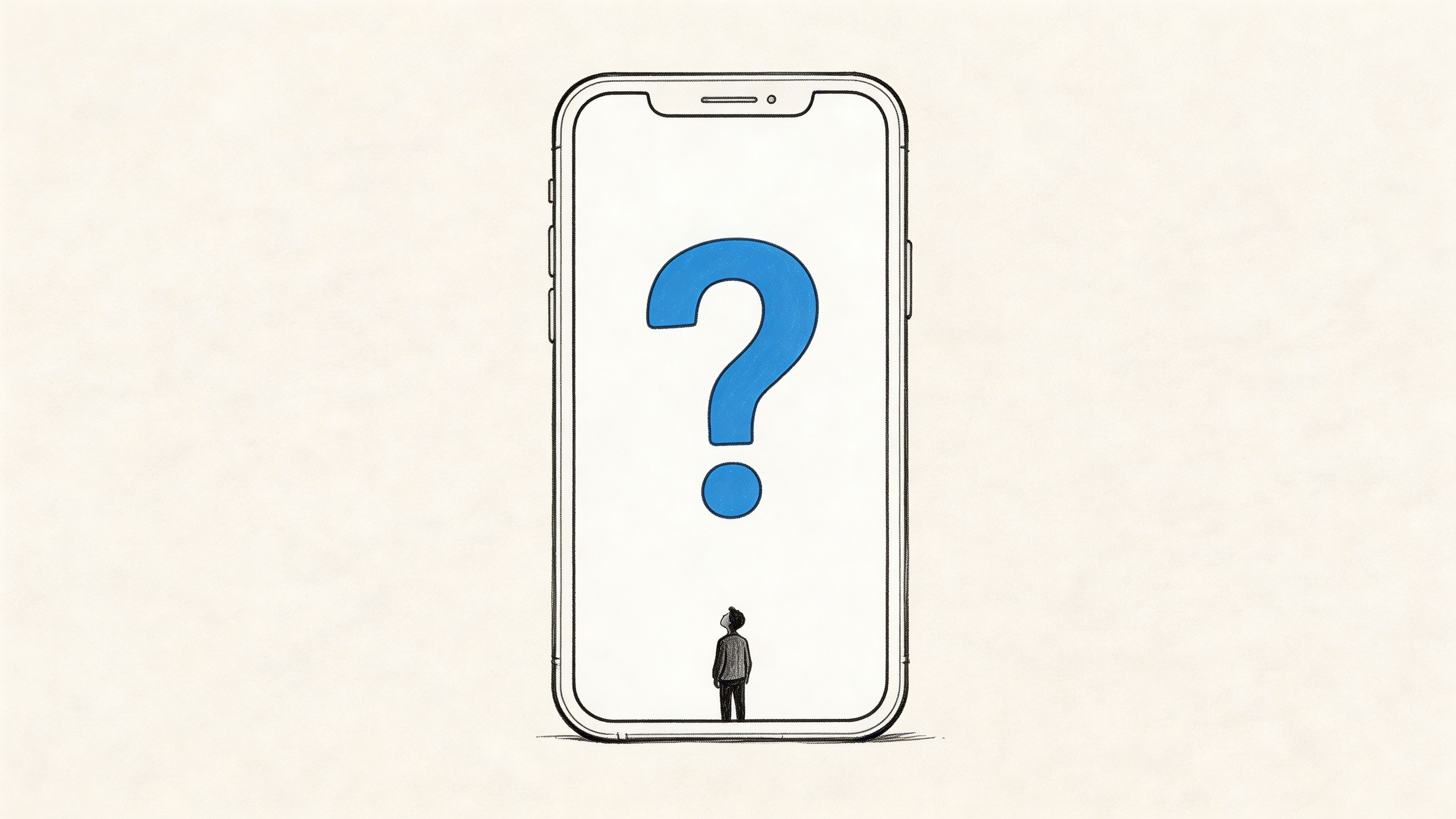
2. The Question Hook
A good question hook earns attention because the brain wants closure.
Not every question works. “Want better results?” is weak because it is generic and predictable. “Why are your workouts getting worse even though you train more?” is stronger because it points at a specific pain point and implies there is an answer worth hearing.
The best question hooks feel like they were pulled from the audience’s internal monologue.
The difference between weak and strong questions
Weak questions ask for agreement. Strong questions trigger self-diagnosis.
A project management tool saying, “Tired of switching between apps?” can work if the visual immediately shows fragmented tabs, Slack pings, and missed tasks. A game ad asking, “Can you beat level 47?” works because the viewer can instantly imagine themselves trying. A fintech app asking, “Where did your paycheck go this month?” lands because it calls out a familiar frustration.
The question should create a gap, but the next frame has to start closing it. Otherwise it feels like bait.
That is why I like a simple rhythm for this hook type:
- Ask the question fast: one sentence, plain language.
- Show proof immediately: screen recording, demo, UGC reaction, or a clear visual answer.
- Move to the payoff: explain what changes with your product.
Question hooks also translate well across channels. The same psychology behind curiosity-driven openings appears in email. The verified material notes that curiosity-gap subject lines produced higher open rates in email contexts, which supports the same basic principle when adapted to paid social.
How to produce question variants at speed
This hook type benefits from audience segmentation more than almost any other format. Parents ask different questions than founders. New users ask different questions than lapsed users.
That makes script organization important. If you are building these at scale, save questions by pain point, audience segment, and stage of awareness. A system like script for advertising is useful because it forces the team to tie each opening line to a real problem instead of writing generic prompts.
A practical way to test question hooks:
- By pain point: “Why am I always behind?” versus “Why does planning never stick?”
- By tone: empathetic, urgent, playful, skeptical.
- By visual answer: founder cam, product demo, testimonial, split-screen comparison.
What usually fails is overcomplication. If the viewer has to parse the sentence, the hook is already too slow. The line should sound like something a real customer would say out loud.
3. The Controversy Contrarian Hook
This hook works because people stop for disagreement.
A contrarian opening states a position that cuts against familiar advice, category norms, or platform clichés. It creates tension because viewers either agree strongly or want to challenge it. Both reactions can create attention.
Examples are everywhere. Fitness creators say cardio is hurting gains. SaaS brands claim productivity tools create more busywork. Onboarding ads say you should try the product before creating an account. The strongest version is not inflammatory for its own sake. It is specific, defensible, and tied to the product truth.
Why this hook can outperform safer creative
Many ads lose before they begin because they sound like category wallpaper. Contrarian hooks reject the wallpaper.
If every competitor says, “Get organized,” the stronger opening might be, “Your to-do list is the reason nothing gets finished.” If every wellness brand says, “Build more discipline,” the opening could be, “Discipline is not your problem. Friction is.”
That kind of line does two things at once. It interrupts the scroll, and it positions the brand.
There is a real trade-off, though. Strong contrarian hooks often increase comments and conversation, but they can also attract low-intent engagement or defensive reactions. That is not automatically bad. Comments can reveal whether the angle is sharp in the right way or just needlessly polarizing. But if the body cannot support the opening, the ad collapses into empty provocation.
A contrarian hook should challenge a belief, not reality. If the body cannot prove the claim, tone it down.
How to keep it credible
The body of the ad needs evidence fast. That evidence can be product footage, customer testimony, or a clear explanation of why the common belief fails in this situation.
One verified example from hook testing makes the point well. In an A/B test summarized by Zeely’s review of scroll-stopping hooks, the line “What if you could boost sales by 50% in one month?” produced a higher click-through rate than “Ready to boost sales?” The important lesson is not to copy the number. It is that sharper, more provocative framing often beats soft, generic framing when backed by a more compelling promise.
For scale, create a ladder of intensity:
- Mild contrarian: “Most planners make teams slower.”
- Medium contrarian: “Your workflow tool is causing the chaos.”
- Strong contrarian: “Stop organizing. Start deleting.”
Then test how far the audience will go with you before trust drops. AI production helps because you can keep the same body and CTA while swapping only the claim intensity.
This hook is especially effective for mature categories where buyers think they already know the solution. The ad earns attention by challenging the category’s default story.
4. The Extreme Transformation Benefit Hook
Some products sell best when the end state is obvious immediately.
Transformation hooks do that. They lead with the desired outcome first, then explain how it happened. In direct response, this can be powerful because it answers the user’s first question before they ask it. “What do I get?”
The catch is credibility. The more extreme the promise, the more carefully the body has to prove it.
Show the payoff before the process
Before-and-after formats are common because they work when the result is visible. Fitness, editing apps, language learning, creator tools, and productivity products all use this structure. One side shows the old state. The other shows the improved state. The viewer understands the value in a fraction of a second.
That speed matters. The verified material notes that ad view times average only a couple of seconds on Facebook and Instagram, reinforcing the need to front-load the benefit where the user can grasp it immediately. If the result is buried later in the video, many users never see it.
For a note-taking app, the transformation might be chaos to organized dashboard. For a budgeting app, it might be anxious checking to calm visibility. For a creative tool, it might be raw footage to polished asset.
What works and what gets flagged as hype
A believable transformation hook is concrete. A weak one is inflated.
Good:
- “From scattered receipts to one clear spending view.”
- “From three tools to one workflow.”
- “From rough clip to ready-to-publish ad.”
Bad:
- “Change your life overnight.”
- “Instant success.”
- “Everything solved in days.”
If you make a strong claim, back it up quickly with mechanics. Show the feature. Show the sequence. Show the user doing the work with the product.
For teams building direct response creative, direct response video ads is a useful framing resource because this hook performs best when the creative moves from outcome to proof to action without dead space.
A practical production setup:
- Lead with the end state: split-screen, reveal frame, or visual result.
- Prove the bridge: screen recording, workflow breakdown, testimonial clip.
- Keep the CTA aligned: ask for the next step that matches the promise.
This is also one of the easiest hooks to systemize with AI rendering. If your team has a reusable set of “before” and “after” assets, you can combine one result with many audiences and messages quickly. Just avoid overclaiming. Extreme benefit hooks produce attention fast, but they lose efficiency just as fast when the promise feels detached from reality.
5. The Social Proof Authority Hook
When a brand is unfamiliar, credibility has to arrive early.
Authority hooks do that by showing signs the product is real, trusted, or already validated by other people. This can be a customer testimonial in the first frame, a recognizable creator using the product, a press mention, a platform badge, or a credible expert speaking directly to camera.
The aim is not to brag. The aim is to lower skepticism before the user scrolls away.
Why authority works best for colder audiences
Cold traffic has no reason to trust your claims. That is why authority hooks often work better higher in the funnel than benefit-heavy openings.
The strongest versions are visual and immediate. Think app store badge, recognizable interface with a known creator, or a customer saying the result in plain language. If the proof takes too long to decode, it loses force.
One reason video still dominates here is retention. The verified material notes that viewers retain far more information from video than text, which helps explain why social proof lands harder when a real person says it, or when the proof appears on screen in motion instead of as a static claim.
How to use this hook without looking corporate
Many authority ads fail because they look like investor decks.
The fix is simple. Pair the proof element with human context. Instead of flashing logos with dramatic music, open with a user saying what changed. Instead of leading with a credential title card, show the expert solving a problem.
A few practical forms:
- Customer-first: user selfie clip, then product demo.
- Badge-first: award or platform mention, then proof of use.
- Creator-first: recognizable face using the product naturally.
If your team works with testimonial clips, review user-generated content strategy for a more native way to package social proof. UGC often carries authority better than polished brand footage because it looks like social content, not a boardroom presentation.
What to avoid:
- Stacking too many proof elements at once.
- Using logos that are hard to read on mobile.
- Leaning on prestige markers that do not matter to the buyer.
Authority should answer one question fast. “Why should I believe this?” If the answer is clear in the first beat, this hook can outperform more dramatic openings for products that need trust before desire.
6. The Emotion Aspiration Hook
Not every winning hook starts with logic.
Some start with a feeling the viewer wants, fears, or recognizes immediately. Relief. Belonging. Confidence. Calm. Pride. Emotional hooks work because people often decide first with instinct and justify later with reason.
That makes this format especially useful for wellness apps, community products, finance tools tied to stress reduction, relationship products, and any offer where the outcome is emotional before it is functional.

Start with the feeling, then earn the click
A strong emotional hook often looks simple. A relieved face after paying off debt. A runner crossing a finish line. Someone finally sitting still and breathing. A creator smiling at a clean dashboard after chaos.
These hooks work best when the emotion is visually legible without explanation. The viewer should understand the feeling before the voiceover even finishes.
There is also a practical reason this format keeps winning. Visual posts consistently outperform text-only formats in the verified material, and user-generated visuals increase engagement further. That does not mean every ad needs cinematic storytelling. It means the opening emotion needs to be visible, not just described.
If the viewer has to listen closely to understand the emotion, the hook is doing too much work with words and not enough with visuals.
The trade-off often overlooked
Emotion alone rarely closes the sale. It opens the door.
That means the body needs to supply the rational bridge quickly. If the opening says “feel calmer,” the body should show how. If the opening says “find your people,” the body should show community mechanics or onboarding. If the opening says “finally in control,” the body should show the feature that creates control. AI-generated b-roll can help if your team lacks footage variety in this area. Aspirational or mood-led openings can be produced faster when you have a system for generating fresh visual scenes, then storing them with reusable body segments and CTAs.
A simple test framework:
- Relief versus ambition
- Belonging versus confidence
- Calm versus urgency
Different emotions pull different users. Some audiences convert on aspiration. Others convert on pain relief. The hook reveals which story the market wants to hear first.
7. The Specificity Data Hook
A precise number can buy attention fast because it signals evidence, not copywriting.
That matters most with skeptical buyers. Broad claims blur together. A concrete figure gives the viewer something to evaluate in the first second, which is often all the time the hook gets.

The right way to use numbers in hooks
Specificity only works when the number is relevant and easy to process on mobile. If the stat feels cherry-picked, too academic, or disconnected from the offer, trust drops instead of rising.
The better approach is simple. Put one clear number on screen, tie it to a real outcome, and make the framing obvious. A line like “30% lift in engagement, A/B test, 6 weeks” does more work than “better results” because it gives the claim edges. The viewer can agree, question it, or stay curious. All three responses are better than indifference.
Category-level numbers can work too, but only if they sharpen the decision the viewer needs to make. For example, if the ad is teaching a team to improve first-frame performance, a speed-to-judgment stat can reframe the whole problem quickly. The point is not to turn the hook into a research slide. The point is to make the promise feel grounded.
Where teams waste this hook
They add numbers that sound impressive in a script doc but do nothing in-feed.
A data hook needs one job:
- Expose a problem
- Prove a result
- Set a benchmark
If the number does not do one of those, cut it.
“Most viewers leave before your message starts” can frame the problem. “A/B test winner shown on screen” can prove the claim. “Your opening frame has a tiny window to work” can establish the benchmark without overloading the creative with detail.
This hook also has a production trade-off. Specificity increases credibility, but it reduces flexibility. A vague benefit line can be reused across five offers. A stat-based hook usually needs version control, legal review, and cleaner sourcing. That is why high-output teams build these in batches. One source claim becomes multiple hook angles, visual treatments, and audience variants. AI tools help here by turning approved proof points into dozens of testable first-frame concepts without rewriting the underlying claim each time.
For teams testing this systematically, hook rate benchmarks and measurement methods for Meta ads are the right reference because this format lives or dies on front-end performance. Track whether the stat improves thumb-stop rate, hold rate, and downstream conversion quality. A number that wins attention but attracts the wrong click is not a strong hook. It is just a flashy opener.
The strongest specificity hooks look built for the feed. Large text. Clean contrast. One idea per frame.
8. The Pattern Trend Hook
This hook wins by naming something the audience already feels is true.
It starts with an observation, not a claim. A shift in behavior. A new norm. A frustration that has become common. When the viewer recognizes the pattern, the ad feels relevant before the pitch even starts.
This can be especially strong for products in crowded markets because recognition creates instant rapport.
Recognition is the mechanism
A subscription app might open with, “Everyone is paying for tools they forgot they signed up for.” A creator product might say, “Creators are tired of rebuilding strategy every time the algorithm changes.” A hiring tool might say, “Teams keep adding meetings because no one trusts the process.”
The line works when the audience hears it and thinks, yes, that is exactly what is happening.
This kind of hook also ages quickly. Trends shift. User language changes. Community frustrations mutate. So pattern hooks should be refreshed more often than authority hooks or emotion hooks.
The verified material includes one especially useful idea here. It notes that in some markets, verbal hooks can outperform visual ones, and that platform behavior may vary by region and audience. Even if you are not using the cited future-facing market figures as a current benchmark, the strategic lesson is clear. Trends are not universal. A pattern that resonates with U.S. SaaS buyers may not land with gaming users in another region.
How to keep these hooks current
Mine the audience’s language directly. Reddit threads. TikTok comments. App store reviews. Sales calls. Creator communities. Support tickets. Those are all pattern libraries.
Good pattern hooks usually have three parts:
- Recognizable situation: a thing the audience sees often.
- Reason it matters: why the pattern creates pain or opportunity.
- Product relevance: the bridge to your solution.
What fails is trend-chasing without buyer relevance. Just because a sound, meme, or format is popular does not mean it belongs in the ad. The hook should validate the audience’s reality, not advertise the brand’s social awareness.
This is one of the easiest hook types to systemize inside a creative workflow. Store trend observations with dates, audience tags, and examples. Then rotate them quarterly. AI can help turn those observations into opening lines fast, but the raw material still needs to come from the market.
8 Scroll-Stopping Hook Types Compared
| Hook | 🔄 Implementation Complexity | ⚡ Resource Requirements | ⭐ Expected Outcomes | 💡 Ideal Use Cases | 📊 Key Advantages |
|---|---|---|---|---|---|
| The Pattern Interrupt Hook | Moderate: creative edits & unexpected visuals | Medium: visual assets, editing; scalable via templates | High ⭐: strong initial attention; conversion depends on follow-through | Mobile-first short-form feeds (TikTok, Meta) | Stops scroll quickly; easy A/B testing |
| The Question Hook | Low: text/voiceover copy-based | Low: copy, basic editing | High ⭐: curiosity-driven engagement; intent-aligned | Problem-solution ads, UGC, SaaS demos | Directly addresses pain points; scalable across segments |
| The Controversy/Contrarian Hook | Medium-High: careful framing & moderation needed | Medium: validation assets, community monitoring | High ⭐: strong shares/comments; risk of backlash | Brand positioning, opinion-led creators, viral plays | Generates discussion & reach; memorable positioning |
| The Extreme Transformation/Benefit Hook | Medium: requires compelling before/after proof | Medium-High: real results, testimonials, compliance checks | High ⭐: clear ROI signal; high completion if credible | Fitness, app installs, direct-response offers | Communicates dramatic value quickly; drives intent |
| The Social Proof/Authority Hook | Low: overlay badges/logos or endorsements | Low-Medium: credentials, permissions, assets | Medium-High ⭐: builds trust; improves conversions | New brands, B2B/high-consideration products | Reduces skepticism; establishes legitimacy fast |
| The Emotion/Aspiration Hook | High: strong storytelling, mood, casting | High: production, music, authentic performances | High ⭐: high memorability & shareability; conversion varies | Lifestyle, wellness, community-driven campaigns | Builds brand affinity and long-term loyalty |
| The Specificity/Data Hook | Low-Medium: source data + clear visualization | Low-Medium: research, design, citations | High ⭐: credibility and trust; persuasive for decisions | B2B, case studies, research-led marketing | Fact-based persuasion; hard to dismiss when sourced |
| The Pattern/Trend Hook | Medium: requires timely cultural insight | Low-Medium: trend monitoring, quick production | Medium-High ⭐: strong resonance when current | Trend-capture campaigns, niche communities, creators | Validates audience experience; drives shares and tagging |
From Hooks to Wins Scaling Your Creative Strategy
Knowing the eight hook types is useful. Building a system around them is what changes results.
Many teams still treat hooks like copywriting moments. They brainstorm a few lines, pick a favorite, make one ad, and hope the algorithm validates their taste. That approach is slow, expensive, and hard to learn from. It also hides the main variable. The opening often determines whether the rest of the ad gets a chance at all.
A better approach is modular. Treat the hook, body, and CTA as separate components. Build several versions of each. Then combine them deliberately.
One body can support multiple hooks. The same product demo might work with a question hook, a contrarian hook, a specificity hook, and a trend hook. The CTA may stay constant while the top frame changes. That is good news for production because it means creative scale does not always require shooting entirely new ads.
This matters even more because the verified material points to a real shift in engagement behavior. One source notes that while the initial decision window is compressed, successful content can hold attention longer once it earns that first stop. That means hook testing is not only about raw stop rate. It is about matching the right opening promise with a body that pays it off.
In practice, that means measuring several layers:
- View initiation: did the opening stop the scroll?
- Watch duration: did the body justify the hook?
- Click behavior: did curiosity convert into action?
- Post-click quality: did the promise align with the landing experience?
Teams also need to separate “noisy success” from useful success. A controversial hook can drive comments without driving purchases. An emotional hook can increase view-through without lifting install quality. A data hook can attract attention from the wrong audience if the stat is interesting but irrelevant. Good creative strategy means diagnosing which part of the chain is working and which part is leaking.
Process starts to matter more than inspiration at this point.
A practical operating model looks like this:
- Build hook libraries by type: pattern interrupt, question, contrarian, transformation, authority, emotion, specificity, trend.
- Tag assets by function: opening clip, proof clip, demo clip, testimonial, CTA.
- Keep audience context attached: awareness stage, pain point, market, platform.
- Refresh on a cadence: winning hooks fatigue. Trend hooks age fast. Authority hooks often last longer.
- Review comments and watch behavior together: sometimes the audience tells you why the hook is working or failing.
This is also the point where AI platforms can earn their keep. Used well, they reduce manual editing, help teams search and reuse the right clips, generate fresh hook variants, and render many combinations quickly enough to support ongoing testing. Sovran is one example that fits this workflow because it is built around modular Hook-Body-CTA production, asset tagging, bulk renders, and direct deployment for Meta and TikTok. That is not a substitute for strategy. It is a way to operationalize strategy faster.
The core principle is simple. Stop trying to guess the perfect hook in advance. Build a repeatable way to test multiple credible hooks against the same offer, then let performance narrow the field. Over time, your team stops debating taste and starts accumulating evidence. That is when hook writing becomes a growth function instead of a creative gamble.
If your team wants to turn these hook frameworks into a repeatable production system, Sovran is built for that workflow. You can upload clips once, tag them into reusable parts, generate Hook-Body-CTA variations, batch-render many versions, and push creatives into testing faster without rebuilding each ad manually.

Manson Chen
Founder, Sovran
Related Articles
Demographic Targeting: A Performance Marketer's Guide 2026
Choose Your App Advertising Agency Wisely: 2026 Guide