CTA Overlay vs Verbal CTA: A 2026 Performance Guide
Jump to a section
- The Ultimate CRO Question for Video Ads
- Comparing Visual vs Auditory Calls to Action
- When to Use CTA Overlays for Maximum Impact
- The Power of the Spoken Word When to Use Verbal CTAs
- How CTA Performance Varies on Meta and TikTok
- How to A/B Test and Scale Your CTA Strategy
- Frequently Asked Questions About Video CTAs
Organizations often ask the wrong question about video CTAs.
They ask, “Are CTA overlays better than verbal CTAs?” The better question is, “Which CTA format fits this campaign, this audience, and this feed behavior?” That shift matters because CTA overlay vs verbal CTA isn't a universal winner-takes-all decision. It's a testing problem.
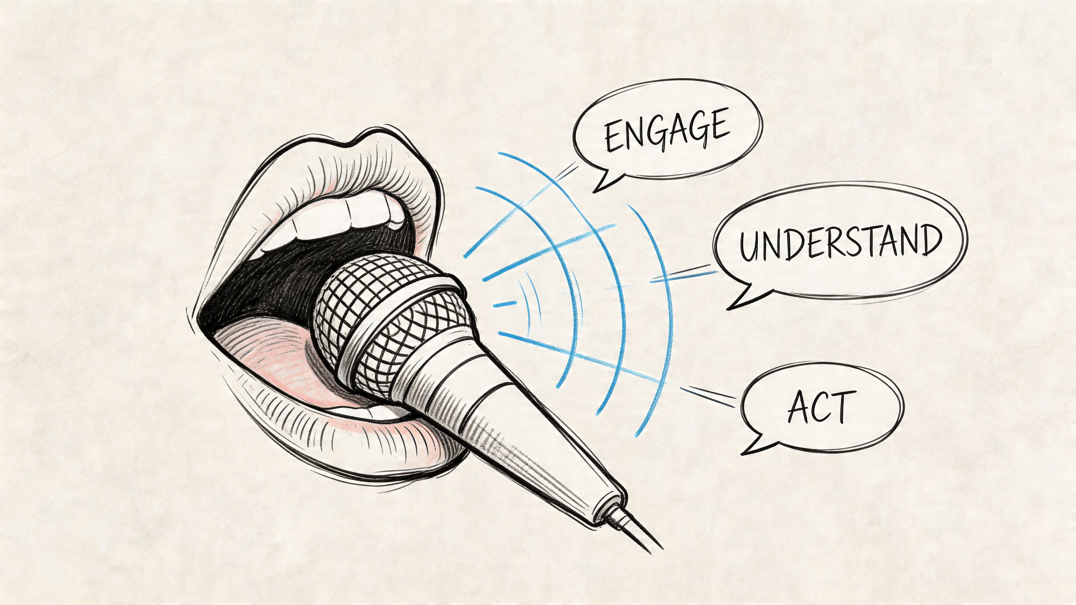
A CTA overlay is the on-screen prompt inside the video itself. Usually text, a button-style graphic, or a directional visual cue. A verbal CTA is the spoken instruction in the audio track, whether that comes from a founder, creator, actor, or AI voiceover.
Both can work. Both can fail. A polished overlay can feel too salesy if it interrupts the story. A strong spoken CTA can disappear completely if the user never turns sound on. That's why creative strategy has to account for viewing conditions first, not just copy.
If you're building direct-response assets, this is the same discipline that separates disposable ads from high-converting video sales letters. The CTA isn't an isolated line. It's part of the conversion architecture. The ending, the pacing, and the delivery all shape whether the ask lands. If you're reworking ad endings, the practical guidance in how to end a video ad is useful because CTA performance often collapses at the handoff between body and close.
The Ultimate CRO Question for Video Ads
The critical CRO question isn't which CTA type wins in theory. It's which one wins under your delivery conditions.
On Meta, a user may only give you a glance. On TikTok, a creator-style read might carry more trust if the ad feels native. In a B2B demo, a spoken CTA can sound more credible than a flashing button. In a discount-led DTC ad, the opposite is often true. Context decides the role of the CTA.
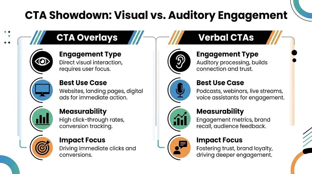
Two CTA formats, two jobs
A CTA overlay does one thing extremely well. It makes the desired action visible without asking the viewer to process audio.
A verbal CTA does something different. It carries tone, urgency, and persuasion inside the narrative itself.
That distinction matters because performance marketers often treat CTAs like copy swaps. They're not. They're delivery mechanics.
Practical rule: Choose the CTA format based on how the ad is likely to be consumed, not how it was edited in the studio.
What actually changes performance
Three variables usually determine whether overlay or verbal wins:
- Viewing mode: Sound-on and sound-off behavior changes what the audience can even perceive.
- Offer complexity: Simple asks often benefit from visual clarity. Higher-intent asks may need verbal framing.
- Creative style: UGC, founder-led, testimonial, app demo, and motion graphic ads don't carry the CTA the same way.
That means the right answer isn't “always use overlays” or “spoken CTAs feel more human.” The right answer is to build a repeatable testing method. That's what matters when you're launching lots of iterations across Meta and TikTok.
Comparing Visual vs Auditory Calls to Action
Which CTA format gives you more signal, faster, when you're testing creative at volume?
The useful answer is not "overlay" or "verbal." It is knowing which format isolates the variable you want to learn. A CTA overlay tests clarity and visibility. A verbal CTA tests how well the ask fits the script, voice, and pacing. If a team is iterating quickly across Meta and TikTok, that distinction matters more than arguing about a universal winner.
A practical way to compare them is to judge each format by three questions. Can the viewer notice the ask immediately? Does the ask make sense in the tone of the ad? Can the team swap the CTA without rebuilding the whole asset? Those criteria usually decide whether a test is useful or noisy.
CTA Overlay vs. Verbal CTA At a Glance
| Criterion | CTA Overlay (Visual) | Verbal CTA (Auditory) |
|---|---|---|
| Primary strength | Immediate visibility | Natural persuasion inside the script |
| Best environment | Fast-scroll feeds and muted viewing | Audio-on viewing and story-led ads |
| User processing | Seen quickly, low dependency on audio | Heard in context, depends on attention to sound |
| Click intent | Direct and explicit | Often stronger when the ask needs explanation |
| Creative flexibility | Easy to swap copy, color, placement, and format | Easy to change tone and phrasing in script reads |
| Common failure mode | Looks intrusive or generic | Gets missed if the viewer never hears it |
| Best fit | Direct-response, offers, app install, product ads | B2B, demos, founder reads, creator-native storytelling |
What changes in real testing
Overlay tests are usually cleaner. The body of the ad stays intact while the team changes one on-screen prompt, placement, or treatment. That makes overlays easier to use in high-velocity systems where dozens of variants need to go live without sending every edit back through post-production. Teams building modular creative libraries often use resources like video CTA testing ideas for different ad types to keep those variables organized.
Verbal CTA tests are messier, but sometimes more revealing. A spoken line changes more than the ask itself. It changes tone, trust, cadence, and how the close feels inside the story. That can be a strength if the campaign depends on credibility, but it also means weaker test hygiene because several variables shift at once.
This is the trade-off. Overlays are easier to standardize. Verbal CTAs are harder to isolate.
Where each format earns its place
Overlays usually make more sense when the job is immediate action and the offer is already clear. The viewer sees the prompt, understands the next step, and can act without waiting for more explanation.
Verbal CTAs usually make more sense when the ask needs framing. A creator explaining why to try the product, or a founder inviting the viewer to book a demo, can make the CTA feel more credible and less forced than a graphic layered on top.
Using both can work well, but only if each one plays a different role. For example, the spoken CTA can explain why to act, while the overlay makes the action unmistakable. If both say the same thing in the same moment, the ad often feels over-produced or repetitive.
The best CTA format is the one that gives you a clearer test read for that campaign objective, audience, and editing workflow.
For teams using platforms like Sovran to run rapid iteration, that is the framework. Start with the CTA format that is easiest to vary cleanly, then add the second format only when the first stops improving performance or fails to match the creative style.
When to Use CTA Overlays for Maximum Impact
What should the viewer be able to do before the ad finishes?
That question usually decides whether an overlay should carry the CTA. If the offer is already easy to grasp and the campaign is optimized for fast action, a visible prompt gives you a cleaner path to test and scale. On Meta and TikTok, that matters because short watch times and rapid thumb-stop decisions leave little room for a soft or delayed ask.
According to Benly’s CTA optimization guide, contrasting button overlays increase CTR by 33%, directional arrows add another 18%, specific visual CTAs outperform generic ones by 42%, text overlay CTAs average 13% conversion rates, and mid-roll overlay placements reach 16.95% conversion rate. I would not treat those numbers as universal benchmarks, but the pattern is useful. Clear visual instruction tends to help when the viewer already understands the offer and just needs the next step.
Where overlays usually win
CTA overlays do their best work in ads with low explanation burden and high testing volume.
That includes:
- Offer-led DTC ads: discounts, bundles, free shipping, and limited-time promos
- App install campaigns: direct prompts like “Download Now” or “Start Free Trial”
- Gaming and fast-cut UGC: footage moves too quickly to rely on a spoken close alone
- Meta feed placements: users often decide before they hear or process a full sentence
- TikTok variants built for retention testing: keeping the CTA editable lets teams isolate one variable at a time
The practical advantage is test hygiene. An overlay can be swapped without changing the creator read, pacing, or close. For teams running high-velocity iteration through platforms like Sovran, that makes overlays easier to turn into a repeatable testing system instead of a one-off creative opinion.
What to test first
A strong overlay usually comes down to three controllable variables.
- Contrast: the CTA has to separate from the footage immediately on mobile
- Specificity: “Claim My Discount” gives a clearer action than “Learn More”
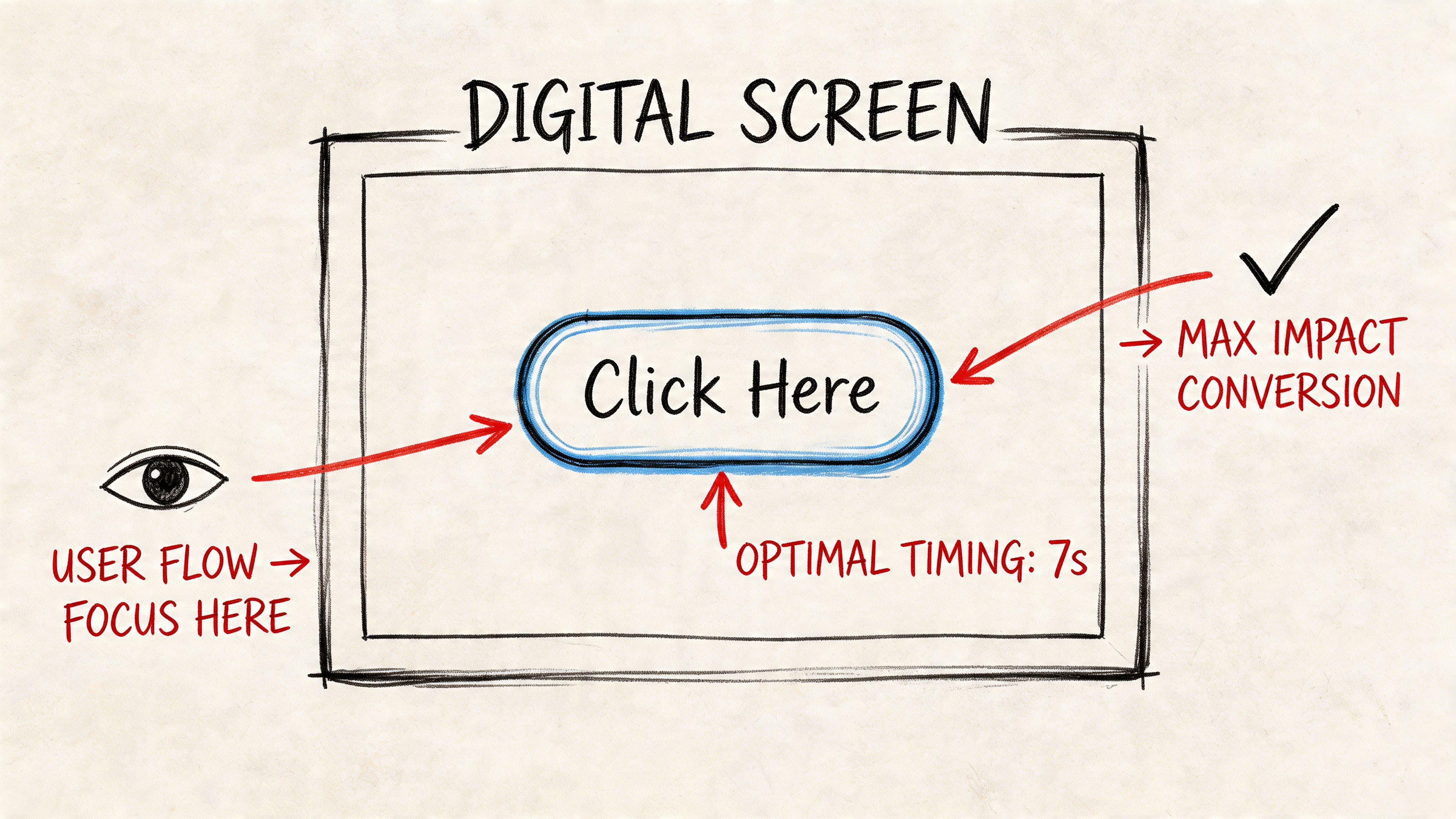
- Timing: mid-roll often works well because the prompt appears before attention drops
This is the part many teams miss. The right question is rarely “overlay or verbal?” The better question is “which CTA variable can we isolate fastest across 10 to 20 edits?” In practice, I start with overlay copy and timing, because they are easier to standardize across creators, hooks, and offers. If you need a faster production loop, tools for adding text overlays in a video editor make it easier to swap language, color, and placement without rebuilding every asset.
Common overlay failures
Poor overlays usually fail for production reasons, not strategic ones.
- Text is too small for mobile viewing
- Color blends into the footage
- The ask is generic and could fit any ad account
- The CTA appears too late to influence action
- Multiple prompts compete in the same 15 to 30 seconds
One more trade-off is worth calling out. Overlays are fast to produce, but they can feel mechanical if every ad uses the same button treatment. That is where testing breadth helps. Rotate between direct-response overlays, softer instructional overlays, and creator-native text treatments so the CTA stays clear without making the ad feel templated.
If your workflow also includes synthetic narration or rapid voice variants, pair that process with the visual CTA instead of replacing it outright. Teams experimenting with audio at scale often create AI voice overs for videos while keeping overlays editable, which makes it easier to test message delivery and on-screen action as separate variables.
The Power of the Spoken Word When to Use Verbal CTAs
Verbal CTAs are strongest when the ad needs more than a click. They work when the viewer needs reassurance, context, or a reason to trust the next step.
That's why spoken CTAs often perform well in B2B, app user acquisition with feature education, and founder-led or creator-led ads. In audio-enabled environments, verbal CTAs can drive 25% higher submission rates than overlays, and spoken hooks like “Claim Your Spot Now” can boost views-to-submissions by 32%, according to HubSpot’s CTA performance analysis.
Why spoken CTAs persuade differently
A spoken CTA can carry nuance that a button can't.
Tone matters. Pace matters. A calm instruction from a founder or creator can make a higher-friction step feel reasonable. “Book a demo if you want to see how this would work for your team” lands differently from a button that says “Book Now.” The second is more forceful. The first can feel consultative.
That difference becomes useful when your audience is evaluating, not impulse-buying.
Formats where verbal CTAs make sense
These are the placements where I’d actively test spoken CTAs first:
- B2B explainers: The ask often needs context and confidence.
- Feature-led app ads: The voiceover can connect the product benefit to the next step.
- Creator-style TikTok ads: Spoken language often feels more native than polished graphic treatment.
- Founder videos and testimonials: Trust comes through the speaker as much as the words.
If you're producing lots of variations, voice delivery becomes part of the test matrix. Teams using synthetic reads often review guides on how to create AI voice overs for videos to speed iteration while keeping pacing and tone consistent. If voice is central to your workflow, AI character voice approaches are also useful for making spoken CTAs feel less flat.
Script patterns that usually work
A few verbal structures consistently hold up:
“If you want to see how this works for your brand, book a demo.”
That works because it connects desire to action.
Creative note: First-person phrasing often sounds more natural in spoken CTAs than command-style copy.
Other strong patterns include:
- Outcome-first: “Try it if you want faster reporting without another dashboard.”
- Invitation style: “Join the beta if you want early access.”
- Problem-to-action: “If this workflow is slowing your team down, start a free trial.”
What weak verbal CTAs sound like
Most underperforming spoken CTAs fail for one of three reasons. They arrive too late, they sound scripted in a bad way, or they ask for action without tying it to the value just shown.
The best spoken CTA doesn't interrupt the ad. It sounds like the natural conclusion of the ad.
How CTA Performance Varies on Meta and TikTok
Meta and TikTok reward different CTA behaviors because people consume ads differently on each platform.
On Meta, sound-off viewing is a major constraint. Hookstudio reports that sound-off viewing accounts for up to 85% of views on platforms like Meta, and eye-tracking data shows on-screen text overlays capture 87% viewer attention in those scenarios, according to their analysis of CTA placement in short-form feeds. If the CTA only exists in the voiceover, a large share of viewers won't receive the instruction at all.
Meta needs visible intent
On Facebook and Instagram, the practical implication is simple. Your CTA has to survive silent scrolling.
That usually means:
- Prioritize overlay-led versions for prospecting
- Make the offer readable quickly
- Use the verbal CTA as reinforcement, not the only instruction
- Treat end cards cautiously, because many users decide before the final beat
This is why overlay-first testing tends to be the safer starting point on Meta, especially for DTC, app, and broad audience campaigns.
TikTok allows more tonal flexibility
TikTok is different. Users are often more open to creator voice, direct speech, and less polished delivery. A spoken CTA can feel native if it sounds like part of the content rather than part of the ad unit.
That doesn't mean overlays stop mattering. It means the role shifts. On TikTok, overlays often support the spoken line rather than replace it. Short text reinforcement, especially around the offer or next step, can help the CTA stay clear without making the creative feel overbuilt.
Platform strategy in practice
A useful operating rule is:
- Meta: Start with visual clarity, then test spoken reinforcement.
- TikTok: Start with native verbal delivery, then add lightweight visual support where needed.
The teams that get this right don't chase a universal CTA winner. They adapt the CTA format to the way users consume each feed.
How to A/B Test and Scale Your CTA Strategy
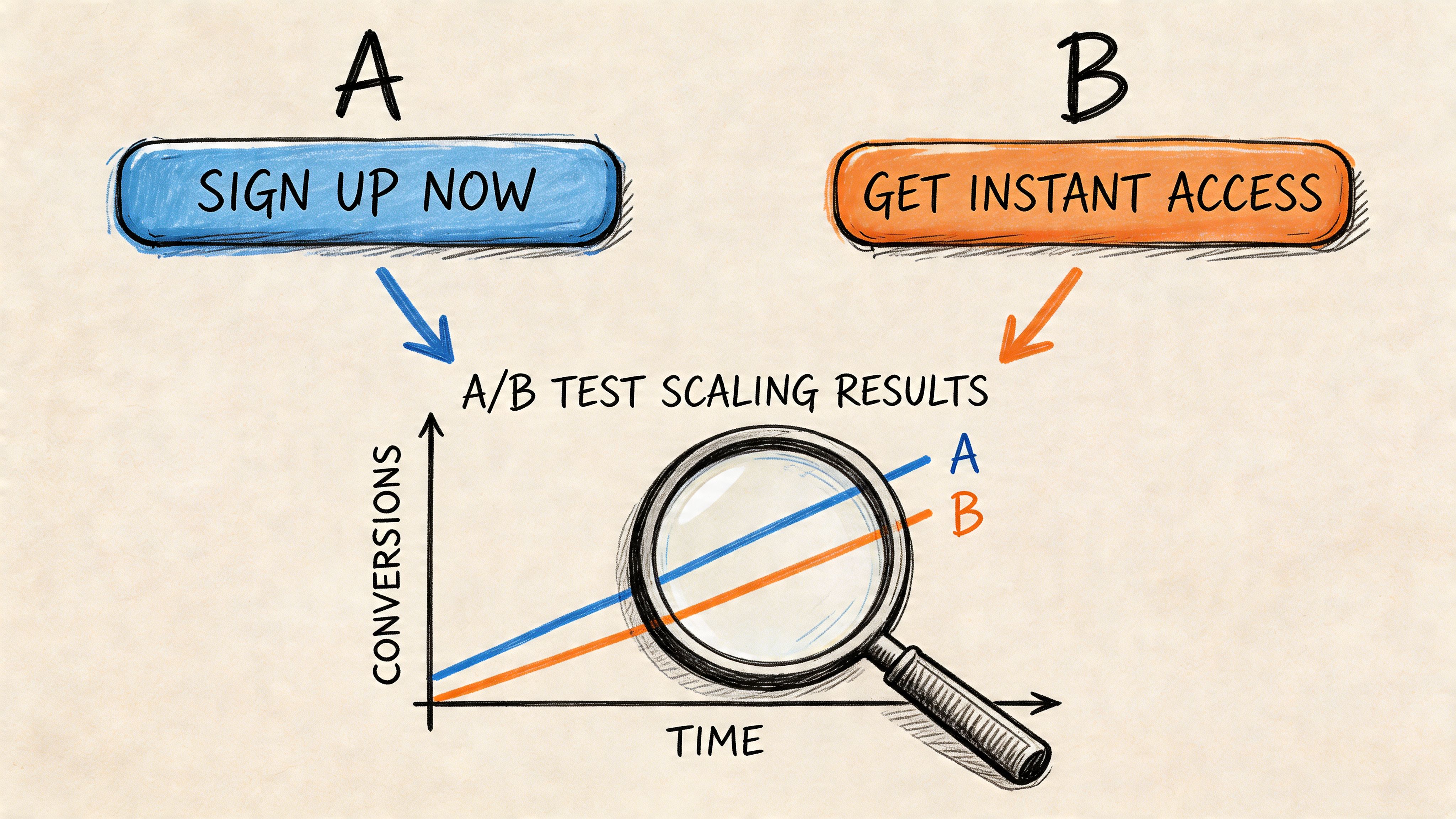
The fastest way to lose signal in CTA testing is to change too many variables at once.
If you want a real answer on CTA overlay vs verbal CTA, isolate the CTA and keep the rest of the ad stable. Same hook. Same body. Same offer. Same landing destination. Change the CTA format, placement, phrasing, or delivery one variable at a time.
Build a modular CTA testing matrix
The cleanest testing structure is Hook, Body, CTA.
Keep hooks and bodies as reusable modules. Then rotate the CTA layer separately. That gives you a usable matrix without turning every ad into a unique production project.
A practical setup looks like this:
- Choose one hook and one body that already have stable delivery
- Create CTA variants by format
- Overlay only
- Verbal only
- Hybrid overlay plus verbal
- Then create phrasing variants
- “Start My Free Trial”
- “Get My Free Trial”
- “Try It Free”
- Then test timing
- Mid-roll
- Late body
- End card reinforcement
A high-velocity workflow matters. If your process requires manual re-editing for every CTA, testing slows down and your team starts skipping useful variants. For teams building lots of combinations, video creative testing workflows matter because they let you keep the ad modular instead of rebuilding exports from scratch.
Track the right KPI for the CTA’s job
Don't evaluate every CTA on CTR alone.
If the ad is meant to drive direct clicks, CTR deserves priority. If the CTA asks for a demo, lead form, or higher-consideration action, post-click quality matters more. A CTA can generate more clicks and still produce weaker downstream results.
I usually sort CTA tests into three buckets:
- Click-driving CTA tests: Prioritize CTR and landing-page continuation.
- Submission-driving CTA tests: Prioritize form starts and completed submissions.
- Efficiency tests: Look at CTR and downstream conversion together, not in isolation.
Test the CTA against the business outcome it controls. Don't reward a CTA for attracting the wrong action.
Organize assets for scale
The operational problem is usually bigger than the strategy problem. Teams know they should test more CTA variations. They just can't produce them fast enough.
One workable method is to maintain a CTA asset library with:
- Pre-approved overlay styles
- Reusable spoken CTA scripts
- Tagged versions by platform, offer, and funnel stage
- Naming conventions for timing and placement
Sovran is one option for this kind of workflow. It supports modular video assembly, bulk text overlays, asset tagging, and reusable CTA components, which is useful when teams need to swap CTA formats across many variants without changing the rest of the ad.
After the first rounds of testing, review winners by platform, offer type, and creative style. Don't just label one CTA as a winner globally. A spoken CTA that works in founder-led TikTok ads may not carry a Meta prospecting campaign. The point is to build a repeatable decision system, not a single creative opinion.
A short walkthrough helps if you're structuring this process internally:
A simple decision framework
If you need a fast call before launch, use this framework:
| Campaign condition | Start with | Why |
|---|---|---|
| Meta prospecting, offer-led ad | CTA overlay | Fast visibility in likely sound-off feed behavior |
| TikTok creator-style ad | Verbal CTA with light text support | Feels more native to platform consumption |
| B2B demo or webinar push | Verbal CTA | The ask benefits from explanation and trust |
| App install or sale event | CTA overlay | Clearer direct-response instruction |
| Uncertain audience behavior | Hybrid test | Lets the data sort out format preference |
This keeps the debate practical. You're not choosing a side. You're choosing a testable starting point.
Frequently Asked Questions About Video CTAs
Can you use a CTA overlay and a verbal CTA at the same time
Yes, and in many cases you should. The spoken CTA carries tone and context. The overlay makes the action visible. The mistake is making them redundant in a clumsy way. If both appear, align the wording and keep the timing intentional so the viewer gets one clear instruction instead of two competing asks.
Does CTA placement matter more than CTA type
Sometimes, yes. A well-timed CTA can outperform a stronger line delivered at the wrong moment. Mid-roll placements often work well for direct-response ads because the viewer is still engaged. End cards still matter, but they shouldn't be the only place the CTA appears if the ad depends on fast action.
What works best in vertical formats like Reels and Stories
Keep the CTA readable, short, and inside safe zones. In vertical video, clutter hurts faster because screen space is tighter. For overlays, use concise copy and strong contrast. For verbal CTAs, keep the line simple enough to process on the first listen. If you're using both, the overlay should reinforce the spoken ask, not restate it word for word with extra noise.
If your team is testing video ads at scale, Sovran can help organize modular CTA assets, generate overlay variations, and speed up the workflow of comparing visual and verbal CTA formats across Meta and TikTok campaigns.

Manson Chen
Founder, Sovran
Related Articles
British Text to Speech: A Marketer's Guide for Ads
AI Talking Head Videos for Scaling Ad Creative