Create a Winning Instagram Ad Template in 2026
Jump to a section
- The Modern Instagram Ad Template Is a System Not a File
- Blueprint Your Core Ad Template for the Feed
- How to Modularize Your Hooks Bodies and CTAs
- Adapting Your Ad Template for Reels and Stories
- Building a High-Velocity Creative Testing Workflow
- How to Scale Production with Creative Platforms
- Frequently Asked Questions

Meta reports that advertisers who use more creative variations can improve delivery and performance because the system has more combinations to test and match to users in auction. That changes the job of an instagram ad template. It needs to support fast iteration, not just produce a polished file.
A strong template now works as a modular production system for hooks, proof, offers, CTAs, and aspect ratios. That is the practical shift inside Meta's Andromeda environment. Creative teams need assets that can be swapped, resized, and retested quickly enough to keep CAC under control while protecting ROAS. Teams that still build one finished Canva or Figma layout at a time usually slow down testing before media buyers get enough signal to act.
This also changes how creative ops should be set up. A template system depends on naming conventions, reusable scenes, and a clean video asset management system for paid social teams, not just better design files. Sup Growth's Facebook and Instagram ads guide is useful context here because media performance on Meta depends as much on creative volume and variation as targeting and budget.
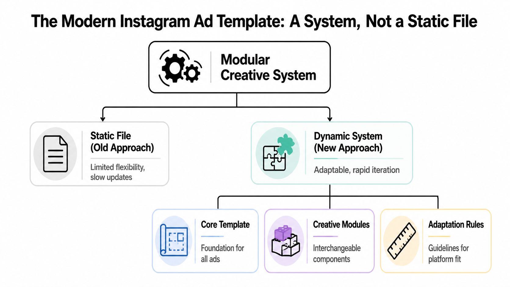
The Modern Instagram Ad Template Is a System Not a File
Many teams don't have a design problem. They have a throughput problem.
Reporting has already evolved. Modern Instagram ad reporting templates now consolidate clicks, conversions, and CTR in centralized dashboards, which pushes teams toward more data-driven decision making and creates pressure to feed those dashboards with more advanced creative testing, as noted by Windsor.ai's Instagram ads dashboard overview. Once your reporting gets that granular, a static creative workflow starts to break.
What the old workflow gets wrong
A static file is built to be finished. A scalable instagram ad template is built to be recombined.
That difference matters in Meta's current environment. If media buyers want to learn which angle drives cheaper acquisition, they need structured creative inputs. Two fully finished ads can tell you which ad won. They usually can't tell you whether the winner came from the first three seconds, the proof section, or the CTA treatment.
Here's the practical trade-off:
| Approach | What it's good for | Where it breaks |
|---|---|---|
| Static file | Brand reviews, one-off launches, simple promos | Slow iteration, weak learnings, manual versioning |
| Modular system | High-volume testing, cleaner creative analysis, faster refreshes | Requires naming rules, asset discipline, and workflow setup |
Practical rule: The template should define what stays consistent, what can change, and how those pieces fit together across placements.
A lot of marketers grasp this conceptually but still store footage in vague folders like “UGC finals” or “new edits.” That's not a system. That's archive management with nicer thumbnails. A true modular setup needs a usable asset bank, clear naming, and agreed rules for assembly. If you're reworking this at the operations layer, a structured video asset management system matters more than another design mockup.
The shift from finished ads to creative inputs
The better way to think about a template is this:
- Core frame for layout, branding constraints, and safe areas
- Interchangeable modules for hooks, bodies, social proof, demos, and CTAs
- Adaptation rules for Feed, Reels, Stories, and account-level testing needs
That's also why broader strategy guides like Sup Growth's Facebook and Instagram ads guide are useful. They help connect media buying decisions with placement strategy, but the creative execution still needs a modular engine underneath.
If one concept deserves to die, it's “make me a winning ad.” Strong teams don't ask for one winning ad. They build a template system that can produce many candidates, then let performance data sort the winners from the rest.
Blueprint Your Core Ad Template for the Feed
The best starting point for an instagram ad template is still the Feed. Not because Feed is the only placement that matters, but because it forces discipline. You have less room than full-screen placements, more pressure on the opening frame, and a higher chance your creative will be repurposed elsewhere.
For Feed ads, the recommended master canvas is 1080x1350 pixels in a 4:5 ratio, and keeping core text and hooks inside the central 1080x1080 square allows smooth cropping to 1:1 without reflowing elements. The same source notes this approach can lift CTR by 15-20% because vertical formats occupy more of the mobile screen, according to Coinis's Instagram ad design template guidance.

Set the file up once, then stop reinventing it
The core mistake is designing each ad like it's a standalone deliverable. Build one master file and lock in the structure.
Use this setup:
Master canvas Build at 1080x1350. That becomes the parent format for Feed.
Protected square Treat the central 1080x1080 area as sacred space for the primary hook, product shot, and any text that can't be cropped.
Layer groups Separate background, product, text, proof elements, and CTA treatments into their own groups so editors can swap them without disturbing the rest of the frame.
Export logic Export from the same source file into variants rather than creating separate design files for each concept.
If your team wants a practical walkthrough for file setup and production decisions, this guide to Instagram ad creation workflows is worth reviewing alongside your own brand system.
Build for cropping, not just for looks
A clean design can still fail if it only works in one aspect ratio.
The central square matters because many teams eventually need to crop creative to 1:1 for alternate placements, reporting previews, or partner requirements. If your headline, offer, or product demo sits outside that square, every resize becomes a manual salvage job.
Keep the message hierarchy stable. The crop should remove optional background detail, not critical persuasion.
A strong Feed template usually follows a simple visual order:
- Top area for the hook or stopping device
- Middle area for product, proof, or visual demonstration
- Lower area for CTA support and brand reinforcement
What usually hurts performance
The failures are predictable:
- Overdesigned first frames that look polished but delay the point
- Text crammed near edges so the crop breaks readability
- Template files with merged layers that make variation testing painfully slow
- One-size-fits-all layouts that ignore different creative angles
A usable template should let you swap a problem-led opener for a UGC opener in minutes. If it takes a designer half a day to produce the next version, the system is too brittle.
How to Modularize Your Hooks Bodies and CTAs
Once the frame is set, the primary advantage comes from decomposition. A high-performing instagram ad template isn't one ad. It's a repeatable structure for mixing persuasive parts.
The three parts that matter most are the hook, the body, and the CTA. Each one does a separate job. Teams get weak results when they blur those jobs together and call the whole thing “creative.”
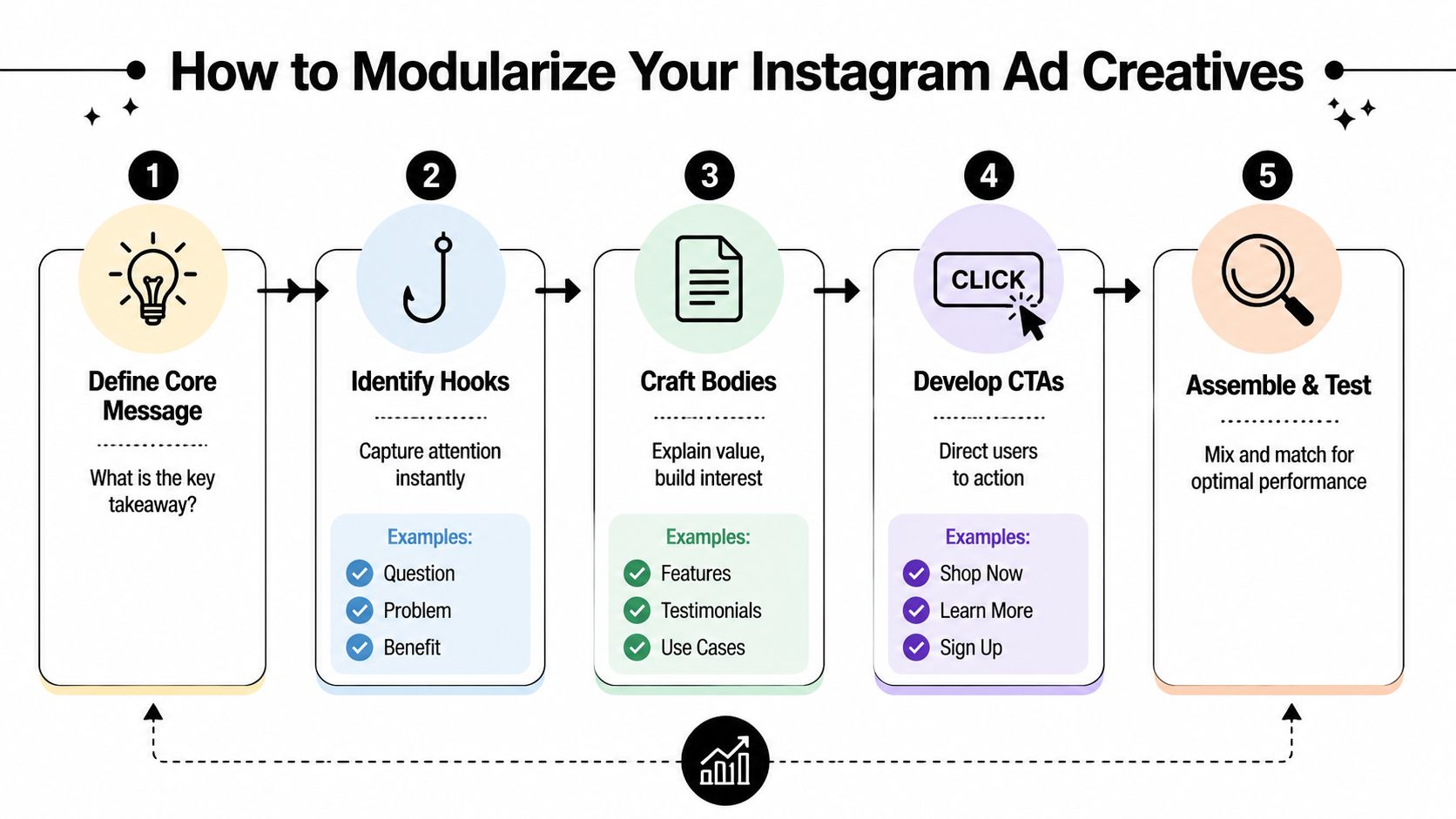
Give each module one job
Think in functions, not scenes.
| Module | Job | Typical ingredients |
|---|---|---|
| Hook | Stop the scroll | Question, tension, bold claim, visual contrast, unexpected motion |
| Body | Build belief | Demo, testimonial, before-and-after, feature proof, objection handling |
| CTA | Convert intent | Offer framing, urgency, next step, destination clarity |
The hook doesn't need to explain everything. It needs to earn the next second. The body doesn't need to be cinematic. It needs to move the viewer from curiosity to belief. The CTA shouldn't introduce a new idea. It should make the next action feel obvious.
A deeper breakdown of this structure appears in this hook body CTA video ad structure guide.
Tag assets like a media buyer, not an editor
Most asset libraries fail because the naming logic is visual instead of strategic.
“Blue-shirt creator final v2” tells you almost nothing. “hook-problem_agitate,” “body-demo-closeup,” or “cta-discount-soft” tells you how the asset can be used in a test. That's the difference between searchable inputs and random footage.
A practical tagging model can include:
- Function tags such as hook, body, CTA
- Angle tags such as problem, benefit, comparison, testimonial
- Format tags such as UGC, founder, product demo, motion graphic
- Offer tags such as free trial, discount, bundle, learn more
- Audience tags based on segment or intent level
Good modularization reduces decision fatigue. The team shouldn't ask “what is this clip?” They should ask “what role should this clip play in the next test?”
There's also a copy angle here. If you're using AI to draft variants, clean them up before they hit production. A utility like humanize chatgpt text can help smooth robotic phrasing so your hooks sound like ad copy, not a generated placeholder.
Examples of modules that usually travel well
Some modules adapt across offers better than others.
Hook that travels well “Nobody tells you this before you buy.” This opens a curiosity loop and fits many categories.
Body that travels well Tight product demo with one visible outcome. It works because it shows, not explains.
CTA that travels well “See how it works.” Low-friction CTAs are useful when the body is doing most of the persuasion.
What doesn't travel well is a body section overloaded with three claims, two overlays, and a hard sell. That kind of module forces every future variation to inherit the same clutter.
Adapting Your Ad Template for Reels and Stories
Feed-first systems break if they aren't adapted properly for vertical placements. Resizing a 4:5 asset into 9:16 isn't adaptation. It's often just distortion with extra steps.
For Reels and Stories ads, use a 1080x1920px 9:16 canvas and keep essential text and visuals away from the top and bottom 14% margins so Instagram's interface doesn't cover them. The same source notes that Reels ads deliver 2.2x higher view-through rates than feed ads, according to Strike Social's Instagram ad specs overview.

Respect the danger zones
A lot of otherwise strong creatives get wrecked here. The headline sits too high, the CTA falls too low, or key product detail lands under interface elements.
Use a simple placement rule:
Top safe area Don't put essential hook text in the top margin where profile and platform UI can compete with it.
Middle action area Keep the product, face, motion, and primary selling message in the central band.
Bottom safe area Don't let your CTA or offer detail drift into the lower interface zone.
If your editor is manually eyeballing this every time, mistakes will keep slipping through.
Adapt the message, not only the canvas
Reels and Stories usually reward more immediate pacing. The first frame has to work harder because the viewer is in a faster swipe pattern than in Feed.
That often means:
- shorter text overlays
- earlier branding if visual identity matters to trust
- faster proof delivery
- less dependence on small subtitles or fine UI detail
A useful visual reference is below.
If the CTA only becomes readable when the viewer pauses, it's too late for most Reels traffic.
Common adaptation mistakes
The repeated errors aren't complicated. They're operational.
| Mistake | What happens |
|---|---|
| Porting Feed layout directly | Elements feel cramped or oddly centered |
| Ignoring top and bottom margins | Key text gets obscured by UI |
| Using too much copy | The ad feels dense and easy to skip |
| Treating Stories and Reels as identical | The same asset may fit technically but miss contextually |
The better practice is to treat 9:16 as its own environment with its own rules. Your modules should survive the shift, but their spacing, text density, and sequence often need adjustment.
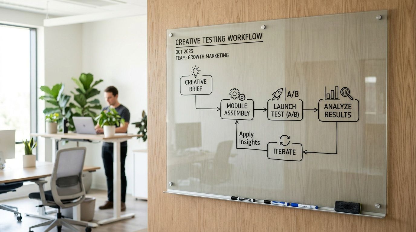
Building a High-Velocity Creative Testing Workflow
Creative testing falls apart when teams launch a pile of variations without a learning plan. Volume matters, but random volume creates random conclusions.
Modern reporting templates now track detailed conversion funnels, including website clicks, leads, and sales, which makes modular testing more useful because marketers can attribute which hooks or CTAs are moving users through each stage of the funnel, as shown in Whatagraph's Instagram analytics reporting template.
Test questions first, combinations second
Start with a question that a media buyer can act on.
Bad test question: “Which ad wins?” Better test question: “Does a founder-led hook outperform a pain-point hook when the body and CTA stay constant?”
That distinction matters because you're trying to isolate learnings, not just find a temporary winner.
A workable weekly workflow often looks like this:
Choose one variable to pressure-test Hook style, proof type, CTA language, visual pacing, or text overlay angle.
Hold the rest steady Don't swap three things at once unless the goal is broad exploration rather than learning.
Map variants to funnel stages Some hooks earn clicks but weak downstream quality. Others may attract fewer clicks but stronger intent.
Review by component Don't just label ad IDs as good or bad. Track which module patterns keep showing up in winners.
If your team needs a repeatable operating model, this creative testing framework for Meta ads is a useful reference point.
Build a simple testing matrix
You don't need a giant spreadsheet to get smarter. You need a matrix that separates variables clearly.
| Variable under test | Keep constant | What to evaluate |
|---|---|---|
| Hook angle | Same body and CTA | Which opener gets stronger entry into the funnel |
| Body proof type | Same hook and CTA | Which proof builds more belief |
| CTA framing | Same hook and body | Which close produces stronger action |
Review creative at the module level. That's where reusable insight lives.
What disciplined teams do differently
They treat creative data as operational input. Not post-campaign decoration.
That means they'll note patterns like these qualitatively:
- UGC hooks may attract broader traffic, but demo-led bodies may qualify intent better.
- Soft CTAs may improve click quality when the offer is unfamiliar.
- Heavy copy overlays can suppress message clarity even when the angle itself is strong.
The account becomes easier to optimize when creative and media buying speak the same language. Hook types, proof types, and CTA types become variables you can manage instead of vague opinions from review calls.
How to Scale Production with Creative Platforms
Production usually breaks before strategy does.
A team can have clear modules, a usable naming system, and a steady flow of new concepts, then still miss testing windows because versioning is trapped in editing tools and handoffs. Editors swap clips manually. Designers update text overlays one file at a time. Media buyers wait on exports, then clean up filenames and upload in batches. That friction is what keeps a modular instagram ad template system from turning into actual output.
Creative platforms solve that operations problem. The best ones act as production infrastructure for performance teams. They store assets by role, keep variants organized, and reduce the manual work between idea, render, and launch. In Meta's current environment, where Andromeda rewards broader creative coverage and faster iteration, that matters as much as the template itself.
A useful platform should help your team:
- maintain a searchable asset library by hook, body, CTA, offer, and persona
- tag modules so winning message patterns are easy to reuse
- batch-generate overlays and versioned text treatments
- adapt outputs for feed, stories, and reels without rebuilding from scratch
- assemble many ad combinations from approved modules
- push finalized variants into the buying workflow with clean naming and less admin work
That changes the economics of testing. Instead of spending creative hours on repetitive assembly, the team spends more time on better inputs, sharper briefs, and faster readouts on what is improving CAC and ROAS.
If you are evaluating vendors, broad roundups like best AI marketing tools can help you scan the category. The essential filter is narrower. Can the platform support modular production, version control, placement adaptation, and handoff into Meta without creating another layer of process?
Sovran's performance creative platform is one example built around that production model. The practical benefit is not flashy automation. It is the ability to turn a structured template system into a repeatable volume engine without losing control over message quality, asset governance, or testing clarity.
There is a trade-off.
Platforms increase the speed of whatever system you already have. If the messaging architecture is messy, you will produce more messy ads. If the modules are well defined, the platform removes the operational drag that usually caps testing volume long before the budget does.
Frequently Asked Questions
Is this different from Meta Dynamic Creative
Yes. Dynamic Creative helps combine assets inside Meta, but it doesn't replace the work of designing clean modules beforehand.
A modular instagram ad template system controls the inputs before they ever reach the ad account. That gives teams more clarity around structure, naming, messaging roles, and placement adaptation. Meta can still help with delivery, but it can't fix messy source assets.
Can Canva or Figma still be part of this workflow
Yes. They're useful for designing core layouts, creating overlay systems, and maintaining brand consistency.
The limitation shows up when the team needs rapid recombination, tagging, batch versioning, and frequent output updates. Design tools are good for making assets. They're less effective as a full operating system for high-velocity performance testing.
How many variations should you test at once
There isn't one universal number that fits every account, and forcing a number without context is how teams waste budget.
A better rule is to test enough variations to answer a specific question clearly. If you can't explain what variable changed between ads, you're testing too loosely. If every variation differs in several ways, your learning quality drops even if output volume rises.
What should stay fixed inside a template system
Keep your brand rules, layout logic, safe areas, and module definitions stable.
Rotate hooks, proof angles, offers, text overlays, and CTA framing inside that structure. Stable rules make the results easier to interpret. Constant redesign makes every test noisier.
What usually breaks first when teams try this
Asset management.
Teams often underestimate how much naming discipline and clip tagging matter. Once footage gets messy, editors waste time searching, media buyers lose confidence in what's being tested, and learnings become harder to reuse across future campaigns.
If your team wants to turn raw footage into a scalable instagram ad template system, Sovran is built for that workflow. It helps performance marketers organize modular assets, assemble high-volume variations, and move creative into Meta faster without rebuilding every ad from scratch.

Manson Chen
Founder, Sovran
Related Articles
Highlights Video Maker: The Ad Scaling Playbook for 2026
AI Talking Head Videos for Scaling Ad Creative