10 Attention Grabbing Ad Openings to Test in 2026
Jump to a section
- 1. Pattern Interrupt and unexpected visual
- 2. Question-based hook
- 3. Stat and data-driven hook
- 4. Before and after visual hook
- 5. Social proof and FOMO hook
- 6. Benefit-forward and pain relief hook
- 7. Relatable scenario and customer mirror hook
- 8. Contrarian and unconventional wisdom hook
- 9. Demo and proof-of-concept hook
- 10. Curiosity gap and mystery hook
- 10 Ad Opening Hooks: Quick Comparison
- From hooks to winners and your scalable testing framework
People encounter a brutal volume of advertising every day. Infillion cites clinical tests estimating 4,000 to 10,000 ads daily, plus 5.3 trillion display ads annually worldwide, which is why the opening seconds decide whether a user keeps watching or ignores you completely (Infillion on attention advertising facts). On social feeds, that opening isn't a nice-to-have. It's the make-or-break variable.
For performance teams, attention grabbing ad openings aren't just a creative exercise. They're a testing system. A weak hook hides a strong offer. A strong hook gives the rest of the ad a chance to sell. That's why I treat the first seconds as the most valuable real estate in any Meta or TikTok ad.
There's also a practical reason to obsess over openings. Teams don't lose because they run out of ideas. They lose because they test too slowly, recycle stale intros, and can't isolate what caused the result. The fix is modular creative. Build hooks separately from bodies and CTAs. Swap one variable at a time. Keep the winners. Kill the rest fast.
Below are 10 attention grabbing ad openings worth testing in 2026, but this isn't just a swipe file. Each one connects to a repeatable workflow so you can turn good hooks into a scalable testing program instead of a one-off lucky hit.
1. Pattern Interrupt and unexpected visual
The fastest way to stop a thumb is to show something that doesn't belong in the feed.
A pattern interrupt works because the surrounding content trains people to scroll on autopilot. Your opening breaks that rhythm with contrast, motion, framing, or an abrupt cut. Dollar Shave Club did this with deadpan weirdness. Squarespace often uses jarring transitions that feel cleaner and stranger than the content around them. Allbirds can get there with a plain product reveal on a stark background, especially when the first frame looks more like a design post than an ad.
What works
The best pattern interrupts are simple enough to register instantly.
- Hard contrast: Bright object on a muted background, or the reverse.
- Abrupt movement: Fast zoom, sudden hand entry, object drop, camera whip.
- Unexpected framing: Product too close, subject off-center, awkward crop that creates tension.
- Format mismatch: A polished brand using UGC-style chaos, or a UGC-heavy account leading with an ultra-clean shot.
What usually fails is random chaos. If the opening shocks but doesn't connect to the offer, you'll buy a pause and lose the sale.
Practical rule: The interrupt should create a question your body can answer in one line.
A sleep app might open on a loud 2 a.m. clock flash, then cut directly to the calm interface and result. A budgeting app might start with a visually absurd pile of subscription notifications, then move into a dashboard demo. The visual break earns attention. The body has to cash it in.
How to test it systematically
Pattern interrupts are ideal for modular production because the body often stays the same while the first visual changes.
Use a small library of high-contrast intros and pair each with one proven body. Tag clips by motion type, framing, and visual intensity so you can find reusable openers quickly. If you're building in a Hook-Body-CTA workflow, this breakdown of video ad components is the right mental model.
Refresh these intros often. Audiences adapt fast, especially on TikTok. The hook that felt disruptive last month starts feeling familiar once you've pushed enough spend behind it.
2. Question-based hook
Questions work when they force the viewer to answer in their head.
"Stressed? Struggling to sleep?" is a classic app opener because it instantly sorts the audience. Calm and Headspace-style hooks work when the question is specific enough to sting a little. Duolingo has long benefited from questions that make learning feel easy and immediate. Robinhood-style questions pull from aspiration and insecurity at the same time.
Better questions beat clever questions
The strongest opening questions usually fall into one of three buckets:
- Pain-point questions: "Still waking up tired?"
- Frustration questions: "Why does your team still use five tools for one project?"
- Identity questions: "Are you the person everyone asks for design help?"
Weak versions sound like brand copy. Strong versions sound like something a customer would say out loud.
That matters because the hook creates a promise. If the body doesn't answer the exact question raised in the first line, retention drops fast. The user feels baited.
Ask only the question your product can answer fast.
A meditation app can ask about racing thoughts before bed. A language app can ask whether you've got five spare minutes. A project management tool can ask whether your work is scattered across tabs, docs, and Slack threads. Each one opens a loop. The body should close it immediately with a proof point, a demo, or a simple transformation.
How to scale question hooks
Question hooks are one of the easiest formats to mass test because the variable is mostly copy, not production.
Store customer reviews, support tickets, and founder notes in one place, then mine them for repeated phrasing. That's where the best questions come from. If you need a starting point for writing those lines, this guide to ad scripting is useful because it keeps the copy focused on audience pain instead of generic brand language.
Run parallel variants aimed at different pain points. One audience segment may respond to time savings. Another reacts to embarrassment, confusion, or missed opportunity. Same product. Different doorway into the problem.
3. Stat and data-driven hook
A number in the first frame can stop a scroll because numbers look different from everything around them. They feel concrete. They imply proof. But this hook style only works if the stat is real, relevant, and immediately understandable.
One strong example comes from Australia. A 2022 DoubleVerify study found 69% of Australian respondents were more likely to pay attention to an ad if it captured their interest within the first five seconds (B&T coverage of the DoubleVerify report). That's the kind of opening stat that works for a presentation, a B2B video, or a creative strategy ad because it turns attention into a measurable business issue.
Use numbers that sharpen the promise
A good stat hook does one of two things:
- It proves the problem is bigger than people think.
- It proves the outcome is more achievable than people think.
For a productivity app, a number can frame wasted time. For a sleep app, it can frame the scale of the problem. For a finance or hiring product, it can create immediate credibility if the figure is precise and sourced.
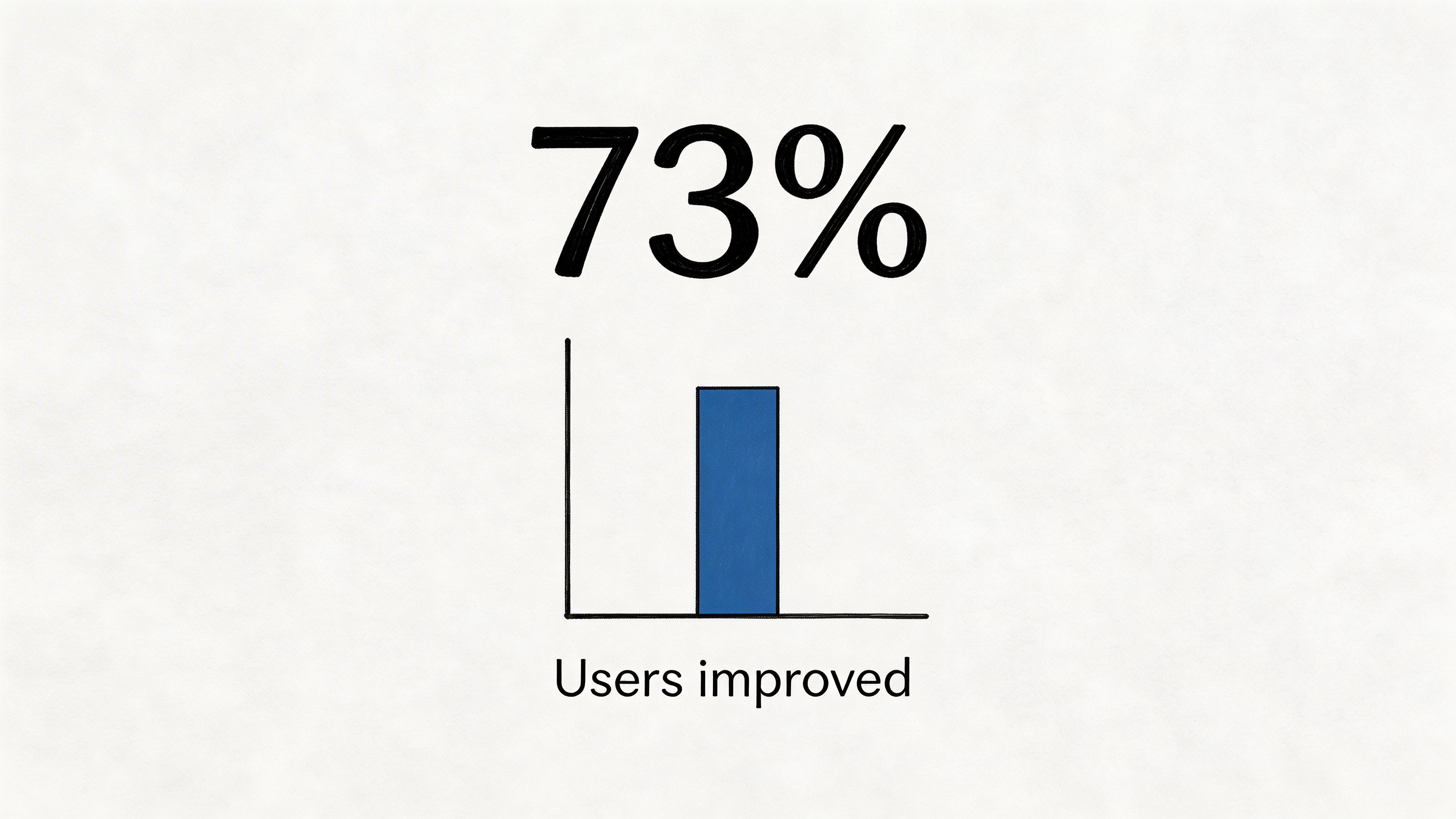
What doesn't work is decorative data. "73% better" with no context isn't persuasive. It's just typography.
If the viewer can't explain why the number matters in one sentence, don't lead with it.
The visual treatment matters too. Big text overlay. Minimal competing elements. Fast read. If you're testing this format seriously, use a repeatable process for text overlays, framing, and proof visuals. A scientific approach to testing video ad hooks helps here because stat hooks often fail from execution, not strategy.
Pair the number with a body that interprets it. The hook earns attention. The next line should tell the viewer why they should care.
4. Before and after visual hook
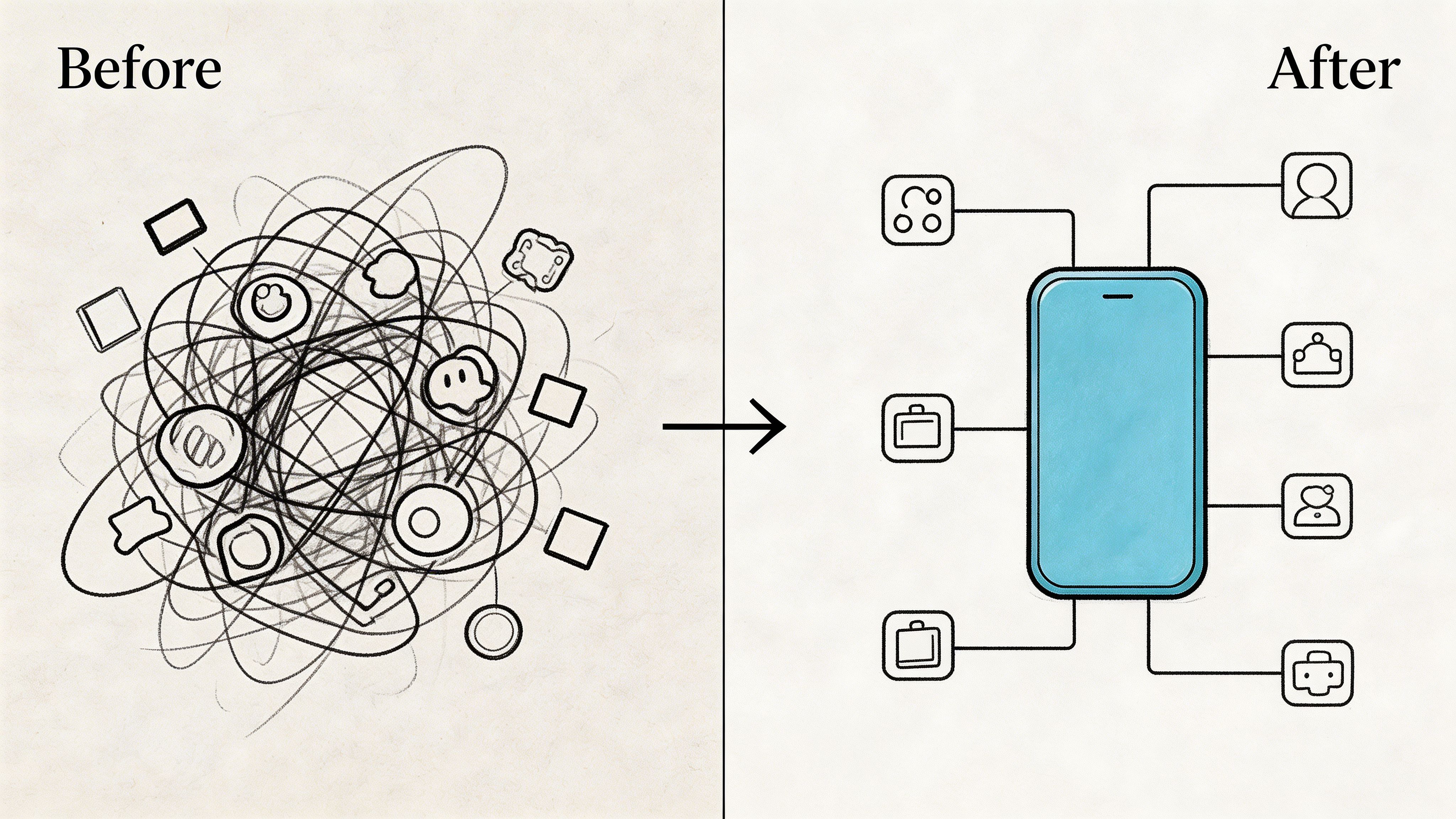
Few openings communicate value faster than transformation.
A before-and-after hook gives the viewer instant orientation. Here's the mess. Here's the fix. You don't need much narration because the contrast does the selling for you. Canva-style creative often benefits from this. So do fitness products, cleaning products, sleep tools, and workflow software.
A cluttered desktop becoming one organized dashboard is a before-and-after ad. A chaotic night routine becoming a clean bedtime flow is one too. Fashion, beauty, and productivity brands use the format for the same reason. It compresses the promise into one visible shift.
The trap with transformation ads
The common mistake is making the "after" prettier than it is believable.
The before state needs to feel familiar, not cartoonish. If the pain looks fake, the transformation looks staged. A student with scattered notes, screenshots, and missed deadlines feels real. A person buried under floating paper graphics usually doesn't.
The second mistake is slowing the transition down too much. In-feed, transformation needs to register almost instantly. Quick cuts usually beat cinematic buildup unless the reveal itself is unusual enough to hold attention.
A useful reference for structuring this kind of creative is this high-converting before after ads playbook. The principle is simple. Make the pain obvious, make the payoff specific, and don't blur the line between the two.
Best use cases
This hook tends to work best when the product's value is visual by nature:
- Design tools: Blank canvas to finished output
- Health and wellness apps: Restless routine to calm routine
- Organization products: Chaos to system
- Beauty and personal care: Visible improvement without overexplaining
If your offer is abstract, add one anchor. A caption, UI moment, or voiceover line can turn a vague glow-up into a believable reason to act.
5. Social proof and FOMO hook
People trust behavior they can see.
That's why social proof remains one of the most dependable attention grabbing ad openings, especially on platforms where trends move faster than formal brand credibility. A testimonial clip, app store reaction, creator endorsement, review stack, or "everyone's talking about this" format can pull a user in before your product explanation starts.
The key is choosing the right proof for the audience. Duolingo can lean into ranking and cultural ubiquity. Notion can open with a founder, student, or designer saying how they use it. Figma can show community validation through work output and workflow examples. Calm-style brands often do well with emotionally specific reviews instead of broad claims.
Proof needs context
A lot of advertisers misuse social proof by throwing logos or ratings on screen without giving the viewer a reason to care.
The better move is to connect proof to a job-to-be-done.
- Community proof: "Designers use this to move faster with clients."
- Use-case proof: "Parents use this to keep bedtime from turning chaotic."
- Trend proof: "This is the app creators keep posting about."
- Urgency proof: Limited beta, waitlist access, or time-sensitive access if true.
If you're building UGC-style ads, testimonial mashups usually outperform isolated praise because they create momentum. One person says it saved time. Another says it simplified the process. A third shows the product in use. Suddenly the proof has texture.
For inspiration on how different brands frame that trust signal, review these testimonial ad examples.
Social proof works best when it answers the unspoken question, "Why should I trust this over the ten other ads I saw today?"
Used badly, FOMO feels manipulative. Used well, it reassures the viewer that trying the product is normal, current, and low-risk.
6. Benefit-forward and pain relief hook
Sometimes the best opening is the blunt one.
Benefit-forward hooks skip the scene-setting and go straight to the payoff. "All your work in one place." "Learn a language in minutes." "Sleep better tonight." This style works when the audience already knows the problem and doesn't need you to dramatize it.
That makes it useful for products tied to urgency or daily frustration. Project management. Sleep. Focus. Budgeting. Learning. If the pain is obvious, speed wins.
Why direct hooks convert
Direct benefit hooks often work because they reduce cognitive load. The viewer doesn't have to decode the setup. They immediately understand what the product claims to do.
This is especially helpful in feeds where users are multitasking. They aren't always watching with sound. They may only give you a glance. A clear statement survives that environment better than a clever setup.
Still, direct doesn't mean generic. "Be more productive" is weak. "Plan your whole week in one view" is stronger. "Stop switching between five tabs to manage one project" is even stronger because it blends benefit with pain relief.
A good structure is simple:
- Primary benefit first
- Specific mechanism second
- Proof or demo third
For example, a note-taking app could open with "Turn scattered notes into one clean system," then cut straight into the UI. A sleep app could lead with "Fall asleep without the bedtime spiral," then show a calming flow inside the product.
What to avoid
Don't stack three benefits in the opening. Pick one. The first seconds aren't for full positioning. They're for clarity.
This hook also suffers when the claim sounds interchangeable with every competitor. If the same line could describe six apps in the category, it won't hold attention for long. Add one distinct angle, either in the wording or in the visual proof that follows.
7. Relatable scenario and customer mirror hook

The customer mirror hook works when viewers think, "That's me."
Instead of opening with a claim, you open with a moment. A student buried in disorganized notes. A founder toggling between tabs and forgetting where a file lives. A runner trying to reconstruct workouts from memory. A parent staring at the ceiling after another bad night of sleep.
TikTok especially rewards this style because it feels native to the platform. It doesn't announce itself as an ad right away. It feels like a person documenting a familiar frustration.
Specificity is the whole game
Generic relatability doesn't land. The scenario has to include details your audience recognizes.
Headspace-style ads often work better when the stress looks ordinary rather than dramatic. Not a meltdown. Just lying awake, checking the time, trying again. A productivity app should show the actual mess users live with. Tabs, docs, screenshots, sticky notes, calendar pings. BetterHelp-style concepts often open on tiny everyday stressors because that's what makes them believable.
Good customer mirror hooks usually include:
- One recognizable setting: desk, bedroom, commute, gym
- One visible frustration: missed reminder, messy workflow, restless routine
- One emotional cue: sigh, confusion, frustration, low-key overwhelm
The more accurately you describe the user's life, the less hard you have to sell the product.
Stored customer language is highly relevant here. Reviews, support chats, and onboarding call notes often give you better openings than a brainstorm does. Customers tell you the exact situation. You just need to stage it truthfully.
When it underperforms
This style can drag if you overbuild the setup. If the user doesn't know what the ad is about after a few beats, you've mistaken realism for pacing. Keep the scenario tight, then move to the solution before the viewer feels trapped in exposition.
8. Contrarian and unconventional wisdom hook
A contrarian opening works by challenging a belief the audience has accepted without thinking very hard about it.
That can be strategic if your category is crowded and every brand says roughly the same thing. Apple's "Think Different" is the classic example of value created through opposition, not just explanation. Dollar Shave Club won attention by mocking the industry's self-serious premium language. Oatly built recognition by attacking assumptions around the category itself.
Good contrarian hooks create tension, not confusion
The opening line should sound a little risky, but not reckless.
Examples of the structure:
- "Stop using more features. Use fewer."
- "Your morning routine isn't the problem. Your bedtime is."
- "The best budgeting tool isn't the one with more charts."
- "Productivity apps can make scattered work worse."
Those lines work because they imply an argument. The viewer wants to know why. That's the retention lever.
What fails is empty provocation. If your hook attacks a category norm but the body doesn't support the claim with a demo, customer logic, or a distinct mechanism, it reads like hot air.
Use this carefully
Contrarian hooks can attract attention from the wrong people too. That's the trade-off. You may spark comments and hold rates, but pull in viewers who were never likely to convert. That's why I usually test a contrarian angle against a safer control using the same offer and audience.
This format is strongest when your product breaks a pattern. Maybe your app strips away complexity. Maybe your price model rejects industry bloat. Maybe your product fixes the downside created by the standard approach.
If the difference isn't real, don't fake a rebellious posture. Users can smell it.
9. Demo and proof-of-concept hook
Some products don't need a setup. They need proof.
A demo hook opens by showing the product doing the thing people care about. Figma is naturally suited to this. So is Stripe, Slack, Pitch, and almost any software product where value becomes obvious the moment the screen starts moving.
The biggest advantage here is trust. You remove abstraction. Instead of promising usefulness, you show it.
Compress the path to value
The opening demo should highlight the shortest route from first frame to "I get it."
That usually means:
- Show the core action first
- Cut extra navigation
- Add captions only if they clarify
- Lead with the strongest feature, not the easiest one to film
For a collaboration tool, that might mean showing real-time edits. For a budgeting app, it might mean instant categorization or a simplified dashboard. For a creative tool, it could be a rough input becoming polished output in seconds.
Used well, demo hooks can feel stronger than polished lifestyle ads because they remove the need for interpretation.
A good reference point for building these with AI-assisted workflows is this piece on AI video ads, especially if you're mixing screen recordings, generated b-roll, and modular edits.
Here's an example format to study:
Where teams get this wrong
They show the product, but not the payoff.
A dashboard with lots of graphs may impress the team that built it, but not the user seeing it cold in a feed. Lead with the moment that changes the user's life or workflow, not the internal architecture of the tool.
10. Curiosity gap and mystery hook
Curiosity is one of the cleanest ways to earn a few more seconds of watch time.
This hook withholds just enough information to create tension. The user senses there's a reveal coming and stays to resolve it. BuzzFeed built an empire on this instinct. Netflix trailers use it constantly. Duolingo-style social content often turns simple reveals or guessing mechanics into retention engines.
The challenge is control. Too much mystery and the ad becomes vague. Too little and there's no reason to keep watching.
The reveal has to pay off fast
In Australia, 52% of respondents reported spending more daily time on CTV and social media post-pandemic, according to the same DoubleVerify report covered by B&T. More content consumption means more competition for every second of attention, which makes fast payoff even more important in short-form environments.
That means your curiosity hook should open one loop, not five.
Good examples:
- A blurred result that gets revealed quickly
- An unusual object or motion with a clear explanation
- A statement that sounds incomplete until the product reframes it
- A setup that implies "wait until you see the second half"
A sleep brand could start with "This is why you're tired even when you go to bed on time," then reveal the behavioral or routine issue. A design app might show a rough visual and promise the polished output a moment later. A language app could open on a sentence challenge and reveal the answer through the product flow.
Keep mystery tied to the offer
The reveal can't be random entertainment. It needs to route directly into product value.
If the hook creates suspense but the payoff has nothing to do with the product, you'll get watch time without commercial intent. That's a vanity win. Not a performance win.
One more warning. Curiosity hooks are easy to overuse. Once the audience learns your pattern, the tension fades. Rotate reveal types and keep the body structure flexible so the format doesn't become predictable.
10 Ad Opening Hooks: Quick Comparison
| Hook | 🔄 Implementation Complexity | ⚡ Resource Requirements | 📊 Expected Outcomes | 💡 Ideal Use Cases | ⭐ Key Advantages |
|---|---|---|---|---|---|
| Pattern Interrupt/Unexpected Visual | Medium, creative edits & rapid iteration | Low (short shoots, effects) | High stop-rate; attention spikes, variable downstream metrics | Meta/TikTok feeds; low-attention environments | Highest immediate attention; quickly testable at scale |
| Question-Based Hook | Low, copy-driven, easy to iterate | Low (script + short shoot) | High CTR & conversion when audience-relevant | Conversion-focused campaigns; PAS frameworks | Direct cognitive engagement; easy A/B testing |
| Stat/Data-Driven Hook | Low–Medium, needs verified data & overlays | Low (data sourcing, simple graphics) | High credibility and shareability; trust-building | B2B, finance, health, productivity verticals | Establishes authority with specific numbers |
| Before/After Visual Hook | Medium–High, requires authentic transformations | Medium–High (real results, editing) | High emotional impact and memorability | Fitness, beauty, lifestyle, self-improvement apps | Communicates value visually without words |
| Social Proof / FOMO Hook | Low, assemble testimonials & counts | Low–Medium (reviews, endorsements, updates) | High conversions via trust/urgency; may attract low-quality signups | Scaling UA; conversion funnels; trend-driven platforms | Builds trust quickly and creates urgency |
| Benefit-Forward / Pain Relief Hook | Low, direct messaging, simple sequencing | Low (copy + supporting visuals) | High ROI for action-oriented users; less for awareness | Time-sensitive solution apps; direct-response campaigns | Communicates ROI immediately; reduces friction |
| Relatable Scenario / Customer Mirror Hook | Medium, requires authentic scenes/UGC | Medium (casting or UGC sourcing) | High emotional resonance; drives qualified users | TikTok, UGC-style storytelling, community-building | Deep identification and high shareability |
| Contrarian / Unconventional Wisdom Hook | Medium, needs evidence and tone control | Low–Medium (research & positioning) | High engagement and awareness; risk of backlash | Thought leadership; competitive differentiation | Memorable positioning; sparks discussion |
| Demo / Proof of Concept Hook | Medium, polished product capture & pacing | Medium (screen recordings, smooth UX demos) | High credibility and clarity for function-driven buys | SaaS, productivity, B2B product launches | Removes skepticism by proving capability |
| Curiosity Gap / Mystery Hook | Medium, careful reveal timing & pacing | Low–Medium (storyboard + editing) | High retention and watch-time; risk of frustration if unrewarding | Short-form platforms optimizing watch-time (TikTok) | Drives retention and organic reach through intrigue |
From hooks to winners and your scalable testing framework
Many teams don't need more hook ideas. They need a way to learn from them.
That's the gap between creative activity and creative performance. You can brainstorm ten attention grabbing ad openings in an hour. That doesn't mean you can turn them into profitable winners. The winning system is built around controlled variation, clean naming, fast production, and disciplined analysis.
A useful benchmark comes from Adelaide's 2025 Outcomes Guide. Across 52 case studies in 18 industries, campaigns using its attention metric recorded an average 41% higher upper-funnel brand lift and 55% stronger lower-funnel impact than non-attention-optimized benchmarks (Adelaide Metrics Outcomes Guide announcement). The practical takeaway isn't "chase a metric." It's this: treat attention in the opening as a measurable input, not a creative mystery.
I like to run this as a loop.
First, separate the ad into modules. Hook, body, CTA. That sounds obvious, but a lot of teams still build every video as a one-off. When one ad wins, they can't tell whether the result came from the opening line, the proof section, the pacing, or the offer. Modularity fixes that.
Second, create variants around one hypothesis at a time. If you're testing pattern interrupts, keep the body and CTA stable. If you're testing benefit-forward lines, don't also swap the proof section and end card. The more variables you change at once, the slower you learn (or the faster you misinterpret signals).
Third, name every variant in a way that tells you what changed. Hook type, audience angle, body style, CTA. Clean naming sounds boring until you're looking at a campaign full of similar videos and can't remember which opening used the customer review, which used the UI demo, or which one led with the problem.
Fourth, judge hooks by what they were supposed to do. Openings should earn attention. Bodies should create belief. CTAs should convert intent. If the hook gets people in and the body loses them, the hook isn't the problem. Too many teams kill good openings because the middle of the ad was weak.
This is also where competitive research helps. Reviewing what other advertisers repeat can show you which categories are saturated with the same intro patterns. If you need that angle, this guide on how to spy on competitor ads is useful for spotting creative clusters before you copy them by accident.
Fifth, build a memory system. Winning hooks shouldn't disappear into old campaign folders. Save the script, visual style, audience it worked on, and the body formats that paired well with it. Do the same for failed concepts. Knowing what not to remake saves just as much time.
A platform like Sovran fits naturally here if your team is producing ad volume for Meta and TikTok. The modular setup matters. Upload clips once, tag them into reusable parts, store proven scripts and customer language in the Context Vault, and render combinations in bulk instead of rebuilding every edit manually. That workflow is especially useful when you're trying to fight fatigue across multiple audiences or accounts.
The teams that stay ahead don't just make more ads. They shorten the loop between idea, launch, result, and next test. That's how hooks become winners, and winners become a system instead of a lucky exception.
If you're tired of rebuilding videos by hand every time you want to test a new hook, Sovran is built for this workflow. You can turn existing clips into reusable Hook-Body-CTA blocks, store scripts and customer insights in Context Vault, render variants in bulk, and push creative to Meta faster without a pile of manual editing.

Manson Chen
Founder, Sovran
Related Articles
Create Video Ads with AI That Perform in 2026
AI Talking Head Videos for Scaling Ad Creative