8 High-Converting Ad Scripts Examples for Meta & TikTok in 2026
Unlock winning campaigns with our deep dive into 8 proven ad scripts examples for Meta & TikTok. Get frameworks, analysis, and tips to scale your video ads.
Jump to a section
- 1. Hook-Body-CTA (Three-Part Linear Structure)
- 2. Problem-Agitate-Solution (PAS) Framework
- 3. Listicle/Numbered Format (Top 5, 7, 10, etc.)
- 4. User-Generated Content (UGC) Testimonial Mashup
- 5. Before-and-After Transformation
- 6. Quick Tip/Educational How-To Format
- 7. Direct Response/Demo-Focused Feature Showcase
- 8. Social Proof/Review Compilation Format
- 8 Ad Script Formats Compared
- From Scripts to Scale: Systematize Your Creative Success

Creative fatigue is the biggest threat to profitability. A single winning video can skyrocket performance, but finding it often feels like a guessing game. The solution isn't just more content; it's a smarter, scalable approach to creative development rooted in proven frameworks. Relying on repeatable structures eliminates guesswork and provides a clear roadmap for producing high-converting video ads consistently.
This guide moves beyond generic advice to provide a strategic breakdown of high-performing ad scripts examples and the frameworks that power them. We'll analyze each structure, from the fundamental Hook-Body-CTA to the psychologically powerful PAS model, and equip you with actionable tactics, visual cues, and testing variations. You'll learn not just what works, but why it works, and how to replicate that success systematically.
We will deconstruct specific scripts for formats like User-Generated Content (UGC) testimonials, quick educational tips, and direct-response product demos. Understanding the strategic thinking behind each script is crucial for effective adaptation. To see how these scriptwriting principles translate into static ad formats, explore these powerful advertising copy examples that drive results on Meta platforms.
For teams aiming to accelerate their creative testing velocity, platforms like Sovran automate the assembly of these frameworks, turning a library of clips into hundreds of testable ad variants, helping you find your next winner up to 10x faster. Let's dive into the scripts that are defining performance marketing on social media.
1. Hook-Body-CTA (Three-Part Linear Structure)
The Hook-Body-CTA framework is the bedrock of modern video advertising, especially on fast-paced platforms like Meta and TikTok. It organizes an ad script into three distinct, sequential parts designed to capture attention, deliver a core message, and drive a specific action. This linear structure provides a reliable blueprint for crafting clear and persuasive ad scripts examples that guide the viewer from initial interest to conversion.
This framework’s power lies in its simplicity and psychological effectiveness. By front-loading the most compelling element, you earn the viewer's attention, which you then use to present your value proposition before sealing the deal with a clear directive.
How It Works
The structure is broken down into three critical phases, each with a specific job:
Hook (0-3 seconds): The single most important part of your ad. Its sole purpose is to stop the scroll and create intrigue. Hooks can be a provocative question, a surprising visual, a bold statement, or the presentation of a common problem.
Body (3-15 seconds): Once you have their attention, the body delivers the core message. This is where you introduce your product, demonstrate its key feature or benefit, explain how it solves the hook’s problem, or build on the initial intrigue.
Call-to-Action (CTA) (15-30 seconds): The final segment tells the viewer exactly what to do next. It should be direct, clear, and urgent, using phrases like "Download Now," "Shop the Collection," or "Sign Up for Free."
Why It’s a Top Framework
This method is foundational because it aligns perfectly with user behavior on social feeds. Viewers make snap judgments, and the Hook-Body-CTA model respects their limited attention span. Dollar Shave Club’s viral launch video mastered this by hooking viewers with a blunt, pattern-interrupting line: "Our Blades Are F***ing Great." This was immediately followed by a body explaining the value proposition (quality blades, low cost, convenience) and a clear CTA to join the club.
Strategic Insight: Treat these three parts as modular building blocks. A high-performing hook from one ad can be combined with a proven body from another. This "remixing" strategy allows for rapid, efficient testing to find the optimal combination without reshooting entire concepts.
Actionable Tips for Implementation
Focus on the Hook: Dedicate at least 40% of your creative energy to the first three seconds. Brainstorm and test 5-10 hook variations for every single ad concept.
Keep the Body Concise: The body should focus on the single most compelling benefit. Avoid listing too many features; instead, show how one key feature solves a major pain point.
Make the CTA Unmistakable: Use on-screen text, voiceover, and a clear visual cue (like a finger tapping a button) to reinforce the desired action. Test different urgency drivers in your CTA, such as "Limited Time Offer" or "Get Yours Before It's Gone."
2. Problem-Agitate-Solution (PAS) Framework
The Problem-Agitate-Solution (PAS) framework is a powerful persuasive storytelling structure that leverages empathy to drive action. It operates by first identifying a specific pain point the viewer experiences, then amplifying the emotional frustration associated with that problem, and finally presenting the product as the perfect resolution. This narrative approach is incredibly effective for creating compelling ad scripts examples that resonate on a deeper emotional level.
This framework excels because it mirrors the viewer's own internal monologue. It validates their frustration before offering relief, creating a natural progression from problem-awareness to solution-desire. This makes the product feel less like an advertisement and more like a timely discovery.
How It Works
The PAS script is built around a three-act emotional journey:
Problem (0-3 seconds): Immediately introduce a relatable pain point or frustration. This acts as the hook, grabbing the attention of anyone who has experienced that specific issue. For example, an ad for Notion might open with a shot of someone frantically switching between five different apps.
Agitate (3-12 seconds): This is the crucial emotional core. Don't just state the problem; amplify it. Show the negative consequences, the wasted time, the mounting stress, or the social embarrassment. This is where you pour salt on the wound to make the need for a solution feel urgent.
Solution (12-30 seconds): Introduce your product or service as the clear, simple, and effective answer to the agitated problem. Visually demonstrate how it resolves the pain point directly, providing a sense of relief and satisfaction to the viewer before ending with a clear call-to-action.
Why It’s a Top Framework
The PAS framework, famously utilized by copywriters like Eugene Schwartz, creates a strong narrative tension that keeps viewers engaged. It moves beyond features to focus on feelings. For instance, the Calm app effectively uses PAS by showing the problem (stress, inability to sleep), agitating it with the consequences (ruined mornings, poor health), and then presenting its guided meditations as the serene solution. This makes the viewer feel the need for the product.
Strategic Insight: Your best "Agitate" lines are often hidden in your customer reviews and support tickets. Mine your existing user feedback for the exact emotional language people use to describe their frustrations before they found your solution. Using their words creates instant authenticity and relatability.
Actionable Tips for Implementation
Be Specific with the Problem: Don't say "disorganized." Show a screen recording of a messy desktop with overlapping windows and lost files. The more specific the problem, the more visceral the agitation.
Magnify the Agitation Visually: Use quick cuts, stress-inducing sound effects, or desaturated colors during the Agitate phase. When you introduce the Solution, shift to brighter visuals, calmer music, and a smoother pace to create a clear emotional contrast.
Make the Solution the Hero: The transition from Agitate to Solution should feel like a massive relief. Show the "after" state in a compelling way. The solution shouldn't just fix the problem; it should transform the user's experience.
3. Listicle/Numbered Format (Top 5, 7, 10, etc.)
The listicle format is a highly structured ad framework that presents information as a numbered list, such as "5 Ways Our App Saves You Time." This approach systematically breaks down a product's value proposition into digestible, bite-sized points. By leveraging curiosity and a clear sense of progression, these ad scripts examples keep viewers engaged as they anticipate the next item on the list.
This format is particularly effective for products with multiple features or benefits that can't be communicated through a single narrative. It transforms a potentially overwhelming amount of information into an easy-to-follow, high-impact sequence.
How It Works
The structure organizes the ad into a series of mini-stories, each tied to a number:
Hook (0-2 seconds): The hook is the title of the list itself, presented as an enticing promise (e.g., "3 Hacks to Double Your Productivity"). It immediately sets expectations and creates a curiosity gap.
Body (2-20 seconds): This section is a rapid-fire sequence of numbered points. Each point briefly introduces a feature, benefit, or use case, often paired with quick-cut visuals and bold text overlays announcing the number ("1," "2," "3").
Call-to-Action (CTA) (20-30 seconds): After the final list item, the ad culminates in a CTA that summarizes the collective value and directs the user to take the next step, like "Get All These Benefits and More. Download Now!"
Why It’s a Top Framework
The listicle format, popularized by content platforms like BuzzFeed, is powerful because it hijacks the brain’s natural desire for order and completion. Each numbered item provides a small dopamine hit, encouraging the viewer to watch until the end. For feature-rich apps, this format is ideal. A productivity app could run an ad titled "5 Ways We Replace 10 of Your Tools," dedicating a few seconds to each replacement (documents, spreadsheets, project management, etc.).
Strategic Insight: The order of your list is a key variable for optimization. Test different sequences to see what performs best. Common strategies include starting with the most relatable problem, placing your strongest feature in the middle to combat drop-off, or ending with the most surprising benefit to create a lasting impression.
Actionable Tips for Implementation
Keep Each Point Punchy: Devote no more than 3-4 seconds per list item. The goal is momentum, not a deep dive. Use a combination of quick video clips and animated text to explain each point.
Use Bold Visual Cues: Make the numbers prominent with large on-screen text overlays, sound effects for each transition, and distinct visual clips. This reinforces the structure and helps maintain viewer orientation.
Test List Length: Don't assume more is better. A/B test a "Top 3" against a "Top 5" version. Shorter lists often perform better on fast-paced platforms like TikTok, while longer lists can work for more engaged audiences on platforms like YouTube.
4. User-Generated Content (UGC) Testimonial Mashup
The User-Generated Content (UGC) Testimonial Mashup is a powerful ad format that stitches together multiple short clips from real customers into a single, compelling montage. Instead of a polished brand message, this approach leverages the raw authenticity of user experiences to build trust and social proof. These dynamic ad scripts examples are built from genuine customer feedback, making them highly persuasive and relatable.
This framework’s strength comes from its authenticity and volume. By compiling a rapid-fire sequence of real people sharing positive results, you create an overwhelming sense of consensus and credibility that is difficult for viewers to dismiss.
How It Works
The structure is a dynamic compilation designed to showcase widespread customer satisfaction:
Rapid-Fire Hook (0-3 seconds): The ad opens with the most impactful or surprising testimonial clip. This could be someone stating a dramatic result ("I learned Spanish in 30 days") or expressing strong emotion ("This app completely changed my routine").
Montage Body (3-20 seconds): This section is a fast-paced sequence of different users sharing their experiences. Each clip should be short (2-5 seconds) and focus on a specific benefit or feature, creating a compelling narrative of success through multiple voices.
Synthesizing CTA (20-30 seconds): The ad concludes with a clear call-to-action that positions the viewer to join the community of satisfied customers. Text overlays might summarize the key benefits shown, followed by a directive like "See Your Own Results" or "Join Thousands of Happy Users."
Why It’s a Top Framework
This method thrives on social proof, a psychological principle where people assume the actions of others reflect correct behavior. When potential customers see a diverse group of people like them endorsing a product, it lowers their skepticism and increases their desire to try it. Apps like Duolingo and Calm frequently use this, mashing up clips of users achieving language goals or finding peace, which validates the app's value proposition in a genuine way.
Strategic Insight: Systematize your content pipeline. Instead of hunting for UGC reactively, build a process to collect it. To effectively implement UGC in your ad scripts, developing a winning user-generated content strategy is crucial for consistent and impactful results. This turns content creation from a bottleneck into a reliable growth engine.
Actionable Tips for Implementation
Batch by Theme: Don't mix random testimonials. Create thematic mashups, such as one focused entirely on "time-saving benefits" and another on "health outcomes." This allows you to target specific user pain points more effectively.
Vary the Visuals: Keep the montage engaging by mixing different formats. Alternate between a user talking to the camera, a screen recording of the app in use, a before-and-after shot, and even text-based reviews animated on screen.
Amplify Key Phrases: Use bold, automated subtitles to highlight the most powerful words in each testimonial, such as "saved me 5 hours" or "finally sleeping better." This ensures the core message lands even if the viewer is watching with the sound off.
5. Before-and-After Transformation
The Before-and-After Transformation is a powerful, visually driven narrative that demonstrates a product's value by showing a clear and desirable change. This framework leverages the psychological appeal of progress and aspirational outcomes, making it one of the most compelling ad scripts examples for products that deliver tangible results. It instantly communicates the core benefit by contrasting a state of struggle with a state of success.
This framework’s effectiveness comes from its ability to make an abstract promise concrete. Instead of just telling the audience what a product can do, it shows them, creating an immediate and emotional connection. The visual proof shortcuts persuasion and builds trust by presenting what feels like undeniable evidence of the product's impact.
How It Works
The script is built around a simple, two-act visual structure that highlights a dramatic change:
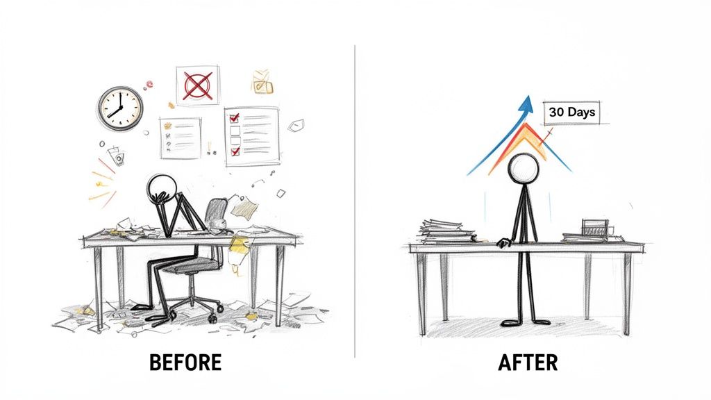
The "Before" State (The Problem): The ad opens by showcasing a relatable pain point or limitation. This could be a cluttered workspace for a productivity app, a chart showing high debt for a finance tool, or a "Day 1" photo for a fitness app. The goal is to establish an undesirable starting point that the audience recognizes.
The "After" State (The Solution): The ad then transitions to the transformed state achieved with the product. The cluttered desk becomes organized, the debt chart shows $0, and the "Day 1" photo is replaced with a "Day 90" photo showing clear progress. This visual payoff demonstrates the product’s direct benefit.
Why It’s a Top Framework
This method is highly effective for any product that creates a measurable change, from fitness and finance to skincare and education. Its visual-first nature performs exceptionally well on platforms like Meta and TikTok, where users quickly process imagery. The weight-loss industry built its advertising model on this concept, but it's equally powerful for a language app showing a user's journey from basic phrases to a fluent conversation. The transformation itself is the hook, the body, and the CTA all in one compelling visual story.
Strategic Insight: The most persuasive transformations are not just visual but also emotional. Combine the "after" visual with a user testimonial voiceover describing how the change felt. For instance, a finance app's "after" shot isn't just about zero debt; it's about the feeling of "financial freedom" or "finally sleeping at night," which adds a powerful emotional layer to the logical proof.
Actionable Tips for Implementation
Ensure Visual Consistency: For credibility, shoot "before" and "after" images or videos with the same lighting, angle, and setting. Inconsistencies can make the transformation feel staged or untrustworthy.
Quantify the Change: Use bold text overlays to highlight specific metrics. Phrases like “Saved 10 Hours a Week,” “Paid Off $15,000 in 6 Months,” or “Confidence Level: 100%” make the results tangible and easier to grasp.
Add a Timeline: Reinforce the journey by adding a timeline overlay, such as "Week 1 vs. Week 8." This helps manage expectations and shows that results are achievable within a specific, relatable timeframe.
6. Quick Tip/Educational How-To Format
The Quick Tip/Educational How-To format delivers immediate value to the viewer by teaching them something useful, positioning the brand as a helpful resource rather than a pushy advertiser. This approach thrives on platforms like TikTok and Instagram Reels, where the algorithm favors content that provides genuine utility. It’s an ideal framework for building trust and demonstrating expertise before ever mentioning a product.
This format flips the traditional advertising model by prioritizing the audience's needs first. By offering a valuable hack, tip, or mini-tutorial, you create a positive interaction that makes the viewer more receptive to your brand and its eventual call-to-action.
How It Works
This structure is designed for rapid value delivery and is broken into three distinct parts:
Value Proposition (0-2 seconds): Immediately state the tip or benefit. Start with phrases like "Here’s a hack for..." or "How to do X in 30 seconds." This serves as the hook, promising instant knowledge.
Demonstration (2-15 seconds): Show, don't just tell. This is a fast-paced visual walkthrough of the tip in action. For an app, this often involves screen recordings. The goal is to prove the tip is easy and effective.
Soft Call-to-Action (CTA) (15-25 seconds): Instead of a hard sell, this CTA gently connects the value provided to your product. It’s an invitation, not a command, using phrases like "Try this in [App Name]" or "Find more tips in our app."
Why It’s a Top Framework
This method is powerful because it aligns with user intent on discovery platforms, where people are actively seeking new information and skills. It generates goodwill and establishes authority, making it a perfect strategy for apps in the productivity, wellness, or education spaces. Notion excels at this by creating Reels that show users how to build a project dashboard in under a minute, directly demonstrating the app's power without a sales pitch.
Strategic Insight: Treat your ad creative like a content library. Batch-produce 10-20 distinct tips and release them consistently. The TikTok and Instagram algorithms often reward accounts for posting frequency, and this volume of value-first content can build a loyal following that eventually converts.
Actionable Tips for Implementation
Lead with the Learning: Your first two seconds must clearly state the value the viewer will receive. Frame it as a solution to a common frustration.
Use Heavy On-Screen Text: Since the format is educational, use bold text overlays to highlight key steps and takeaways. This makes the content scannable and accessible, even with the sound off.
Keep the CTA Contextual: The CTA should feel like the natural next step. If you just taught a design hack, the CTA "Create your own with Canva" feels helpful rather than intrusive.
7. Direct Response/Demo-Focused Feature Showcase
The Direct Response/Demo-Focused format is a utilitarian approach that strips away narrative and focuses entirely on showcasing a product’s core features and functionality. This method prioritizes showing over telling, using screen recordings, UI walkthroughs, and quick cuts of features in action. It's one of the most effective ad scripts examples for apps or software where demonstrating the user experience directly correlates with conversion.
This framework’s strength is its clarity and directness. It answers the viewer's most fundamental question: "What does this actually do, and how does it work?" By removing storytelling friction, it allows the product’s value to speak for itself, which is highly effective for audiences who are already solution-aware and comparing options.
How It Works
The structure is a visual tour of the product's most valuable capabilities, designed to build confidence and understanding.
High-Value Feature Hook (0-5 seconds): Instead of a narrative hook, this script opens by demonstrating the single most impressive or problem-solving feature. This could be a complex task completed in one tap or a unique collaborative function.
Core Functionality Tour (5-20 seconds): This section rapidly showcases 2-4 additional key features. The goal isn't a comprehensive tutorial but a highlight reel of what makes the product powerful and easy to use. Visuals are often augmented with callouts and text overlays to explain benefits.
Clear Outcome & CTA (20-30 seconds): The final segment shows the successful end result of using the features (e.g., a finished design, an organized schedule, a successful transaction) and follows with a direct call-to-action like "Download and Try" or "Start Your Free Trial."
Why It’s a Top Framework
This method is essential for tech, SaaS, and app marketing because it demystifies the product and reduces perceived risk for the user. It’s the digital equivalent of a test drive. For complex tools like Figma or productivity apps like Slack, a simple demo can instantly clarify the value proposition far better than a lifestyle-focused ad. This straightforwardness builds trust and attracts high-intent users looking for specific functionality.
Strategic Insight: This format is perfect for retargeting. If a user visited your pricing page but didn't convert, a demo-focused ad showcasing a premium feature they haven't seen can be the final push they need. Segment your demos to align with different stages of the user journey.
Actionable Tips for Implementation
Lead with Your "Wow" Moment: Don't structure your demo like a new user tutorial (e.g., login, setup, basic navigation). Identify the single feature that makes users go "wow" and put it in the first three seconds.
Use Visual Accents: Raw screen recordings can be boring. Add animated taps, swipes, arrows, and zoom-ins to guide the viewer’s eye to the most important parts of the interface.
Create Feature-Specific Variants: Don't rely on one generic demo. Create multiple ad variations, each focusing on a different core feature. This allows you to test which benefit resonates most with different audience segments.
8. Social Proof/Review Compilation Format
The Social Proof/Review Compilation format is a powerful, credibility-first approach that leverages the voice of the customer to build trust. It functions as a rapid-fire montage of positive reviews, star ratings, and user-generated endorsements, creating a wave of social validation that is difficult for skeptical audiences to ignore. This format provides compelling ad scripts examples by transforming genuine customer feedback into a persuasive narrative.
This framework’s effectiveness comes from its authenticity. Instead of the brand making claims, it lets satisfied customers do the talking, which is often more convincing and relatable for new prospects, especially in conversion-focused campaigns for apps and software.
How It Works
This format stitches together various forms of social proof into a single, cohesive video ad:
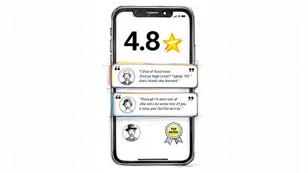
Quantitative Proof (The Hook): The ad often opens with hard numbers that immediately establish authority. This includes on-screen text like "4.8 Stars," "50M+ Downloads," or "Editor's Choice."
Qualitative Endorsements (The Body): Following the initial data point, the ad showcases a quick succession of user reviews and testimonials. These can be screenshots from the App Store, Trustpilot, or quotes animated on screen.
Actionable Validation (The CTA): The final segment reinforces the social proof with a direct call-to-action, such as "See why 10 million users love us. Download for free!" or "Join the 5-star rated community."
Why It’s a Top Framework
This method directly addresses a primary purchase barrier: a lack of trust. It shortcuts the consideration phase by providing third-party validation from peers. Apps like Duolingo and Calm frequently use this, compiling reviews that say "Best language app ever" or "Finally sleeping through the night," turning customer satisfaction into their most powerful marketing asset. It’s a highly efficient way to communicate value without a complex narrative.
Strategic Insight: The key to this format is velocity and variety. Don't linger on a single review for more than 2-3 seconds. Use a dynamic mix of review screenshots, animated text quotes, and star-rating graphics to maintain visual interest and create an overwhelming sense of positive consensus.
Actionable Tips for Implementation
Source Reviews Broadly: Pull testimonials from multiple platforms like the App Store, Google Reviews, Twitter mentions, and your own website to show widespread approval.
Organize by Theme: Create different ad variations by grouping reviews around specific themes. One ad might focus on "ease of use," while another highlights "life-changing results" to target different user motivations.
Emphasize Metrics with Overlays: Make quantitative data impossible to miss. Use large, bold text overlays for key stats like "4.9/5 Stars" or "100,000+ 5-Star Reviews" to anchor your ad's credibility.
8 Ad Script Formats Compared
Format | 🔄 Implementation complexity | ⚡ Resource requirements | ⭐ Effectiveness/quality | 📊 Expected outcomes/impact | 💡 Ideal use cases & key advantages |
|---|---|---|---|---|---|
Hook-Body-CTA (Three-Part Linear Structure) | Low — modular 3‑part assembly, easy to systematize | Low — reusable clips, minimal new production | ⭐⭐⭐ — very effective on short-form platforms | High completion & conversion; fast learning via section A/B tests | Performance ads on Meta/TikTok; easy scaling, rapid variant testing; identifies best hooks/CTAs |
Problem-Agitate-Solution (PAS) Framework | Medium — requires thoughtful narrative & authentic pain points | Medium — testimonial or scripted footage, stronger editing | ⭐⭐⭐ — high emotional resonance | Better retention and desire; strong for consideration-stage conversions | Subscription/productivity apps; builds urgency and persuasive storytelling |
Listicle/Numbered Format (Top 5, 7, 10) | Low — repeatable structure, simple sequencing | Low–Medium — multiple short clips + animated overlays | ⭐⭐⭐ — consistently high completion rates | Demonstrates breadth/value quickly; easy to test ordering/length | Feature-rich apps; rapid batch rendering; curiosity-driven completion |
UGC Testimonial Mashup | Medium — clip sourcing, rights clearance, assembly | Medium — low production cost but needs content library & moderation | ⭐⭐⭐⭐ — highest trust perception for cold audiences | Strong ROAS uplift; high credibility and social proof | Cold-audience acquisition; scales authenticity; cost-effective when UGC available |
Before-and-After Transformation | Medium — requires documented, authentic results over time | Medium — source verified before/after assets; add metrics | ⭐⭐⭐ — high emotional/visual impact when credible | Drives desire and shareability; clear ROI signals when measurable | Fitness, finance, wellness; tangible transformations that prove value |
Quick Tip / Educational How‑To | Low — short demo format, cue-first editing | Low — simple demos, captions, repeatable templates | ⭐⭐⭐ — excellent organic reach and authority building | High engagement and awareness; softer/longer conversion path | TikTok/Reels educational strategy; builds trust and frequency via value-first content |
Direct Response / Demo‑Focused Feature Showcase | Low — straightforward screen recordings & callouts | Low — requires clean UI captures and concise overlays | ⭐⭐⭐ — very effective for already-interested users | High conversion for warm/audience-aware segments; low cold performance | ASO trailers, retargeting, competitor comparisons; shows functionality clearly |
Social Proof / Review Compilation | Low — collect & format existing reviews or ratings | Low — uses existing review assets; needs curation | ⭐⭐⭐ — effective at reducing skepticism | Improves trust and lowers purchase hesitation for aware users | Lower-funnel conversion campaigns; highlights ratings/metrics to boost credibility |
From Scripts to Scale: Systematize Your Creative Success
Throughout this guide, we’ve deconstructed a wide array of high-performing ad scripts examples, moving from the foundational Hook-Body-CTA structure to more nuanced formats like UGC testimonials and problem-focused PAS narratives. Each example serves as more than just a template; it's a strategic blueprint for capturing attention, building desire, and driving action on platforms like Meta and TikTok.
Mastering these frameworks is the critical first step. The real competitive advantage, however, emerges when you move from simply writing scripts to building a systematic creative engine. The examples we analyzed reveal a clear set of universal principles for success in today's fast-paced digital advertising landscape.
Key Takeaways: From Frameworks to a Winning Formula
The most successful ad scripts don't just happen by accident. They are the result of understanding core human psychology and applying it through proven structures.
The Hook is Everything: As demonstrated across every format, the first three seconds determine success or failure. Whether it's a polarizing statement, a relatable problem, or a visually arresting product demo, your hook must stop the scroll and earn the viewer's attention.
Align Format with Objective: A direct response product demo serves a different purpose than a UGC testimonial mashup. The former excels at showcasing tangible value and features, while the latter builds trust and social proof. The key is to match your script's framework to the audience's stage of awareness and your campaign's specific goal.
Leverage Social Proof Relentlessly: From review compilations to testimonial-driven narratives, social proof is the ultimate conversion accelerator. Integrating authentic user voices, ratings, and endorsements into your scripts removes friction and validates your product's claims in a way that branded messaging simply cannot.
Value-First, Sell-Second: The Quick Tip and Before-and-After formats work so well because they provide immediate value. By teaching the viewer something useful or showing a tangible, desirable transformation, you build reciprocity and make the final call to action feel like a natural next step, not a jarring sales pitch.
The Power of a Modular Creative System
Viewing these ad scripts examples as isolated, one-off assets is a limiting approach that inevitably leads to creative burnout. The most advanced marketing teams adopt a modular strategy, breaking down their ads into a library of reusable components.
Think of it as building with LEGOs. You have a collection of:
Hooks: Different opening lines, questions, and visual scenes.
Bodies: Various product demos, benefit explanations, and user stories.
Testimonials: A bank of powerful UGC clips and review screenshots.
CTAs: Multiple calls to action tailored to different offers and user intents.
By creating a system to mix and match these elements, you transform creative production from a slow, linear process into a dynamic, high-velocity operation. This allows you to test hundreds of variations, rapidly identify winning combinations, and consistently out-learn the competition. You are no longer searching for a single "silver bullet" ad; you are building a machine that continually discovers what works. This systematic approach is the definitive path to scaling your campaigns, combating creative fatigue, and achieving predictable, profitable growth.
Ready to stop manually editing and start systematically scaling your creative output? Sovran is an AI-powered creative platform built to automate this exact process, allowing you to assemble, render, and deploy hundreds of ad variations from your best-performing components in minutes. Turn your winning ad scripts examples into a scalable engine for growth by visiting Sovran and discovering a smarter way to create.

Manson Chen
Founder, Sovran
Related Articles
10 Actionable Ad Creative Ideas That Convert in 2026
Discover 10 actionable ad creative ideas for Meta & TikTok. Get hooks, scripts, and testing frameworks to boost your ROAS and combat creative fatigue.
How to Turn Link Into Video: Ads That Convert in 2026
Learn how to turn link into video for Meta & TikTok ads. Leverage AI to scale creation, boost ROI, and succeed in 2026.
Your Ultimate Guide to UGC Style Video Ads
Master UGC style video ads for Meta and TikTok. This guide reveals proven frameworks, scripts, and scaling tactics to boost your ROAS in 2026.